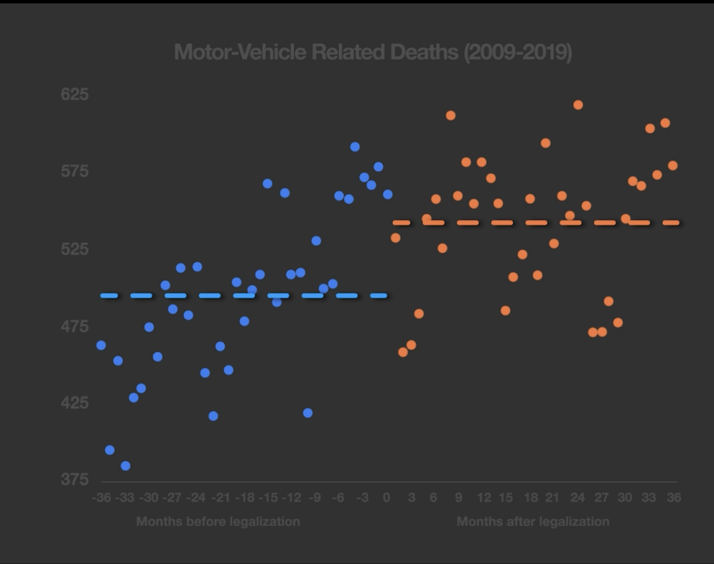
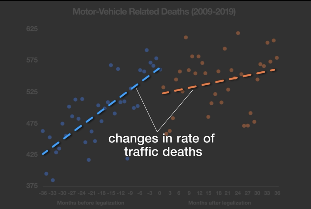
"Eh, only in the short run:
We study the causal impacts of income on a rich array of employment outcomes, leveraging an experiment in which 1,000 low-income individuals were randomized into receiving $1,000 per month unconditionally for three years, with a control group of 2,000 participants receiving $50/month. We gather detailed survey data, administrative records, and data from a mobile phone app. The transfer caused total individual income excluding the transfers to fall by about $1,900/year relative to the control group and a 4.2 percentage point decrease in labor market participation. Participants reduced their work hours as a result of the transfers by 1-2 hours/week and participants’ partners reduced their work hours by a comparable amount. Among other categories of time use, the greatest increase generated by the transfer was in time spent on leisure. Despite asking detailed questions about amenities, we find no impact on quality of employment, and our confidence intervals can rule out even small improvements. Treated participants broadly increase expenditures, led by spending on non-durable goods and services, with smaller increases in spending on durable goods and human capital. We observe no significant effects on degree attainment, though the magnitudes of the estimated effects generally appear larger among younger participants. Measures of subjective well-being are higher among treated participants in the first year of the transfers but then revert to control group levels. Overall, our results suggest a moderate labor supply effect that does not appear offset by other productive activities.
That is from the QJE by Eva Vivalt, Elizabeth Rhodes, Alexander Bartik, David Broockman, Patrick Krause, and Sarah Miller. Via Matt Yglesias."
Saturday, August 22, 2026
Did UBI make people happier? (only in the short run)
Friday, August 21, 2026
What Slaughtered Pigs Can Teach Us About Europe’s Wine Policy
There’s a senselessness to Europe’s attempt to manage wine supply and dictate prices that echoes the New Deal’s effort to alleviate poverty by destroying millions of pigs.
"In the spring of 1933, American farmers pleaded for help from their newly elected president, Franklin Roosevelt. Hog prices were at record lows, and the farmers wanted the government to do something.
Not one to let a crisis go to waste, FDR took action. Agriculture Secretary Henry Wallace was tasked with arranging the slaughter of millions of pigs in an effort to raise hog prices. Farmers who participated in the federal government’s hog program — later dubbed by economists “the porcine slaughter of the innocents” — were compensated. Their animals were turned into “inedible meat and bone meal,” courtesy of US taxpayers, even as hunger in America hit record highs.
A country destroying its own food during a depression might sound like economic madness, and it is — but we are once again watching governments ramp up policies that pay farmers to destroy food.
It’s no secret that European vineyards have been disappearing for years. The trend is starkest in Pyrénées-Orientales in southern France: that region “lost nearly half its vines” between 2000 and 2020, The Economist recently reported. Limited access to water and rising energy costs played a role. But vineyards have vanished with increasing speed in recent years, thanks to government policies.
In 2024, the French government revived a familiar tactic: paying farmers to rip out their vines. Under this national program, farmers can receive roughly €4,000 (about $4,600) for every hectare they remove. If lawmakers aimed to see the country produce less wine and hasten the disappearance of vineyards, that’s what they got.
France typically produces well over 40 million hectoliters of wine annually, but in 2025 it produced just 36 million, according to the French Ministry of Agriculture. Meanwhile, growers in the Languedoc-Roussillon region saw a surge in vines removed last year — roughly 15,000 hectares, an area approaching the size of Washington, D.C., according to The Economist.
Many might assume climate concerns drove France’s policy, but the primary reason resembles the catalyst for FDR’s “porcine slaughter of the innocents”: oversupply.
Global trends show fewer people drinking alcohol, especially Gen Z. Wine has taken a particularly hard hit, even in France, where red wine consumption recently reached an all-time low. French lawmakers say their policy is designed to “rescue” the wine industry from what the ministry described as excessive output.
To the average person, paying vineyard owners to destroy their vines likely looks crazy — but in Europe, it’s business as usual.
For years, the European Union has attempted to micromanage wine production through various incentives, including direct payments to farmers to remove vines. A European Parliament report found that the EU’s 2008 wine reform set an aggressive target: removal of 175,000 hectares with commitments to not replant. (Actual removal totaled 160,550 hectares.)
Now it appears Brussels is intent on ramping up its policy. The EU’s most recent Wine Package will, among other measures, make it easier for countries to make direct payments to farmers to destroy their vines.
“…new rules on State aid would allow Member States to use national financing not only for distillation of surplus wine,” the package reads, “but also for green harvesting (the total destruction or removal of grapes while still in their immature stage) and grubbing up (complete elimination of all vine stocks) of vineyards.”
There’s a certain irony in the policy.
For decades, the EU subsidized wine production, resulting in surplusses critics dubbed “wine lakes.” Now Brussels wants to ratchet up efforts to rip out vines — to curb the very surplus that bureaucrats helped create.
There’s a senselessness to Europe’s approach that matches New Deal efforts to alleviate poverty by destroying millions of pigs. At least some New Dealers eventually learned their interventionist policies were failing.
“We are spending more money than we have ever spent before and it does not work,” United States Secretary of the Treasury Henry Morgenthau Jr. admitted to Congress in 1939. “I want to see this country prosperous. I want to see people get a job, I want to see people get enough to eat. We have never made good on our promises.”
Morgenthau learned the hard way that trying to engineer a market economy from Washington — through spending, controls, and heavy-handed intervention — produced results far different from those promised.
We can only hope lawmakers in Europe eventually learn the same lesson.
Markets aren’t perfect, but they aggregate information from millions of buyers and sellers far better than bureaucrats, who can’t seem to decide whether to subsidize vineyards to boost production or destroy them to raise prices.
These contradictions will do long-term harm to vineyards. That’s a shame. A world with less wine is a less happy world."
Thursday, August 20, 2026
A Reality Check on the Inequality Panic
Calls for wealth redistribution rest on a faulty premise about inequality
"Summary: Widespread claims of rapidly worsening global inequality are unsupported by the evidence. Long-term data show significant declines in inequality across income, health, education, and other important metrics, largely driven by rising prosperity in poorer countries. Popular policy proposals to address inequality, such as wealth taxes and expanded foreign aid, are misguided and dangerous. Policies that sustain economic growth and market stability are better guarantors of progress.
Anthropic CEO Dario Amodei called for far higher taxation in a recent blog entry, arguing that current wealth concentration is higher than that of the Gilded Age and is about to get worse globally. The chart-topping singer Billie Eilish implored billionaires to give away their money, while New York City mayor Zohran Mamdani has gone further, opining, “I don’t think we should have billionaires” because we live in “a moment of such inequality.” If anything is having a moment, it is the conviction that inequality has grown urgent enough to justify a muscular policy response.
But the facts don’t support this. Not only has global income inequality fallen over the long run — contrary to the popular narrative — but inequality has also declined in education, health, and a host of other areas. The world is now more equal across a range of factors, from lifespan and childhood survival to internet access and schooling. The more broadly one examines inequality, the more encouraging the data appear. It turns out that even the shock of COVID-19 failed to erase decades of progress toward a wealthier and more equal world.
Indeed, the data show a pronounced decline in global inequality over the past few decades, driven largely by rising prosperity in poorer countries. During the pandemic years of 2020 and 2021, progress slowed sharply. Some indicators stalled and a few modestly worsened. But the gains accumulated before the crisis were not undone.
In short, the damage to human well-being was more limited than many feared.
Another recent analysis published in The Economist finds that global inequality in consumption spending is falling. In 2000, the richest 10% of humanity spent 40 times more than the poorest 50%. In 2025, they spent around 18 times more. Using data from World Data Lab, they find that the poorest 50% now out-consume the richest 1%, breaking from past trends.
Yet many think that only large-scale redistribution can stop runaway worldwide inequality. Figures as diverse as Amodei, Eilish, and Mamdani are far from alone in embracing this view. Over the past few years, calls for a worldwide wealth tax, a vast increase in foreign aid spending, and other unprecedented measures are gaining steam across academia, non-profits, the press, and international organizations like the United Nations.
That conclusion is premature. Getting the facts straight is essential, because misunderstanding global inequality can push policymakers toward harmful solutions.
The record on foreign aid is far less encouraging than its advocates suggest: decades of evidence show that aid frequently fails to deliver sustained development and bears no reliable relationship to long-term economic growth. Worse, the fixation on ever larger aid flows often crowds out the harder work of domestic reform. In some cases, foreign aid has been shown to weaken political institutions, entrench bad governance, and slow the process of democratization.
Wealth taxes have their own problems, from high administrative costs and enforcement challenges to low revenue production and invasion of financial privacy. These problems help explain why so many of the countries that have implemented wealth taxes in the past — such as France, Germany, and Sweden— later abolished the tax. Perhaps the worst of all, by discouraging risk-taking, wealth taxes suppress investment and growth, effects that would be felt in both rich and poor countries and would likely prove especially damaging to development in the world’s poorest economies.
Recent work on multidimensional inequality suggests that the world has not been drifting toward ever greater gaps, but that the rich and the poor have been converging in material comfort. Calls for global wealth taxes or massive new aid programs often rest on the assumption that international trade and economic freedom have failed to deliver broadly shared gains. Yet the long-term evidence suggests the opposite.
The pandemic offers two lessons here: First, it highlights just how sensitive progress is to disruptions in markets. It depends on conditions that allow growth to occur and persist, including functioning markets and stable institutions. Many of the proposed policy solutions risk undermining that progress.
The second lesson is that while the pandemic represented a hurdle in the path of progress, the long-term trend toward lower global inequality is holding strong.
Alarmist narratives shape public opinion and encourage policymakers to pursue sweeping interventions that may do more harm than good. A clearer view of the data counsels caution rather than panic."
Wednesday, August 19, 2026
Did the Plaza Accord Cause Japan’s Lost Decades?
"The rebalancing debate has sparked renewed interest in Japan’s experience since the 1980s. Some argue that this is a cautionary tale, exemplifying the dangers of reorienting economies through currency appreciation (People’s Daily, 2010). They claim that the appreciation of the yen after the Plaza Accord forced the authorities to introduce an offsetting macroeconomic stimulus, which then led to an extraordinary asset price boom followed by an extraordinarily painful bust. Japan was one of the world’s fastest-growing economies for three decades but has averaged only 1.1 percent real GDP growth since 1990, while prices have steadily declined. Consequently, the size of Japan’s economy today is about the same as in the early 1990s. The sequence of events is clear and striking. But there are reasons to doubt that it was truly inevitable, whether the Plaza Accord was really the direct cause of Japan’s “Lost Decades.”
What Happened?
The events began in September 1985, when delegates from the G5 countries met at the Plaza Hotel in New York, declared the U.S. dollar overvalued, and announced a plan to correct the situation.1 The essence of the plan was that the main current account surplus countries (Japan and Germany) would boost domestic demand and appreciate their currencies. In effect, this agreement marked a major change in policy regime: the Federal Reserve was signaling that after a long and successful fight against inflation, it was now prepared to ease policies, allow the dollar to decline, and focus more on growth. This signal was backed by coordinated currency market intervention and a steady reduction in U.S. short-term rates. Accordingly, it triggered an exceptionally large appreciation of the yen, amounting to 46 percent against the dollar and 30 percent in real effective terms by the end of 1986. (The deutsche mark appreciated similarly.) As a result, Japan’s export and GDP growth essentially halted in the first half of 1986. With the economy in recession and the exchange rate appreciating rapidly, the authorities were under considerable pressure to respond. They did so by introducing a sizable macroeconomic stimulus. Policy interest rates were reduced by about 3 percentage points, a stance that was sustained until 1989. A large fiscal package was introduced in 1987, even though a vigorous recovery had already started in the second half of 1986. By 1987, Japan’s output was booming, but so were credit growth and asset prices, with stock and urban land prices tripling from 1985 to 1989. Then, in January 1990, the stock price bubble burst. Share prices lost a third of their value within a year, and two decades of dismal economic performance followed (Figure 1.4.1). Today, nominal stock and land prices are back at their early 1980s levels, one- quarter to one-third of their previous peaks.
The critical question is whether this sequence was inevitable. In other words, did the appreciation force Japan to introduce a powerful stimulus to sustain growth, which then triggered a bubble, which caused the Lost Decades when it collapsed? Let’s consider each step in turn.
Was Such a Large Stimulus Needed?
Studies suggest that, in fact, the monetary policy easing may have been excessive. Estimates by Jinushi, Kuroki, and Miyao (2000) and Leigh (2010), among others, suggest that the policy rate was up to 4 percentage points too low during 1986–88 relative to an implicit Taylor rule based on the output and inflation outlook. Why, then, did the central bank sustain such a policy? A key reason is that current inflation remained reasonably well behaved, which led some economists to argue that soaring growth rates did not represent a cyclical boom but rather a “new era” of higher potential growth. This growth was particularly gratifying because it was led by domestic demand, a key commitment under Plaza.
But IMF reports at the time suggest another factor was also at work. The authorities worried that higher interest rates would further strengthen the yen and feared that appreciation would eventually have serious effects on the economy. In the end, external demand did indeed diminish. But it did not collapse. Real exports continued to grow in the five years after Plaza, by an average of 2½ percent a year (half the rate of the previous five years), while the current account surplus diminished by a moderate 2 percentage points of GDP. (Similarly, Germany’s currency appreciation failed to derail its export or GDP expansion, even with a smaller monetary response.) Put another way, excessive stimulus was adopted in part because there was excessive concern about the impact of appreciation.
Did the Stimulus Cause the Bubble?
Although the monetary easing was certainly large, it is far from clear that it alone was responsible for the asset price bubble. Chapter 3 of the October 2009 World Economic Outlook and Posen (2003) have examined the link between monetary policy and asset price booms in advanced economies over the past 25 years. They conclude that policy easing is neither necessary nor sufficient to generate asset price booms and busts. In Japan’s case, two other elements seem to have played a large role. As Hoshi and Kashyap (2000) explain, financial deregulation in the 1970s and early 1980s allowed large firms to access capital markets instead of depending on bank financing, leading banks to lend instead to real estate developers and households seeking mortgages. As a result, bank credit to these two sectors grew by about 150 percent during 1985–90, roughly twice as fast as the 77 percent increase in overall bank credit to the private sector. Finally, because the dangers of real estate bubbles were not well understood in those years, the Japanese government did not deploy countervailing regulatory and fiscal policies until 1990.
Did the Bubble’s Collapse Cause the Lost Decades?
The aftermath of the bubble proved extraordinarily painful for Japan. But the collapse of a bubble does not inevitably have such powerful and long-lasting effects. What was special about Japan’s case? A key factor was the buildup of considerable leverage in the financial system, similar to what occurred in the United States before 2008. Tier 1 capital of Japanese banks in the 1980s was very low, much lower than elsewhere, as global standards (the Basel I accord) had not yet gone into effect. Moreover, much of the collateral for loans was in the form of real estate, whereas under the keiretsu system a significant portion of bank assets consisted of shares in other firms from the same group. So, when real estate and share prices collapsed, the banking system was badly damaged.
This underlying vulnerability was exacerbated by a slow policy response. The authorities delayed forcing banks to recognize the losses on their balance sheets and allowed them to continue lending to firms that had themselves become insolvent, a process Caballero, Hoshi, and Kashyap (2008) call “zombie lending.” This process continued into the early 2000s, stifling productivity growth and prolonging Japan’s slump. Why did the authorities not force faster restructuring? Possibly because restructuring would have required additional bank capital, which they were not in a position to provide in light of the strong political backlash after an initial injection of public capital in 1995. Consequently, the authorities exercised forbearance instead.
The postbubble slump may also have been exacerbated by the macroeconomic policy response and adverse external shocks. Some argue that premature monetary tightening and the lack of a clear commitment to raising inflation led to unduly high real interest rates (Ito and Mishkin, 2006; Leigh, 2010). In addition, the tightening of fiscal policy in 1997 may have undercut the nascent 1995–96 recovery (Posen, 2003; Corbett and Ito, 2010). Finally, adverse external shocks played a role, including the 1997–98 Asian financial crisis.
In sum, Japan’s experience shows that currency appreciation does not, in fact, inevitably lead to “lost decades.” The appreciation did not inevitably require such a large macroeconomic stimulus. The stimulus did not inevitably lead to the bubble. Nor did the bubble’s collapse inevitably lead to the Lost Decades. Instead, it was the particular combination of circumstances and choices that led to that result.
Lessons for Rebalancing Today
Calibrating a policy response to exceptionally large appreciations and movements in asset prices remains an extraordinarily difficult task. But some pointers can be gleaned from Japan’s experience. The keys are to
• avoid an excessive macroeconomic response to currency appreciations;• use prudential policies to prevent vulnerabilities from building up, especially in the form of leverage;• address banking problems quickly if they do materialize; and• provide significant macroeconomic support when banking systems and economies come under stress.An even broader lesson is that bubbles can prove dangerous. Accordingly, Japan has introduced a two- perspective framework for monetary policy, with one pillar focusing on price stability and the other looking out for financial imbalances such as asset price bubbles.
But even as Japan’s experience offers lessons to countries considering rebalancing today, the direct parallels are limited. Most notably, circumstances in China today differ from those in Japan in the 1980s in ways that should help it avoid Japan’s disappointing outcomes (Figure 1.4.2). First, the leverage of households, corporations, and the government in China is lower now than it was in Japan before the bubble (N’Diaye, 2010), and the risk of excessive borrowing may thus be smaller. Second, as Chapter 4 of the April 2010 World Economic Outlook and Igan, Fabrizio, and Mody (2007) find, climbing the quality ladder helps offset the impact on growth of currency appreciation, and China has more room to climb the export quality ladder than Japan did. (At the same time, the impact on labor-intensive industries may be greater.) Third, Japan had a floating exchange rate regime in the 1980s, but China has a managed exchange rate supported by vast foreign currency reserves and strong restrictions on capital inflows. This difference in currency regimes should help China avoid the sharp appreciation observed in Japan. Most important, China should be able to reap the benefits of learning from Japan’s experience."
Tuesday, August 18, 2026
China's middle class is below the US poverty line
See 2026’s Counter Tweet of the Year? by Dan Mitchell.
"Regarding Chinese economic policy, I’m both a cheerleader and a critic.
On the positive side, I applaud how hundreds of millions of people in China have escaped poverty.
On the negative side, I complain that the economy is operating way below its potential.
Here are four points I shared earlier this year, and they summarize my view on what’s good and bad.
Before the final point, I probably should have added another sentence, saying something like “China is now a middle-income country instead of a poor country.”
For today’s column, I want to provide some data to highlight the need for more economic freedom in China – assuming, of course, the goal if for China to become rich.
And I’m going to share two charts posted on Twitter/X by @3RenChengHu. I don’t know this person, so I normally would be reluctant to share a stranger’s data, but I am very familiar with Our World in Data, a group from Oxford University with very reliable numbers (and you can access the data in today’s column by clicking here).
Here’s the first chart, which shows the percentage of the Chinese population that it poor based on various measures (ranging from less that $3 per day to less than $40 per day).
I added (in green) my rough guess that the average person in China is at $15 per day.
As you can see, the Chinese numbers have improved dramatically since 1981.
But could they be better? I think the answer is yes, emphatically yes.
In part, this is because of the research I’ve shared showing how Chinese people are rich everywhere but China.
But let’s also look at the second chart shared by @3RenChengHu.
It shows the same poverty data, but for the United States instead of China.
And I’ve added my two cents (in green, again) to note that only a very tiny share of Americans live on $15 per day.
I’m not sharing all this data to be jingoistic. Just as I think China has bad policies that are restricting growth, the same is true for the United States.
But the relative rankings do show that the U.S. is benefiting from more economic freedom, both today and through history.
For what it’s worth, I would like policy makers in both countries to look at these numbers and have them decide that more economic liberty is the recipe for making their respective nations richer.
But I’m also sharing this data because @3RenChengHu’s tweet was actually a counter tweet. As you can see, he was responding to a silly tweet from @TheDanteMunoz about the supposed superiority of socialism.
At the risk of understatement, @3RenChengHu slammed @TheDanteMunoz to the canvas.
P.S. Other counter-tweet-of-the-year contestants can be viewed here, here, here, and here."
Monday, August 17, 2026
Who Will Pay for Democratic Socialism’s $200 Trillion Cost?
"The Democratic Socialists of America (DSA) propose new spending that could more than triple federal outlays. They propose the government pay for health care, housing, higher education, and electricity. Jobs are government-guaranteed, retirement benefits are expanded, paid family leave is universal, fossil fuels are eliminated, and reparations are paid.
The DSA platform claims that the bill for all this will be sent to “the richest individuals and corporations.” Tally up that bill, and it ballparks between $71 trillion and $212 trillion in new spending over the next decade. Confiscating every dollar of high-end wealth and corporate profits would cover only a fraction of those costs. The DSA agenda necessitates high taxes on middle-class Americans.
$200 Trillion in New SpendingTotaling up nine of the largest proposals in the DSA platform would mean new federal spending equivalent to between 18 percent and 53 percent of GDP.
Table 1 reports various low-end and high-end estimates of proposals for programs that approximate the DSA’s vague descriptions. Each proposal’s original spending estimate is converted to a share of GDP and then applied to the 2027–2036 projected GDP, so all estimates are in current dollars.
![]()
Medicare-for-All-style proposals for universal healthcare would increase federal spending by $40 trillion to $75 trillion over 10 years. Reparations, a federal jobs guarantee, infrastructure, green energy investment, larger retirement benefits, free housing, paid family leave, and no-cost college would increase spending by tens of trillions of dollars more. In total, the DSA’s new spending would cost between $71 trillion and $212 trillion over the next decade.
This exercise is inherently imperfect, which is why the estimates vary so widely and should be understood as orders-of-magnitude estimates. They likely overstate the cost where programs overlap with each other or existing spending. They understate the cost by failing to fully capture behavioral responses, broader economic effects, and the comprehensive scope contemplated by the DSA. Each estimate comes from different authors using different methods and assumptions, and builds on a similar methodology by David Burton.
Internationally High Spending
In the US, federal, state, and local governments spent almost 40 percent of GDP in 2024. The average across the European Union is 49 percent, ranging from 58 percent in Finland to 22 percent in Ireland.
Using the lower-bound estimates, the DSA agenda would raise US spending to more than 57 percent of GDP. Among large, industrialized countries, only Finland would have a larger government. France comes in a third of a percentage point under the US’s low estimate. Add the high-end estimates, and US government spending would reach 92 percent of GDP.
No comparable country on Earth spends anywhere close to that amount. The DSA agenda’s spending could give the government a claim on national output much closer to estimates of state control under Soviet-style communism than to today’s European welfare states.
![]()
Who Pays?
The federal government is projected to collect $70 trillion in taxes over the next decade, roughly 18 percent of GDP. Paying for the DSA agenda would require roughly doubling federal revenue at the low end and quadrupling it at the high end, in addition to the revenue needed to cover the Congressional Budget Office’s $24 trillion projected ten-year deficit.
The DSA suggests that the richest Americans and corporations will pay for all these new outlays. The problem is, there simply aren’t enough resources at the top to make this plan work.
![]()
The 400 wealthiest Americans were worth a record $6.6 trillion in 2025. Confiscating all of their wealth would cover only about 9 percent of the low-end revenue requirement and 3 percent of the high-end estimate. Their wealth could be seized only once, and attempting to liquidate trillions of dollars in assets would, in turn, drive their value down.
Domestic corporate profits after federal taxes are projected to be about $35 trillion over the next decade. Seizing every additional dollar of corporate profits would fund half of the low-end estimate and 17 percent of the high end. This also assumes that firms continue operating normally while the government takes every cent of profit. Without a profit motive, businesses would cease to exist.
Higher earners are also not a source of vast untapped revenue. A recent report by economists at the Joint Committee on Taxation concluded that raising top federal income tax rates to their revenue-maximizing level would result in revenue gains of less than 0.1 percent of GDP, equivalent to roughly $400 billion over a decade at today’s projected GDP levels.
The entire wealth of the richest Americans, plus every dollar of corporate profit and maximum top income tax rates, still leaves the DSA agenda between $29 trillion and $169 trillion short.
The only remaining source of revenue large enough to cover the DSA agenda is the same one every large European welfare state relies on: the middle class. France and Finland don’t fund their large governments by only taxing billionaires. They impose high income, payroll, and consumption taxes on ordinary households.
To cover the DSA’s high-end spending estimate and current deficits, every $1 the federal government collects today would need to become about $4.36. Mechanically applying that increase to individual income-tax rates would push the 24 percent bracket above 100 percent and the top rate above 160 percent.
The DSA is promising Americans a world in which someone else will pay for potentially hundreds of trillions of dollars in new benefits. The problem is that there aren’t enough rich people or corporations to pay for Democratic Socialism. Eventually, the bill will come for the rest of us."
Sunday, August 16, 2026
There was a huge collapse in wealth inequality in the UK between 1900 and 1980
Tweet from Sylvain Catherine. He is a professor at Wharton, the business school of the University of Pennsylvania. Excerpts:
"If . . .we look at the top 1% . . . there was a huge collapse in wealth inequality in the UK between 1900 and 1980, and basically no change since then. And that is before taking state pensions into account. The same thing is true when you look at the top 10%."
The graph shows the share or percent of total wealth going to the top 1% and the top 10% over time. Those shares fell dramatically.
California's Minimum Wage Hike
"Firms respond to minimum wage hikes in multiple ways.
One study considers a 2023 California bill that raised the minimum wage for fast food workers from $16 to $20 per hour.
The researchers estimated
a 4.9–5.1 percent increase in fast-food prices and a 2.1–2.2 percent increase in full-service prices. … Additionally, [the] findings suggest that price increases reduced consumers’ demand for fast food by 3.9–4.1 percent and for full-service meals by 1.7–1.8 percent.
Further, the wage hike had
distributional implications, as lower-income households spend a larger share of their budgets at fast-food restaurants.
All in all,
this large, sector-specific minimum wage increase raised labor costs, [which] firms passed … through to consumers by raising prices, and the resulting decline in demand reduced employment.
Exactly what standard economics would predict."
Saturday, August 15, 2026
Obama’s CEA on Reforming Health Care
The CEA’s Contradictions on Obamacare
By David R Henderson. Excerpt:
"What was strange about Duggan’s discussion of adverse selection and moral hazard is that he ignored his own discussion later in the chapter. On adverse selection, for example, he laid out how asymmetric information leads to adverse selection, writing:
Insurers cannot perfectly determine whether a potential purchaser is a large or small health risk. (p. 186.)
But then later, in discussing the House and Senate bills, he writes:
These regulations would correct insurance market failures by preventing health insurers from responding to adverse selection by raising rates and denying coverages . . . . (p. 202)
Huh? Just 16 pages after laying out that the adverse selection problem occurs because insurers can’t adjust rates to risk, he says that these regulations, which he seems to think are good, will prevent insurers from adjusting rates to risk.
On moral hazard, Duggan writes:
A second problem with health insurance is moral hazard: the tendency for some people to use more health care because they are insulated from its price. When individuals purchase insurance, they no longer pay the full cost of their medical care. As a result, insurance may induce some people to consume health care on which they place much less value than the actual cost of this care or discourage patients and their doctors from choosing the most efficient treatment. (p. 187)
But in a section titled, “Declining Coverage among Non-Elderly Adults,” Duggan writes:
The generosity of private health insurance coverage has also been declining in recent years. For example, from 2006 to 2009, the fraction of covered workers enrolled in an employer-sponsored plan with a deductible of $1,000 or greater for single coverage more than doubled, from 10 to 22 percent. The increase in deductibles was also striking among covered workers with family coverage. For example, during this same three-year period, the fraction of enrollees in preferred provider organizations with a deductible of $2,000 or more increased from 8 to 17 percent. Similar increases in cost-sharing were apparent for visits with primary care physicians. The fraction of covered workers with a copayment of $25 or more for an office visit with a primary care physician increased from 12 to 31 percent from 2004 to 2009. (p. 192)
If the goal is to have people pay more attention to cost when buying health care, a goal that the vast majority of health economists, whatever their political stripe would share, this is good news. Yet Duggan seems to lament it.
Along the way, though, Duggan does give little nuggets that suggest that health insurance markets work better than he originally claimed. For instance:
Forty-four states now permit insurance companies to deny coverage, charge inflated premiums, or refuse to cover whole categories of illnesses because of preexisting medical conditions. (p. 188)
“Inflated” in the above quote simply means high and, given the risk, it makes sense to charge high rates. Here again Duggan undercuts his own “adverse selection” critique of insurance markets.
What do the data tell us about insurance companies rescinding coverage and refusing to pay claims if individuals fail to list any medical conditions? Here’s what Duggan writes:
A House committee investigation found that three large insurers rescinded nearly 20,000 policies over a five-year period, saving these companies $300 million that would otherwise have been paid out as claims (Waxman and Barton 2009). (p. 188)
Now, 20,000 sounds like a large number but remember that these are three large insurers who could easily, among them, have one million policy holders. 20,000 over five years is 4,000 a year. So taking the one-million assumption, which I think is too low, one would conclude that 4/10 of a percent of insured people every year lost their insurance in this way.
DRH note in 2026: I probably way underestimated the number of policy holders that the three large insurers insured. I bet that it was at least 10 million. So 4,000 people per year having their policies rescinded would constitute 1/25 of one percent. Should a huge intervention in the health market be justified on the basis of a problem for 1/25 of 1 percent of insured people.
Another nugget is his number on uncompensated care, which he estimates at $56 billion in 2008. Given that approximately 255 million had insurance at any given time that year, this amounts to $220 per insured person. That’s large, but it’s not huge. The Samaritan’s Dilemma, it appears, is smaller than many have thought."
Friday, August 14, 2026
Regulated Markets Are Slow to Handle Change
"Gowrisankaran, Langer and Reguant have an excellent paper, Energy Transitions in Regulated Markets (WP), in the latest AER.
The basic idea is that regulation designed to prevent utilities from building useless power plants can induce them to keep obsolete power plants. Some background. We regulated electric utilities under the theory that they were natural monopolies and therefore we would do better by pushing their prices down. What’s a reasonable price? Hard to say, so regulated utilities were allowed to recoup their operating costs plus a fair return on their “rate base”—their capital stock. Makes sense, but once profits depended on the size of the capital stock, utilities had an incentive to build too much—the classic Averch–Johnson effect. Regulators responded with “prudence” requirements and the rule that capital must be “used and useful.” In a stable world, that rule is a check, albeit an imperfect check, on so-called gold-plating.
But now consider what happens in a time of technological change, such as a rapid decrease in the cost of generating electricity with natural gas (driven by fracking and improvements in combined-cycle natural-gas (CCNG) technology). In a free market, large decreases in costs would cause firms to abandon coal and move to natural gas—some would do this to make profits, others to avoid losses. In short, the market forces sunk investments to be abandoned when not profitable.
But there is another possibility under regulation. Tell the regulator that your plants are still viable. Well, telling is cheap talk so you keep burning coal to prove that the plant remains useful. If you can keep your base operating that’s better than abandoning it and to signal how valuable your coal plant still is, it may even be worth while to burn coal when the cost exceeds the price of electricity! The authors have some nice data on exactly this point.
Figure 3 takes a little work to understand, but the pattern is clear. Each point represents a state. In panel A, the vertical axis shows how much less likely a coal plant is to run when the cost of coal exceeds the price of electricity. Obviously, a strongly negative coefficient is the economically sensible response: when burning coal is more expensive than buying electricity, the plant should burn less.
The red points represent restructured states and the green points regulated states. In restructured states coal burning falls when prices fall, just as expected. Coal burning in regulated states responds much less. (I.e., the red points generally lie below the green points.) Indeed, the six states with the largest reductions in coal operation are all restructured states.
One objection to this analysis might be that utilities in general are just slow to respond to prices, so on the horizontal axis the authors plot how well utilities respond to a higher price of gas. Note that these coefficients are all negative and there is no obvious difference between regulated and restructured states. In both types of states, utilities respond well to the price of gas, but only in restructured states do utilities respond strongly to the price of coal. (Why coal and not gas? Because the used-and-useful standard binds on capital whose usefulness is in doubt—which, once gas got cheap, meant coal. In other words, the utilities have to defend coal to the regulators, not gas.)
Panel B on the right shows a slightly different way of presenting the same data. The vertical axis is again how much less likely a coal plant is to run when its cost exceeds the electricity price. The horizontal axis is the fraction of generation owned by electric utilities. Regulated states tend to be vertically integrated, while restructured states opened electricity generation to competition, so utility ownership and regulatory status are closely correlated. Regulated states generally have utility ownership above 60%, while all the restructured states but one are below 30%. The best-fit line slopes upward: in other words, the more generation a state’s utilities own, the less coal dispatch responds to price. A different perspective on the same story.
That is the direct empirical evidence. The authors then construct a more ambitious structural model. In theory, regulation could produce either too much or too little investment in the new technology; their estimates imply too much. Much, too much. Not only do regulated utilities retain too much coal, they also build too much gas capacity. In short, they accumulate both too much old capital and too much new capital. Averch–Johnson on steroids.
The bottom line is that regulation under dynamic conditions is much more difficult than under static conditions. My view is that it may not even be worth the candle"
Abstract
Natural gas has replaced coal as the dominant fuel for US electricity generation. However, utilities in regulated US states have retired coal more slowly than others. We build a structural model of rate-of-return regulation during an energy transition where utilities face trade-offs between lowering costs and maintaining and using legacy capacity. A regulated utility facing carbon taxes lowers short-run coal generation 48 percent as much as a cost minimizer would. Thirty years after a sudden energy transition, a cost minimizer has retired 71 percent more coal capacity than the regulated utility. Alternative regulations may jeopardize affordability and reliability goals during energy transitions.
Thursday, August 13, 2026
Everything At the Grocery Store is On Sale Relative to 1980
"Back in May 2024, I wrote about grocery prices in 2024 compared to 1980. Relative to average wage increases, almost everything was more affordable — the one exception was bacon.
Grocery prices have continued to climb since 2024, but so have wages. What does the comparison look like now? Well, I have good news for bacon lovers:
Figure 1
![]()
The chart shows the change in relative affordability, as measured by how many minutes of work at the average wage it would take to purchase the item (using consistent product sizes and weights). As I wrote in that 2024 post, these are not items that I cherry picked. These are all 24 grocery items where BLS has price data in both 1980 and 2026 (out of about 150 items total). Perhaps there is some survivorship or selection bias as to which items are available in both years, but looking at the list this seems like a pretty reasonable shopping cart for a typical consumer (well, maybe there aren’t buying all the meats every week, but probably every month). The prices are updated through July 2026, with the CPI data just released this morning.
While I have used average wages here, that isn’t a trick. We don’t have a median wage for 2026 yet, but using a measure of median earnings you can see that average wages and median weekly earnings increased at exactly the same rate since 1980.
But consumers probably aren’t thinking about prices relative to 1980. Their time horizon is likely shorter. What if we made the same comparison to 2026 using the 2019 prices, which is right before the pandemic and within most shopper’s recent memory:
Figure 2
![]()
Relative to 2019, things do look quite as rosy. Some items are “on sale” in terms of affordability, but a lot of items aren’t, especially a lot of proteins. And no doubt many consumers will focus on the items that are less affordable, rather than those that are more affordable (and even for these items, the nominal price is higher, so consumers might still be frustrated).
It is important to note that this basket of 24 items isn’t a perfect representation of all the items consumers purchase. Compared to the CPI “food at home” index, average wages have actually increased more since the beginning of 2019. But consumers are right to feel that beef and few other items are much less affordable than 2019, even if over the long run they are more affordable."
Figure 3