Evaluating the free market by comparing it to the alternatives (We don't need more regulations, We don't need more price controls, No Socialism in the courtroom, Hey, White House, leave us all alone)
The most recent data show a convincing, optimistic story: contrary
to the pessimistic, populist narrative that dominates our current
political moment, the data show that last year, Americans of all stripes
enjoyed record incomes and that gains appear to have accelerated since
the mid-1990s. We should probably expect more gains in the years ahead—unless another recession ruins them.
It will probably not surprise you that the past five years
have been a rocky time in the US for household and family incomes. The
brief but sharp recession in 2020 knocked down incomes, and then the
inflation that ramped up in 2021 and peaked in 2022 made it hard for
incomes to keep up. And we can see this in the data. Thankfully, real
(inflation-adjusted) income growth resumed in 2023, and by 2024, most
measures of income in this report had returned to or even exceeded their
2019 levels.
This first chart shows inflation-adjusted median incomes
for US households and families (which are a subset of households that
contain related people living together), but we can get into more detail
than just the median with this data release, too. Here are the long-run
outcomes: since 1967, real median family income has increased by 74
percent, household income has increased by 53 percent, and personal
income has increased by 71 percent. That’s all adjusted for inflation.
For the wonks interested in different inflation adjustments, I am using the Census’s preferred measure of inflation, the chained CPI
back to 2000 and the retroactive CPI before that. If we had used a
chained inflation measure throughout the series, such as the Personal Consumption Expenditures price index, the gains would have been even larger (e.g., 88 percent for family income, rather than 74 percent).
Five years of no or slight growth in incomes might not seem
like much to celebrate, unless you realize this was probably the most
turbulent economic period in the living memory of most adults today.
It’s also useful to put those 2019 and 2024 peaks in historical
perspective. And the return to growth and recovery of pre-pandemic
income levels happened rather swiftly, at least as compared to recent
history.
For example, if we were looking at this data a decade later
in 2014, we would notice that there had been essentially no improvement
in median incomes since the year 2000, thanks to the slow recovery from
two recessions in the 2000s. We observe this pattern throughout the
history of the income data: when recessions happen frequently, median
income stagnates, never getting a chance to surpass its prior peak.
That’s the cautionary tale of this history: if another recession hits
the US soon, we could be returning to a long stagnation of staying near
the 2019 peak in income.
The chart above shows median income, the middle of the
distribution. But it is also useful to look across the distribution of
income to see if all are benefiting from economic growth. As the chart
below shows, real household income declined across the distribution,
bottoming out in 2022, and then recovered to at least the level of 2019.
It’s true that growth has been best at the top of the income
distribution, but the recovery happened across the distribution. In
other words, Americans at all income levels are now at record high incomes (as always, adjusted for inflation).
Another way we can examine income changes across the distribution is to
take a longer historical perspective and look at the percent of families
(here I am switching from households) that fall within certain income
ranges.
Where the breaks between groups should be isn’t an exact
science, but I use about $50,000 above and below the median family
income as reasonable cutoffs for the middle-income group. As we can see,
the middle-income group was over half of the total in 1967, but this
group’s size gradually shrank by about 10 percentage points over the
next almost six decades. But notice that the lower-income groups shrank
too. That’s because this chart shows one astonishing fact: the number of rich American families has skyrocketed, with over one-third now having at least $150,000 in income.
These trends are not sensitive to choosing different income
cutoffs: if we use $200,000 as our definition of rich, the number has
grown from 2 percent of families in 1967 to 21 percent in 2024. It also
is not a trick of using families instead of households, as Mark Perry’s similar chart using households (and different income cutoffs than my chart) shows the same general trends.
What can we learn from these income trends?
The long-run positive trends show us that the American
Dream is not dead, incomes are rising, more and more Americans are
becoming quite wealthy, and the gains are spread across the
distribution. While free markets in the US are infringed on by
governments and special interests using government to tilt outcomes in
their favor, the market continues to deliver the goods.
The decline of incomes through 2022 and the continued
uncertainty equally show the folly of those government interventions.
Government restrictions on business activity caused or, at the very
least, contributed to the economic downturn in 2020. And the federal
response through both monetary and fiscal policy in response to the
downturn in many ways made things worse, especially the disastrous
inflation of 2021–2023. The dramatic expansion of the money supply in
2020 was combined with multiple rounds of fiscal stimulus. Especially
noteworthy is the 2021 American Rescue Plan, which was passed well after
the initial crisis when the labor market had already been in recovery
mode for almost a full year."
"A few weeks ago, American Compass releasedRebuilding American Capitalism, A Handbook for Conservative Policymakers. This Forbes column (American Compass Points To Myths Not Facts)
provided a very brief critique of the handbook’s “Financialization”
chapter, and Oren Cass, American Compass’s Executive Director, released
a response titled Yes, Financialization Is Real.
Today’s Cato at Liberty post is the second in a series that expands on the original criticisms outlined in the Forbes column. (The first in the series is available here.)
This post deals with American Compass’s claim that the financial sector
has siphoned off “top business talent” to the detriment of the rest of
the economy.
The evidence does not support American Compass’s claims. The post
also points out the inconsistency between American Compass’s complaints
about (allegedly) stagnant American income and an influx of people
working in higher‐paying fields.
American finance has metastasized, claiming a disproportionate share of the nation’s top business talent and the economy’s profits, even as actual investment has declined.” [Emphasis added.]
The original critique
was that American Compass failed to provide supporting evidence for
these claims, and that such supporting evidence doesn’t exist. It also pointed out the number of people employed in the Finance and Insurance industry, as a share of total nonfarm employees, has barely budged from 4.5 percent since 1990.
To provide evidence that the nation is, in fact, losing its top business talent to the financial industry, Cass’s response pointed to two paragraphs in a separate report that Cass wrote, Confronting Coin‐Flip Capitalism. Our critique assumes that “coin‐flip capitalism” is the same phenomenon as “financialization.” The first of the two paragraphs is reproduced here:
Graduates of America’s top business schools provide
a useful proxy for the attraction of various industries and, from 2015
to 2019, nearly 30%
of graduates from Harvard, Stanford, Wharton, Booth, Kellogg, Columbia,
and Sloan went into finance. In 2020, the finance industry was the most
popular and offered the most generous compensation packages for
graduates of the MBA programs at both Harvard and Stanford. [See also,
our Guide to Private Equity.]
This first paragraph does not provide evidence that finance has
claimed a disproportionate share of the nation’s top business talent. It
merely refers to several years of placement data from some of America’s
top business schools, not a systematic study. The paragraph provides
evidence that a large portion of top business school graduates
choose to work in finance. That fact is hardly surprising, and it is not
evidence that the proportion has changed or that businesses have been
harmed.
Engineers have likewise flocked to Wall Street, as compensation at equivalent education levels surged in finance as compared to engineering after 1980. The probability of an engineer switching to a finance career increased more than four‐fold from the 1980s to the 2010s; the share of “STEM” jobs
in finance doubled over that period while the share in manufacturing
fell by half. Lest one think these are the engineers who couldn’t hack
it in engineering, Nandini Gupta and Isaac Hacamo of Indiana
University’s Kelley School of Business find that “financial sector
growth attracts exceptionally talented engineers from other sectors to finance.”
Citing three research papers, American Compass bemoans the finding
that “Engineers have likewise flocked to Wall Street.” Our critique
assumes that engineers should be included in the category of “top
business talent.”
First, even if business majors and engineers do choose finance versus
other fields, that fact alone says nothing about why they make such
choices, much less whether such choices cause harm to the nation’s
economy. Such choices could simply reflect that people tend to seek
opportunities to earn higher compensation, and the outcome could be
beneficial to the economy. And, in fact, between 1968 and 2022,[1]
average annual real wage and salary growth was higher in finance than
in several other sectors, including engineering. (See Figure 1.)
Figure 1: Real U.S. Annual Wage Growth Statistics by Sector, 1968 to 2022
Average annual real wage and salary growth is
1.73 percent in finance since 1968, but 1.26 percent in engineering and
1.36 percent in computer services. Thus, even though wages in finance
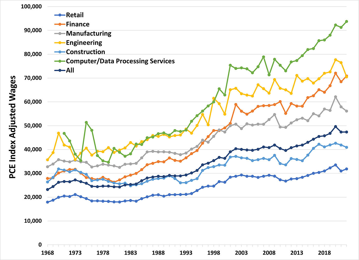
are lower than in computer sciences or engineering (see Figure 2), their
higher growth rate could help explain why many people would choose
finance jobs relative to other fields.
Figure 2: Annual Wages in the U.S. by Sector, 1968 to 2022, inflation adjusted with Personal Consumption Expenditures (PCE)
None of these facts are indicative of an
economic problem. If American Compass believes that people earning so
much more in the computer field harms Americans, they should say so.
Similarly, if American Compass believes that a 0.47 percentage point
difference in average income growth between the financial and
engineering sectors reveals businesses have been harmed, they should
state their hypothesis clearly and make an empirical case.
Surely, though, an organization such as American Compass, one that constantly complains about stagnant income,
would not begrudge Americans for choosing to work in a higher paying
field. (Figure 1 and Figure 2 also demonstrate that Americans’ income is
not stagnant. Real wage and salary growth has been positive across
almost all sectors and time periods, with cumulative growth of 71
percent even in the manufacturing sector. We’ll return to this issue in
a future post.)
Of course, even this compensation growth data tells us very little
about why the different rates of growth occurred in the various sectors.
However, one of the academic research papers Cass cites in his responsedoes provide an explanation for this difference. Specifically, we’re referring to the paper
by Thomas Philippon and Ariell Reshef, titled “Wages and Human Capital
in the U.S. Finance Industry: 1909–2006,” which was published in the
prestigious Quarterly Journal of Economics in 2012.
In that paper, the authors show that the labor market in finance was
artificially suppressed between 1940 and 1980 due to an over‐bearing
regulatory environment. In other words, overall wages and employment in
finance would have been much higher without the heavy regulation in that
sector. Consequently, the uptick in wages and employment after 1980 are
likely due to the finance labor market reverting back to its
non‐suppressed state (similar to pre‐1940) after the regulatory
environment changed (precisely what economics would predict). Here’s
a quote from page 1552:
We find a tight link between deregulation and the flow of
human capital in and out of the finance industry. In the wake of
Depression‐era regulations, highly skilled labor leaves the finance
industry and it flows back precisely when these regulations are removed
in the 1980s and 1990s. This link holds for finance as a whole, as well
as for sub‐sectors within finance. Our interpretation is that tight
regulation inhibits the creativity of skilled workers.
So, this paper does not support American Compass’s position that
anything bad has happened; instead, it argues that any employment
increase seen in finance is essentially a reversion to a state where
skilled workers’ creativity is no longer inhibited.
Another of the three papers
is a Kelley School of Business working paper from 2022 by Nandini Gupta
and Isaac Hacamo. This paper is an even stranger choice for American
Compass to cite as proof of some kind of harm caused by financialization
(or coin‐flip capitalism). It shows that the net effects of people
working in finance boost entrepreneurship. Here is the relevant language (from two separate paragraphs on page 4 of the paper):
Our results show that the finance wage premium increases
overall entrepreneurship. This may occur because engineer‐financiers
are more likely to become entrepreneurs. Or, because talented engineers
in finance facilitate entrepreneurship by others. We find that engineers
who take finance jobs are less likely to subsequently start firms.
Therefore, we study a potential peer effects mechanism where
engineer‐financiers may help their classmates become entrepreneurs.
…
We find the following results: First, we show that top engineers
exposed to a higher finance wage premium at graduation are more likely
to take jobs in entrepreneurial finance (EF) jobs in venture capital,
private equity, and investment banking. Second, we show that engineers
who don’t take finance jobs are more likely to become transformational
entrepreneurs the more classmates from the same
school‐major‐graduation year who are in venture capital, private
equity, and investment banking firms. For example, an engineer with
5 classmates in entrepreneurial finance jobs is 9% more likely to become
an entrepreneur and 18% more likely to create a transformational firm
that issues patents, employs workers, and has a successful exit,
relative to the mean.
At the very least, the paper’s results are consistent with the literature on peer‐effects
“whereby engineers in investment banking type jobs help their
classmates start transformational firms.” Obviously, it’s very odd to
cite this paper as evidence that financialization is some kind of blight
on capitalism. It implies the opposite: the overall labor market trend is good for the economy.
The third paper
is a 2022 working paper by Giovanni Marin and Francesco Vona, and the
evidence it provides does not show that finance is now claiming
a disproportionate share of STEM talent. For instance, the authors show
that the probability a STEM graduate starts working in finance rose
between 1980 and 2019, from 4 percent to 6.8 percent. However, they also
report a substantial increase for non‐STEM graduates – it rose from
6.5 percent in 1980 to 8.2 percent in 2019. (See page 9.)
The authors of this third paper also report (see pages 3 and 4) that they “observe a pronounced task reorientation towards math in finance and business occupations,
which is associated with a change in the types of education required in
these occupations.” (Emphasis added.) In other words, they observe
a change in education requirements for multiple occupations, one that
(especially in finance) is “more pronounced among experienced workers.”[2] Additionally, the paper
corroborates that the drift of STEM graduates to finance is simply
a result of people finding the best match of talent and innovation:
These empirical patterns are associated with profound
technological changes affecting the financial industry more than the
rest of the economy. Finance is an information‐intensive industry that
benefited from improvements in information and communication
technologies (ICT) more than other industries did. The STEM biasedness
in the demand of college graduates is consistent with the
complementarity between ICT technologies and STEM graduates.
Finally, Marin and Vona report (see graph B on page 10)
the share of hours worked by college graduates in the finance industry
for both STEM and non‐STEM graduates between 1980 and 2020. Both STEM
and non‐STEM groups display an increasing trend, and the share for
non‐STEM graduates remains roughly two percentage points higher
than for STEM graduates for the full period. Though not quite as
damning as the previous two papers, this one, too, fails to support the
idea that finance has started claiming a disproportionate share of
talent.
So, on balance, none of this evidence – especially not the papers
cited by American Compass – supports the idea that finance is
responsible for robbing the nation’s businesses of talent. Nor, as
American Compass argues in Confronting Coin‐Flip Capitalism,
does any of this evidence support that finance is robbing talent “from
the real economy” and “further discouraging productive investment.”
On page 102 of his book,
Cass supports the “tracking of less academically talented students
toward vocational training,” so he may have some optimal employment
arrangement in mind for the financial sector. Perhaps someone else at
American Compass has some idea what the optimal quantity of workers
should be in the financial sector, but the “Financialization” chapter
does not mention it.
In the next post, we will discuss claims involving financialization’s alleged effect on profits.
[1]
Figure 1 and Figure 2 report annual average growth rates and actual
amounts, respectively, for real annual pre‐tax wage and salary income,
by sector, from 1968 to 2022, using the IPUMS-CPS, University of
Minnesota, www.ipums.org.
[2]Figure VI (on p. 1571)
from Philippon and Reshef (2012) also confirms this finding. Finance
jobs dramatically increased in complexity while tasks in the rest of the
labor market became substantially less complex."
"Compared with 1972, American homes today are much more spacious and
modern. The proportion of homes today that have two or more rooms per
person is up 33.5%. The share of homes with two or more bathrooms has
more than doubled; central air-conditioning is more than three times as
common; and the share of homes that have dishwashers is up by more than
two-thirds. Most homes in 1972 had televisions, but only about half were
color sets. Today they are all color and most are flat screens in high
definition, attached to cable or satellites. The average home in 1972
had at least one phone, but none had cellphones or internet access.
Kitchens today are stocked with a far wider array of foods,
including out-of-season fruits brought from half a world away and a vast
variety of prepared foods. Compared with 1972, this abundance costs an
ever smaller portion of families’ budgets, freeing up some $3,200 on
average to spend on other things.
Cars last 81.3% longer and are 72.7% safer, and many have GPS
navigation and premium sound systems. No standard model lacks
air-conditioning or power steering. The share of the population with
college degrees is almost three times as high. Americans live 7.4 years
longer and their median age is almost 10 years older, yet the proportion
of people reporting poor health is 20.3% lower. Real median household
net worth is up 172.2%.
By virtually any definition of economic well-being, Americans
are substantially better off today than they were a half-century ago. So
how did we obtain this massive cornucopia of prosperity without a pay
raise since 1972?
Part of the problem is that the BLS’s measure of average hourly
earnings excludes employer-provided benefits, which now make up 30% of
compensation. Counting the value of worker benefits adds 5% to the
46-year increase in total compensation.
More significant, the official index used to adjust for
inflation—the Consumer Price Index for Urban Wage Earners and Clerical
Workers, or CPI-W—overstates actual inflation and understates real
compensation. Nominal average hourly earnings rose from $3.99 in October
1972 to $23.26 this March, a 483% increase, but CPI-W also rose 483%,
creating the reported stagnation in real average hourly earnings. While
the CPI-W accurately measures changes in price for a fixed market basket
of goods and services, it overestimates inflation because it fails to
account for the substitution effect—how people change their consumption
habits as relative prices change. Americans began to fly more often in
the 1970s when the cost of airfare fell relative to the cost of ground
transportation, for example, but the CPI-W missed this increase in
consumer value by neither raising the weight it assigned to spending on
air travel nor downgrading the weight for ground travel.
In contrast, the Commerce Department’s personal-consumption
expenditures price index updates the market basket of goods and services
monthly based on what people actually buy, allowing it to account
partially for the substitution effect. Since 2000 the Federal Reserve
has used this index to set monetary policy because it’s a more accurate
measure of inflation. In designing the 2017 tax reform, Congress indexed
the new income-tax brackets using a similar index to account for
product substitution. Using the PCE price index rather than the
conventional CPI-W to adjust compensation results in real hourly
compensation levels that are 27.7% higher today than they were in 1972."
"the extraordinary growth in new products that have brought new benefits
not captured in any government consumer price metric. The BLS does add
new products to its index when they become widely used, but it often
misses the initial price decline and understates the product’s impact on
consumer welfare, including displacement of other, older products."
"no government metric comes close to capturing the full value of technology"
"Economists Bruce Meyer and James Sullivan attempted to correct for
some of this problem in a 2013 study, integrating the findings of 52
different economic studies to develop a price index that adjusts more
completely for changes in quality and innovation, as well as
substitution. For example, using data from the American housing survey
to quantify size and quality, they determined that the CPI overstates
housing inflation by about 0.25% a year because it mistakes higher
payments for bigger and better homes for real price increases.
They also used hedonic regression, a method of calculating
implicit market prices for different features of an item, to demonstrate
that the CPI overstates the yearly rate of increase in prices for
personal electronic devices by as much as 5.8%. They corrected the CPI’s
overestimation of the yearly rise in health-care costs by pricing based
on treatment of a condition, as well as differences in outcomes such as
survival, recovery and function."
"they provide convincing evidence that at a minimum, real compensation,
in terms of the value of what we can actually buy, hasn’t stagnated
since 1972, but instead has grown by at least 69.5%."
"Want to better understand the mess Greece is in? In 2006 it took an
average of 151 days to enforce a contract in the Hellenic Republic.
Today it takes 1,580. Want to measure Israel’s progress? A decade ago,
starting a business in the startup nation took about 34 days. Now it
takes 12.
What about the United States? When President Obama
took office in 2009, the U.S. ranked third in the overall index, just
behind Singapore and New Zealand. It has since fallen to eighth place.
Eight years ago, 40 days were needed to get a construction permit. Now
it’s 81. When President Bush left office, it took 300 days to enforce a
contract. Today: 420. As for registering property, the cost has nearly
quintupled since 2009, to 2.4% of property value from 0.5%."
"There’s nothing “secular” about our low rate of growth, goes the
argument: It’s just the result of the never-ending accretion of ever
more costly and time-consuming regulations, all of which could, in
theory, be overturned at a stroke. These regulations go largely
unnoticed by coastal elites because we’re mostly in the business of
producing and manipulating words—as politicians, lawyers, bureaucrats,
academics, consultants, pundits and so on."
"In recent months I’ve tried to get a better sense of the things-making
world by asking executives in different industries to share their sense
of what it’s like to do business in America today. They talk about
Sarbanes-Oxley—its punishing auditing requirements. Or Dodd-Frank—the
Compliance Blob it has created within banks. Or the Affordable Care
Act—the employer mandate, the increased age of dependent “children,” the
obscure little taxes for things like the “Patient Centered Outcomes
Research Institute.”"
"Did you know that a company that is a contractor or subcontractor with
the government must, according to recent Labor Department regulations,
establish a goal of having 7% of its workforce be disabled?"
"Did you know that the Occupational Safety and Health Administration
recently banned blanket policies on post-accident drug testing because
they may be discriminatory?"
"Did you know that a driver who makes a delivery within Seattle’s city
limits must earn a minimum of $15 an hour, irrespective of whether his
company has a branch in the city?"
"A new study
from the Federal Reserve Bank of San Francisco suggests just that. It
concludes that widely cited figures showing stagnation are mostly a
statistical fluke. Workers continuously employed in full-time jobs
received wage increases higher than inflation from 2002 to 2015. Last
year, the gain was a 3.5 percent increase after inflation, up from 1.2
percent in 2010.
Typically, the median wage — the wage exactly in
the middle of all wages — is cited as evidence of stagnation. Indeed,
the Fed study confirms this. Median wage increases have fluctuated
around 2 percent, unadjusted for inflation. But the median wage is
misleading, the report argues, because it’s heavily driven by
demographic changes: an influx of young and part-time workers whose
relatively low wages drag down the median; and the retirement of
baby-boom workers whose relatively higher pay no longer lifts up the
median.
“Exiting workers with higher wage levels are [being]
replaced by entrants to full-time employment who earn less than the
median wage,” says the study, which was done by economists Mary Daly and
Benjamin Pyle of the San Francisco Fed and Bart Hobijn of Arizona State
University. The result is that all workers, as judged by the median
wage, seem to be treading water when many workers are actually receiving
modest increases."
"One of the most frequently reported economic trends is the gradual
decline in US real median household income from its 1999 peak of about
$57,843 (in 2014 dollars) to below $54,000 in each of the last five
years (see dark blue line in top chart above). We hear a number of
reasons from politicians and pundits for the decline in median household
income over the last 15 years, mostly reasons that involve a narrative
about economic stagnation and growing inequality caused by the
progressives’ usual suspects: most of the gains in worker productivity,
income, and wealth going to corporations and “the rich” instead of being
shared by average workers; failure to increase the minimum wage or pass
“living wage” laws; the combined effects of globalization, free trade
and outsourcing putting downward pressure on middle-class incomes in
America; excessive CEO pay; Wall Street greed and fraud, and other
narratives of economic malaise and pessimism.
About a year ago, I featured several posts on CD (here and here)
about how demographic changes over time in the composition of US
households might help explain the stagnation and decline in US median
household income starting around 1999. Those posts were inspired by Alex
Pollock’s excellent essay “If income is going up, can median household income go down? It’s possible” where Alex explained how the changing
composition of US households could result in declining median real
household income even if all Americans’ real incomes are rising.
That is, the decline in median household income might not be caused by
decline in real income for the average American worker, but rather by
changes in the composition of the average US household.
More specifically, the demographic changes that Alex and I analyzed include: a) the
declining share of households with two or more earners starting around
1999 (see top chart), b) the increasing share of no earner households
starting around 1999 (see top chart), c) the increasing number of
retirees in the US as a share of the US adult population starting around
2007 (see middle chart above), and d) the decline starting around 2000
in average weekly hours of work per US household (see bottom
chart above). Actually, those demographic trends could all be related
since the increasing number and share of US retirees would obviously
result in: a) an increase in the share of households with no earners,
and b) a decrease in the average number of work hours per US household.
Now that Census and Social Security data are available for another year —
2014 — (data in my previous posts were through 2013), I thought it
would be a good time to update the charts and update the analysis on how
the changing US household demographics and retirement trends
can help explain the 7.2% decline in median household income from the
peak of $57,843 in 1999 to $53,657 in 2014. Here’s the update:
1. Households with No Earners and Two or More Earners. One example of a major dynamic change in household composition is the significant increase in the share of US households with no earners, from fewer than 20% of all US households in 1980 to 24% of households in 2014 (see light blue line in top chart above, Census data here from Table H-12). At the same, there’s been a significant decrease in the share of US households with 2 or more earners
from above 45% of all households in 1999 (when median household income
peaked) to fewer than 40% of US households in each of the last five most
recent years starting in 2010 (see brown line in top chart above). Technical Note:
In a linear regression model, those two variables (no earner and two
earner household shares) explain 90% of the decline in median household
since 1999.
In summary, over the last several
decades, there’s been an increasing share of no-earner households and a
decreasing share of married and two-or-more-earner households. That
major demographic shift in household composition would naturally depress
median household income over the last 15 years, even though it’s
possible, as Pollock showed in his essay, that the income of individual
working Americans could have been the same or rising since 1999.
2. Increasing Number and Share of US Retirees. Another key demographic shift is the increasing number of retired Americans as a share of the adult population based on Social Security data.
As the light blue line in the middle chart above shows, US retirees
represented a pretty stable 15% share of the adult US population from
1990 to 2007. Then, starting around 2008 when the early “baby-boomers” –
those born in 1946 — reached early retirement age of 62, the share of
retirees started increasing from less than 15% of the adult population
in 2007 to nearly 17% in 2014.
In the six-year period between 2008
and 2014, the number of retired Americans increased by 7.4 million,
which was the largest six-year increase in US history, and more than
triple the 2.4 million increase in the previous six-year period. Given
that wave of recent retirements, there have been millions of older,
experienced, highly paid workers going from their peak earning levels to
a much lower retirement income that would typically include Social
Security payments, pensions, and distributions from retirement accounts.
As those millions of retirees are replaced in the workforce by younger,
less experienced, lower paid workers, median household income would naturally be falling even though the average and median incomes of working Americans could be rising.
It’s
probably no coincidence that the recent increase in retirees, both in
absolute numbers and as a share of the adult population, along with the
other demographic changes in households described above, has naturally
coincided with a decline in median household income. It would be hard to
imagine that an aging population with a significant increase in the
number and share of retirees, wouldn’t depress median household income,
for purely demographic reasons.
3. Decline in Average Number of Hours Worked per Household. In a December 2014 Real Clear Markets op-ed (“The Obvious Reason for the Decline In Median Income”),
economist Jeffrey Dorfman points out another very important demographic
change that has significantly contributed to the decline in real median
household income in the US over the last decade: the average number of hours worked per US household has been declining.
So we would naturally and logically expect median household incomes to
decrease when average household work hours are falling. Here’s the
opening of Jeffrey’s article:
Much has been made
recently of the fact that real median household income has been stagnant
over the past twenty years and falling for the past seven. While there
are many problems with using median household income as a measure of the
economic health of the middle class, it is still important to examine
what is causing this middle-income stall. A major, and overlooked, part
of the answer appears to be quite simple: Americans are working less. When people and families work fewer hours, they earn less money.
Following a procedure outlined by Dorfman in his RCM
article but using a slightly different dataset, the bottom chart above
shows the relationship over time between annual US median real household
income and the average weekly work hours per US household in each year
from 1980 to 2014. To calculate the average work hours per household, I
used: a) the BLS series “Average Weekly Hours at Work in All Industries”
(from Table 22 in this BLS report), b) the BLS series “Civilian Employment” for the number of employed Americans, and c) the number of US households in each year from the US Census.
Using the average weekly work hours and the number of Americans
employed, the total number of hours worked annually were calculated and
divided by the number of US households in each year to determine the
average number of weekly work hours per household in each year from 1980
to 2014, and those values are represented by the light blue line in the
bottom chart above.
As can be seen in the top chart, the 7.2% decline in real US median household income (in 2014 dollars) between the 1999 peak ($57,843) and 2014 ($53,657) was accompanied by an even greater 8.8% decline in average hours worked per household, suggesting a very close statistical relationship between those two variables. In fact, a linear regression model reveals that more
than 90% of the decline in median household income between 1999 and
2014 can be explained by the decline in average household work hours, so there is a very strong statistical relationship between median household income and average household hours worked, as expected.
Bottom Line: It’s
an important point that most of the discussions and hand-wringing about
declining US median household incomes completely ignore the demographic
realities that the composition of American households is not static. US
households in 2014 are significantly different from US households in
1999 in important ways (size, age, number of earners, hours
worked, marital status, etc.) that affect household income, so we can’t
accurately compare the $53,657 in median household income in 2014 to the
much higher peak of $57,843 in median household income in 1999 (both
median incomes are expressed in 2014 dollars). Specifically, the
composition of US households is changing over time due to the natural
consequences of an aging population and an increasing share of
households with retirees, along with more (fewer) single-earner
(multiple earner) households that reflects an ongoing trend of smaller
US households dating back to at least WWII – and those factors can’t be
ignored when discussing trends in US household income.
Most
explanations of the recent decline in US median household income are
based on some variation of a narrative of economic stagnation, rising
inequality and pessimism. But what is almost always overlooked are the
very significant demographic changes that have taken place in the
composition of US households over time that would significantly impact
the income of the median US household. Taken together, a) the increase
in the share of no-earner, single-earner, single-parent households, b)
the increase in the number and share of retirees, along with c) the
decline in the share of two-earner-or-more and married households, would
all logically and necessarily depress the income level of the median US
household over the last 10 years.
In conclusion,
the composition of US households is not static, fixed and permanent;
rather it’s dynamic, evolving and ever-changing. Discussions on changes
in median household income over time that ignore the changes in
household composition over time will always be incomplete, distorted and
misleading. Perhaps the decline in median household income this century
is not a narrative of economic pessimism and stagnation after all, but a
more upbeat story of a greater number of Americans living longer lives,
and enjoying periods of time in retirement that were never possible
until this century.
Update: The chart below is
provided in response to comments below the post from Sprewell and
Marque2, and shows that during the 1999 to 2014 period when real US
median household income decreased by -7.2% real hourly earnings
increased by +7.5% and real compensation increased by +13.5%. Those data
support Alex Pollock’s original position that real incomes can be going up at the same time that real household incomes are declining, if the composition of US household is changing. To summarize what we know for sure:
1)
The size and composition of US households has been changing over time,
but especially starting in 1999 when median household income started to
decline, and in ways that would naturally lower median household income
even if average incomes were the same or rising: a) a decrease in the
number and share of US households with two or more earners and b) an
increase in the number and share of US households with no earners.
2)
During the period when real median household income fell by 7.2%
between 1999 and 2014, real wages increased by 7.5% and real
compensation increased by 13.5%.
That doesn’t necessarily mean
that the 1999-2014 wasn’t a period of economic stagnation for some
Americans, since the increases in real wages and real compensation only
apply to those Americans who were employed during that period. It’s
certainly a complicated analysis to determine exactly how much of
declining real median household income between 1999 and 2014 is because
of economic stagnation and how much is explained by the changing
composition of US households and the increasing number and share of
retired Americans. My main point is that the economic stagnation story
usually takes center stage in the hand-wringing about declining median
household income, while the equally, or maybe even more, important
changes in the household size and composition usually get overlooked.





"


 "
"