Monday, September 14, 2026

Does Bank Consolidation Harm Customers?

By Jeffrey Miron of Cato

"Antitrust policy presents a challenge for both libertarians and policymakers. On the one hand, competitive markets are good, which might suggest policy should limit firm mergers. On the other hand, mergers can have beneficial effects (such as economies of scale and scope, or disciplining unproductive firms), so broad opposition to mergers is likely counterproductive.

New research on bank consolidation offers evidence on this tradeoff. Contrary to the belief

that bank mergers reduce competition, increase borrowing costs, and limit households’ access to credit, … [the study finds that m]ergers have no meaningful effect on interest rates, approval rates, or late payments. Merged banks do not appear to use their increased size to charge borrowers more or restrict access to mortgages.

This may be due to

the intense competition in local mortgage markets. The typical county has more than 130 active mortgage lenders per quarter, and the median lender controls just 0.4 percent of its local market. Therefore, even when two banks merge, borrowers generally continue to have many other lending options. In some cases, local competition actually increases after mergers.

Whether these conclusions apply in markets with only a few firms, where mergers might substantially increase market concentration, is harder to know. But this evidence should still remind antitrust and banking regulators to consider the full range of effects from mergers, not just the impact on concentration per se."

By the Time Governments Are Regulating AI, They’re Regulating the Past

By Mark Jamison of AEI.

"AI is changing fast. And spreading fast. Both are problems for people seeking to regulate it.

Regulation works best when regulators understand what they are regulating. That is not the case for AI. Costs are collapsing, having dropped 1000-fold for large language models since 2023. At the same time, capabilities are expanding, business models are changing, and market leaders are turning over rapidly.

These dynamics create both opportunities and problems. Now almost anyone can use AI to manage their household or launch a business. But, as Bill Gates recently noted, they can also create deep fakes, launch phishing attacks, or break into internet sites, as happened to Hugging Face.

This also makes regulation hard: Rules written for the AI that regulators see today will no longer exist by the time the rules take effect.

Nevertheless, many people want regulations that would control AI. The EU has embraced what it calls comprehensive AI regulation, in which regulators judge the relative riskiness of AI applications and systems and then apply controls ranging from outright prohibitions to light-touch oversight. Some people are calling for mandated surveillance of AI users, restrictions on model capabilities, product standards, and computer code review. Gates recommends an international organization layered on top of national all-of-government regulators to oversee all AI risks people imagine. All of these approaches assume overseers who would control innovation.

While it is true that whenever a technology’s costs fall and its abilities grow, people use it more. Sometimes for evil. When Henry Ford put cars within reach of every family, some families created new businesses, but others became bank robbers. When internet service providers spread access across the country, e-commerce exploded, but so did criminal activity on the dark web. In these instances, successful regulatory responses were not to limit cars or the internet, but to use the technologies for regulatory purposes.

The examples of automobiles and the internet illustrate a path forward for AI policy: Let the technology evolve for the good it can do. At the same time, officials and entrepreneurs can protect citizens by developing their own innovations based on a deep understanding of the technologies and their markets.

Recent research published in the Journal of Economic Perspectives provides insights into AI and its markets. The researchers examined the AI most people use, LLMs. LLMs are growing in complexity, now operating in three layers: The Model Layer, where creators such as OpenAI and Meta design and train LLMs; the Inference Layer, where AI providers like OpenAI and Together AI host and run models to respond to user requests; and the Application Layer, where a large ecosystem of startups and established firms embed LLM capabilities into user-facing applications for accounting, legal, retail, and other services.

Activity in each layer has exploded in multiple directions. The Model Layer grew from 1 model in early 2023 to 668 by the end of 2025. There are curious dynamics in this layer. Open-weight models—which allow users to customize systems for specific tasks—charge users 90% less than do closed weight models. Open-weight providers effectively give away their models after spending billions in development and training. Despite what looks like bad economics, there are over twice as many open-weight models as closed-weight models, 449 versus 219.

Customers in the Model Layer also make choices that appear counter intuitive. Even though open-weight providers charge 90% less than do their closed weight counterparts, customers use closed-weight models more than twice as often.

The complexity doesn’t stop there. At the Inference layer, the number of providers grew from 30 to 90 in 2025. These providers largely host open-weight models and their non-price capabilities vary. Closed-weight model creators are more likely to have vertical relationships at this layer.

The growth and interplay of these two layers illustrate why controls can be counterproductive. They limit innovators’ abilities to experiment, meaning that there would be fewer models in both levels. Fewer models at this stage of development means fewer opportunities for customers to express their preferences. And it is unclear whether the two layers will remain separate.

Model diversity is growing in several ways. Measured by the Artificial Analysis Intelligence Index, 80% of the models fell between 0.1 and 0.29 on the scale at the beginning of 2025. By the end of the year, they fell between 0.22 and 0.61, an increase in spread of over 100%.

Market leadership changes often. In the Application Layer, the market leader for science-oriented models changed eight times in 2025, while the market leader for legal services changed five times.

What does this mean for regulators? The innovators, investors, and customers driving AI are creating tremendous value, estimated to be approaching $1 trillion. Regulatory controls handicap legitimate AI providers and create market opportunities for those less inclined to follow the rules.

The lesson isn’t that government has no role in AI’s evolution. It is that seeking to control AI is counterproductive. AI policy should let the government be a leading AI user without limiting legitimate users of AI. This is more like what good governance has always done: punish harmful conduct and protect citizens by adapting its own capabilities as the world changes."

Sunday, September 13, 2026

Mark Cuban and Healthcare Competition

Market competition accomplishes what decades of regulation haven't

By Ryanne Swanson & Raymond J. March of The Independent Institute

"Payton Herres successfully underwent heart transplantation surgery as a preteen. A year later, she began taking everolimus—a vital medication used to prevent her body from rejecting the transplant. Her insurance provider soon after denied coverage, leaving her with an indispensable but largely unaffordable prescription.  

Herres’ situation was alarming, but not uncommon. About 30% of Americans find themselves with uncovered treatment despite having health insurance. Unfortunately, medications for rare and/or chronic conditions, in some cases, have no generic alternatives. Not covering expensive but seldom-utilized treatments is an easy way for health insurance providers to cut costs. Unfortunately, these decisions can leave unsuspecting and financially strapped policyholders with few options. 

This is when Mark Cuban stepped in.  

Mark Cuban Cost Plus Drugs, an online pharmacy, helps many people in these situations access affordable medications, even without health insurance. Once unaffordable, his pharmacy now supplies Herres with a 90-day supply for about $300. In comparison, she likely faced bills ranging from $400 to $13,000 per month elsewhere.  

Cuban’s efforts are laudable, and in this case, probably lifesaving. And thankfully for many other patients, other efforts have been just as successful.  

Diabetic patients who need insulin can also face insurance gaps limiting access to life-prolonging medication. Like everolimus, insulin can be alarmingly expensive without coverage. Yet despite political promises and actions to make insulin more affordable, competition has quietly delivered for decades. Perhaps the most recognized example is ReliOn, which is available for about $25 a vial at Walmart pharmacies across the country. In some states, ReliOn is available over the counter.

During the nearly two-year GLP-1 shortage, many patients hoping to treat severe and complex forms of obesity were left without regular access to Ozempic, Mounjaro, and other injectable weight loss treatment options. Fortunately, copycat pharmacies and telehealth providers worked to help patients access generic-like treatments, even as insurance coverage struggled to keep pace with challenging market conditions. In this case, online pharmacies were so effective that they forced brand-name GLP-1 treatments like Zepbound to half their prices during a national shortage. Prior to the copycat and telehealth competition, some patients found themselves facing $1,000 prescription drug costs.  

These and other examples highlight a vital- but often overlooked- lesson about competition. The US healthcare industry is extremely regulated, particularly pharmaceuticals. And despite literal decades of political promises to expand coverage and lower prices, we’ve yet to see reform provide solid and consistent examples of either. Conversely, a relatively small online pharmacy and other unexpected retailers were able to provide what a larger health insurance provider and a torrent of regulations did not or could not- affordable medication. 

Sometimes a small dose of the right treatment is all you need." 

The never-ending ferry tale: Why Washington shouldn’t subsidize ferries

By Steve Swedberg of CEI.

"The Trump administration recently announced $664.8 million in federal grants for ferry infrastructure, including $28.2 million for North Carolina’s Cherry Branch Ferry Terminal. That caught my attention because before joining CEI, I was a transportation fiscal analyst for the North Carolina General Assembly. I had firsthand exposure to the North Carolina Department of Transportation (NCDOT) and its Ferry Division, including touring its vessels and shipyards.

The timing of the grant is particularly curious. North Carolina is now undertaking a performance audit of the Ferry Division, with the State Auditor required to report its findings by January 15, 2027. So as Raleigh asks how to make its ferry system more sustainable, Washington is sending North Carolina $28 million. That raises a more fundamental question: why is Washington paying for ferries?

North Carolina has spent years wrestling with the costs of its ferry system. Several routes historically carried passengers and vehicles without charging fares, while NCDOT reported insufficient funding for capital needs, including millions of dollars in unfunded vessel replacements. A 2017 General Assembly evaluation found opportunities to increase fare collections and reduce costs by adjusting fares and cutting low-demand crossings.

Meanwhile, the state’s ferry fleet has grown older and more expensive to maintain. Many vessels date to the 1980s and 1990s, and the Ferry Division has struggled to keep pace with maintenance needs. Its shipyards lack sufficient capacity to handle all necessary work, which has required NCDOT to turn to outside contractors for some repairs, at taxpayers’ expense.

After decades of subsidized ferry service, North Carolina is finally asking users to pay more. A 2026 law requires NCDOT to begin collecting tolls on all ferry routes by January 1, 2027, although the toll rates have not yet been finalized. That may be a step toward fiscal responsibility, but it comes after the state has accumulated substantial maintenance and replacement needs.

North Carolina isn’t the only state or recent grant recipient in this same boat. Alaska’s Marine Highway System acknowledges that fares alone don’t cover operating costs. Washington State Ferries recovered less than half of its operating costs from fares in 2024. Maine requires state support for half of its ferry operating costs and funds the system’s capital expenses, while Virginia’s Jamestown-Scotland Ferry charges users nothing.

These ferry systems operate under different circumstances and conditions. Yet in all cases, users do not pay the full cost to provide the service.

This is where economist and Nobel Prize winner Ronald Coase’s famous analysis of lighthouses provides enlightenment. The lighthouse was once the textbook example of a service that government supposedly had to provide because charging individual beneficiaries was difficult — the very definition of a public good. Coase challenged that conventional wisdom by showing that privately operated lighthouses existed and that ships could be conveniently charged for their use.

A ferry has an even more straightforward financing mechanism because its beneficiaries are readily identifiable, and passengers and vehicles can be charged directly. If a ferry provides enough value to justify its cost, its users should bear much more of that expense. This “user-pays” principle applies to transportation generally — even the gas tax is a user fee for road use.

And if policymakers believe a route is worth providing despite its inability to cover its costs, they should have to justify that decision to the taxpayers who fund it. There is no reason to make taxpayers in Ohio or Idaho finance a ferry in North Carolina.

The problem gets worse when the administrative state joins the financing equation. The Federal Transit Administration can cover up to 80 percent of eligible ferry capital costs, including vessels, terminals and related infrastructure. When Washington pays most of the capital bill, state policymakers have less reason to ask whether the people benefiting from that investment are willing to finance it.

Without that subsidy, policymakers would face harder questions: Is the route worth operating? How often should it run? What should users pay? How much should taxpayers subsidize? Is there a better way to provide the service? Federal subsidies make it easier for states to avoid answering those questions because someone else is footing most of the bill.

Ferry service may be important to the communities that use it, but that does not make it a federal responsibility. Federal subsidies shift the costs of state and local ferry service onto taxpayers who may never use it. Washington should stop turning local transportation choices into national obligations. Otherwise, the question, “Who pays the ferryman?” will have a simple answer: the taxpayer."

Saturday, September 12, 2026

Hit the Brakes Hard on Trusting Government

From Don Boudreaux.

"Here’s a letter to the Wall Street Journal.

Editor:

Peggy Noonan is so frightened of AI that she not only calls on investors to stop funding it, but on government to “hit the brakes hard” on this technology (“Pause AI for Humanity’s Sake,” September 11).

Ms. Noonan imagines AI unleashing a terrible dystopia. Yet what we imagine should be informed by the past. Ms. Noonan’s imagination isn’t. Were she to consult the past, she’d encounter a few realities beyond the obvious one that countless technologies that we today celebrate were, when introduced, reproached as imperiling humanity.

One such reality is that when insiders stir up alarm about their own industries, they’re often angling for regulation that shelters them from competition. As classic case involves AT&T: it warned that telephony would collapse into chaos unless regulated as a natural monopoly. Established bankers played the same game during the Depression, warning that, without government-imposed interest-rate ceilings, ruinous competition for deposits would breed financial crises. In each case the peril lay less in the absence of regulation than in the ‘cures’ – a fact that points to a second and more fundamental reality: a far greater danger than new technology to humanity is government authority to regulate technology.

History gives us every reason to distrust government with the awesome power to determine just how new technologies will develop, and how and when we should be permitted to uses these technologies. In short, history teaches that the wealthiest and safest societies are ones in which innovation is, as Adam Thierer calls it, “permissionless.” If we’re to hit the brakes hard, it should be on the ages-old, fear-fueled impulse to put control of economic forces and technological advances into the hands of politicians and bureaucrats."

Friday, September 11, 2026

Why Congress Shouldn’t Change SNAP’s New Payment Error Approach

By Angela Rachidi of AEI.

"Payment errors in the Supplemental Nutrition Assistance Program (SNAP, formerly food stamps) have received considerable attention in recent months. While much of the debate has revolved around the One Big Beautiful Bill Act’s (OBBBA) new requirements surrounding SNAP payment errors and the impact on states, many have overlooked the people most affected by improper payments—low-income households.

The national SNAP payment error has hovered around 10 percent in recent years, accounting for almost $10 billion in erroneous SNAP benefits yearly. Some of this is fraud, but much of it involves correctable mistakes by participants or government eligibility workers. Thanks to the OBBBA, states are now financially incentivized to lower their payment error rates because states are required to fund a portion of SNAP benefits if they climb above a payment error rate threshold.

Facing the prospect of substantial financial penalties if they do not lower their error rates, states have begun to tighten their eligibility process. As Congress works toward reauthorizing SNAP through a new farm bill, it must resist calls to weaken this cost-sharing requirement or otherwise alter SNAP’s payment error formula.

The OBBBA requires states to contribute a share of total SNAP benefits issued in their state starting in fiscal year (FY) 2028, unless their SNAP payment error rates fall below a 6 percent threshold or they are otherwise exempt. Only 10 of the 53 states or territories met this threshold in FY2025. If a similar trend holds for FY2026, states will be required to pay up to $11 billion collectively in annual SNAP benefit costs in future years. This stands in stark contrast to the period preceding the OBBBA, in which the federal government covered benefit costs entirely, leaving states to face little to no penalty for high payment error rates.

Given this blunt reality, some have called for delaying the payment error cost share or ending it entirely. Some have even suggested that states will discontinue SNAP if the payment error cost share is not delayed. Other arguments have pointed to a lack of symmetry in the payment error calculation itself, which penalizes underpayments. These arguments may fall on sympathetic ears, with Senate Republicans proposing to delay OBBBA’s payment error requirements in an attempt to pass a farm bill. However, these arguments overlook the negative effects that SNAP payment errors have on low-income families. The best approach is to leave the SNAP payment error formula as it is and fully implement the payment error cost-share requirement as OBBBA intended in FY2026.

Delaying or eliminating the cost-sharing requirement accepts the current high level of SNAP payment errors. While it is true that the vast majority of SNAP payment errors are overpayments rather than underpayments, SNAP households are still negatively affected by overpayments. For example, federal regulations require that state agencies establish a claim against households that receive an overpayment, in an attempt to collect on those claims. Once overpayments are discovered, recouping them can happen by reducing the amount of future SNAP benefits, which can put a strain on a household’s budget or potentially discourage them from participating altogether.

Although research suggests that less than 20 percent of overpayments are eventually recovered, this process can disrupt assistance, requiring recipients to submit additional paperwork or lose eligibility. Avoiding overpayments will ensure that families consistently receive the resources that they need to meet their food needs.

Furthermore, while changing the payment error formula could create symmetry in the treatment of overpayments and underpayments, the consequences of underpayments are immediate and directly harmful to low-income households. This is likely why overpayments will always be more common than underpayments. State workers may be particularly sensitive to underpayments due to the immediate consequences they can have for recipients—an important consideration for treating underpayments differently than overpayments. However, state workers also need strong incentives to avoid overpayments. Requiring a state financial contribution when payment errors exceed a certain threshold will save the federal government money, but it will more importantly avoid disrupting SNAP benefits for participating households.

The Agriculture Improvement Act of 2018 has been operating on a one-year extension since FY2023, making Congress overdue to pass a new farm bill. The farm bill not only sets agriculture policy for the country but also authorizes SNAP, including the treatment of payment errors. The House of Representatives passed a new farm bill in April 2026 that maintained OBBBA’s payment error approach, but the Senate failed to pass a companion bill even after agreeing to delay the payment error cost share. The Senate’s failure offers a good opportunity to leave OBBBA’s payment error approach as intended."

Growth through innovation bursts: Why industrial policy should not bet on size

By Giuseppe Berlingieri, Maarten De Ridder, Danial Lashkari and Davide Rigo. Excerpts:

"Industrial policy is back on the agenda across advanced economies, with a growing channelling support towards large incumbent firms on the premise that they are the most capable innovators. This column uses data on French manufacturing firms to argue that this premise deserves scrutiny. Firms become large primarily through occasional, large 'innovation bursts' rather than by innovating at persistently higher rates. The arrival of these bursts involves an element of chance, so a firm's current size says little about how much it will innovate in the future. Policies that entrench the position of incumbents may therefore slow down the churn that sustains aggregate growth."

"This column is not an evaluation of any specific industrial policy programme, and our discussion has abstracted from any strategic and security motives behind much of the current debate. Our results also do not imply that scale is never efficient: some technologies – notably intangible-intensive ones with high fixed and low marginal costs – feature genuine returns to scale and ignoring this would be costly (De Ridder 2019, 2024, Lashkari et al. 2024). Our findings do suggest that policymakers therefore face a trade-off between accommodating such scale effects, and entrenching incumbents whose size reflects the luck of past innovation bursts. An industrial policy that shields incumbents from that displacement risks slowing the growth it aims to promote." 

Thursday, September 10, 2026

Decades Of Ice-Related Climate Misinformation Drove False Claim That Glacier Collapse, Rather Than Bedrock, Caused Nepal Disaster

Egg on their faces, activist scientists and journalists are now blaming “melting permafrost,” but there’s no evidence for that either

By Michael Shellenberger

"Anthropogenic climate change caused a glacier to melt, triggering the flooding in Nepal, said scientists and journalists immediately following the disaster. “Climate change is heating up the Himalayas and supercharging the risk of disasters like the deadly flash flooding in Nepal and Tibet,” the New York Times reported on August 27 under the headline “Climate Change Raises Risk of Disasters Like Nepal Floods.” Explained the Times, “As humans warm the planet by burning fossil fuels, the Himalayas are losing their permafrost” and “the thawing permafrost is destabilizing the foundation underneath glaciers, raising the risks of precisely these kinds of landslides and glacial collapses.” It quoted Ashim Sattar of the Indian Institute of Technology Bhubaneswar: “There’s a very straight link between climate change and these types of disasters.” Alton Byers of the University of Colorado told the Times, “Permafrost has been the cryospheric glue that’s held the rock and the ice and the glaciers together for millennia, and now we’re getting increasing evidence that it’s being weakened by warming trends.” Three days later the Times told readers that “one thing seems certain: The risk of such events is increasing.”

But new satellite imagery reveals that the bedrock beneath the glacier collapsed, bringing the glacier down on top of it. “You have this big bedrock failure that took part of the glacier with it,” said geomorphologist Dan Shugar. His colleague Kristen Cook described it as “a collapse of a large piece of bedrock that was sitting below the glacier. The ground underneath the glacier collapsed and took the glacier with it.” Another glaciologist, Jakob Steiner, agreed, explaining that “You basically had the lower part of a glacier tongue that sheared off because the rock below failed.” Cook told the New York Times that “The rock that the glacier was sitting on collapsed,” and yet the Times headline is “Landslide Along With Glacial Collapse Likely Set Off Nepal Flooding, Scientists Say,” which is misleading in that it was the landslide that brought down the glacier. “Essentially, a chunk of the mountainside collapsed,” Shugar told the Times."

Wednesday, September 9, 2026

Capital Is Not Taking Half of America’s Income, and Other Myths About the “Labor Share"

By Richard DiSalvo, Erica York.

"Economists and journalists have been pointing to a labor share of income series from the Bureau of Labor Statistics (BLS) as evidence that capital is taking an ever-increasing slice of the economic pie. By that series, labor’s share fell from nearly two-thirds in the 1950s to about half today, fueling headlines like “US workers’ share of national income falls to a new low.” 

But a closer look at the national income accounts shows a different story. Labor’s share is both higher and more stable than the BLS series suggests.

Capital Takes Between 17 and 24 Percent, Not Half, of Gross Income

Most recently (Q2, preliminary), the BLS series reports 53 percent of income accrues to labor, leaving 47 percent to nonlabor, which commentators call “capital” or “owner” income. But in that commentary, the definitions of income and the underlying assumptions BLS uses to split it often go unclarified. We untangle those assumptions below; but first, we build directly from the national accounts to show how total US income divides to capital and labor, then contrast that with the BLS series.

Gross domestic income totaled roughly $32.2 trillion at an annual rate in the second quarter of 2026. Of every dollar, 50.4 cents were paid to workers as compensation: 41.5 cents of wages and salaries plus 8.9 cents of benefits. This is unambiguously labor income. But it does not necessarily follow that all 49.6 cents of the “nonlabor” income accrue to capital.

The income unambiguously paid to capital includes corporate profits after corporate tax, interest, and rents, and this amounted to nearly 17 cents. About 3.6 cents of that is “imputed rent,” an estimate of what homeowners would pay to rent their own homes. Imputed rent is not actually cash that people collect and is not what people typically think of as “capital income.”  (The national accounts also include the “current surplus of government enterprises,” which operate at a loss, and thus account for a small, negative value, which we exclude.)

Another 6.7 cents were the income of proprietorships and partnerships, a mix of pay for the owners’ work and return on their investment. If this is entirely attributed to return on investment, capital would still only earn 24 cents per dollar of gross income—far less than half.

Gross Income Overstates What Households Actually Receive

The remaining categories of “income” deserve a closer look, because they aren’t income that accrues to anyone.

Depreciation takes nearly 17 cents of every dollar. This is the cost of replacing worn-out buildings, equipment, and software; each year, this spending returns the capital stock to where it started, and it never makes its way to a paycheck or a brokerage account.

Taxes are collected before income ever reaches a household: 7.0 cents in taxes on production and imports (TOPI, including sales and property taxes, federal excise taxes, and customs duties net of subsidies) plus 2.8 cents in corporate income taxes.

Using a gross measure to attribute non-labor income to capital counts these categories as accruing to capital even though they never show up as capital income. That creates a particularly odd position for many commentators when it comes to tariffs. Every dollar of tariff revenue mechanically raises the “nonlabor” share of income and is thus categorized as “capital income.” Analysts’ interpretations of tariff incidence vary, but no common interpretation considers tariff revenue to be capital income.


Labor’s Share of Net Income Is Within Historical Levels

Removing depreciation and taxes leaves net income. In the second quarter of 2026, that leaves roughly $23.7 trillion of private sector income that was actually paid out to people.

A leading literature survey on the labor share distinguishes between income that unambiguously belongs to labor (employee compensation), income that unambiguously belongs to capital (profits, interest, and rent), and the ambiguous remainder (proprietors’ income, after excluding taxes). Tracking these three categories as shares of net income since 1947 tells a clean story and changes the picture substantially from the headlines.


Unambiguous labor income has made a round trip: it was about 69 percent of net income in the late 1940s, rose to about 75 percent in the 1970s, and is 68.3 percent today. Labor share, in other words, is not at a “never before seen” level.

Unambiguous capital income has risen from about 13 percent of net income in the late 1940s to 22.6 percent today. More than half of that rise has come since 2000, when it stood at 17 percent, with the largest jump coming during the pandemic years of 2020 and 2021 (before the release of AI tools).

The ambiguous proprietors’ slice fell from about 18 percent of net income in the 1940s to about 10 percent by 1970, driven largely by the decline in farming. It fell to a low of around 6.7 percent in 1982, then recovered to roughly 9 percent to 10 percent, most recently measuring 9.1 percent.

The nature of proprietors’ income is ambiguous. Assign it entirely to labor, and capital’s share stays at 22.6 percent of net income, the “unambiguous capital share” in the nearby chart. Or assign it all to capital, and capital’s share rises to 31.7 percent of net income—this is the approach we take to reach the highest capital share we can infer. The truth is somewhere in between, but recent research suggests proprietor income is mostly labor, so even our 31.7 percent estimate—still far below half—is likely too high.

Because proprietor income has been a relatively stable share since the late 1980s, no fixed (time-invariant) allocation of it between labor and capital can drive recent trends, although an allocation that itself changes over time can. A time-varying allocation is one of several drivers of the BLS trend, which we discuss next.

Estimating Labor Share and Assumptions Behind the BLS Approach

A labor share estimate requires dividing income into two categories: labor and capital.

In the corporate sector, the split is easy: wages on one line, profits on another. Indeed, some economists restrict their analysis to the corporate sector for this reason. For noncorporate businesses, it must be estimated, since their income is a mix of labor and capital. Government, nonprofits, farms, and the imputed rent on owner-occupied housing are often excluded.

Every published labor share estimate must make assumptions about noncorporate actors, and these assumptions can move the level and trend.

The BLS measure uses an imputation strategy to split the noncorporate business sector into labor and capital income, producing a time-varying allocation. It only covers the nonfarm business sector, or about three-quarters of the economy. This contrasts with using the national accounts, which keeps all income under one fixed convention.

Let’s start with the BLS split of proprietor income. BLS assumes proprietors “pay themselves” the average hourly compensation of employees in the sector times their hours, and treats whatever is left as capital income. Because hours per worker move slowly, this is essentially a comparison of two averages:

The result has shifted enormously; we estimate BLS’s inferred capital share of proprietors’ income rose from less than a fifth in 1990 to about half today, in line with trends documented by Elsby, Hobijn, and Åžahin through 2012.

Then let’s look at the omissions. Government and nonprofits, roughly 15 percent of the economy, are excluded; including them, as BLS economists note, would increase BLS’s estimated labor share. Farms are also excluded; this matters little today but makes historical comparisons anachronistic, as farm proprietors’ income was 6 percent of the total in the late 1940s.  

Finally, the BLS ratio divides income-side compensation by product-side output, so the bookkeeping gap between GDP and GDI (the “statistical discrepancy”) can affect the trend. Our approach uses the income accounts throughout, so all components sum to total income by construction.

Correcting the Headlines

The description of the labor share as “unprecedented” or “record low,” the “close to 50-50 split,” and the commonly shared figure depicting a trend downward since the 1940s are all misleading. Labor earns about half of every dollar of gross income, but the remainder should not all be attributed to capital—much of what is counted in gross income does not accrue to anyone. A better measure uses net income, and the share of net income accruing to capital is between 22.6 percent and 31.7 percent, depending on how proprietors’ income is treated. The labor share is back to a historically precedented, not “never-before seen,” level. And the “downward trend throughout” needs to be replaced with “the labor share rose, then fell, over the postwar era.” It has made a round trip, rather than declining consistently from its starting level."

Tuesday, September 8, 2026

Welfare Digest | Welfare Reform's Success Holds Up 30 Years Later

Romina Boccia and Tyler Turman of Cato.

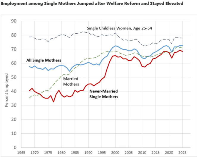
"Welfare Reform's Success Holds Up 30 Years Later. The positive effects of the 1996 welfare reforms on work and poverty still hold three decades later, argues AEI scholar Scott Winship. At a recent House Work & Welfare Subcommittee hearing, Chairman Darin LaHood (R-IL) noted that the law replaced “an open-ended 'no strings attached' cash entitlement” with a program that “included work requirements, time limits, enforced the principle of work in exchange for benefits, and capped federal funding for benefits.” In his testimony before the committee, Winship pointed out that child poverty fell by roughly half to more than three-quarters between 1996 to 2022. As Winship says, earnings among families with children since welfare reform have grown so large, that “if the entire safety net disappeared tomorrow, the child poverty rate would still be lower than in 1993.” Winship credits part of this to the employment gains after welfare reform, especially among single mothers, which rose so dramatically that they have “never returned to pre-[reform] levels. Even in the depths of the Great Recession, single mothers were more likely to be employed than they had ever been before 1995.” To read more about the impacts of welfare reform, including how states circumvented the law’s spending constraints by shifting beneficiaries off TANF and onto other, open-ended entitlements, read the statement we submitted for this hearing here." 


Monday, September 7, 2026

Labor's share of income

From Labor’s Share of GDP: Wrong Answers to a Wrong Question By Alan Reynolds

"Jason Furman and Peter Orszag found “the decline in the labor share of income is not due to an increase in the share of income going to productive capital—which has largely been stable—but instead is due to the increased share of income going to housing capital.” Depreciation and government, they noted, also gained an increased share (i.e., grew faster than labor income.)" 

Workers do not receive shares of GDP – they receive shares of personal or household income.  

Contrary to popular confusion, dividing employee compensation (wages and benefits) by GDP does not measure how a capitalist private economy (e.g., “superstar firms”) divides income between labor and capital. Most obviously, the government makes up a huge share of GDP, including nonmarket goods like defense and public schools. Nonprofits also account for a lot of GDP, with no obvious payout to labor or capital. Less obviously, depreciation makes up another huge share of GDP, including wear and tear on public highways and bridges as well as private equipment, homes, and buildings. The “imputed rent on owner-occupied homes” is another large piece of GDP. Asking if labor is getting a fair share of defense, depreciation and imputed rent is a truly foolish question. Net private factor income would be a better gauge than GDP, for the purpose at hand, but still flawed. The ratio of compensation to GDP uses the wrong numerator as well as an untenable denominator. Labor income must add the labor of self-employed proprietors.  

When people say “labor’s share is falling,” they surely mean income people receive from work has not kept up with income people (often the same people) receive from property: dividends, interest, and rent. But, that crude Piketty-Marx labor/capital dichotomy ignores another increasingly important source of personal income: namely, government transfer payments from taxpayers to those entitled to cash and in-kind benefits."

"labor’s share of household income is highest in deep recessions (77.5% in 1982, 76.2% in 2009) and lowest at cyclical peaks (70.6% in 2000, 68.3% in 2007). The higher labor share in recessions does not mean recessions are good for workers, of course, but that they are even worse for business and investors. Those who equate a higher labor share of income (e.g., during recessions) with higher real income for workers are making a basic and very large mistake." 

"labor’s somewhat smaller share of income is not because of any sustained rise of capital income or capital gains. It is because of a sustained rise in the share of income from transfer payments and a sustained fall in the labor force participation rate."

"Labor’s share of personal income fell mainly because the share devoted to government transfer payments rose. Labor’s share of GDP fell for other reasons (rising shares going to housing, government, and depreciation), but it is a fundamentally misconstrued statistic used to rationalize irresponsible remedies to an illusory problem of “monopolies.”"" 

From The Labor Share Fell. So What? by Alex Tabarrok.

"I have also plotted total compensation to labor (in real terms) in the graph above and far from shrinking it is higher than ever and growing. Moreover the right axis is logged so you can also see that outside of recessions the growth rate of labor compensation looks quite steady (similar slope over time). (Labor compensation per member of the labor force is noisier but looks similar)."

"In short, the data are consistent—not proof of, but consistent with—a story in which capital has become more productive, raising output. More productive capital also raises the demand for labor, so while more of the new output goes to capital in the first instance, the pie is growing and labor’s absolute compensation has grown with it."

Comment from Scott Sumner

"People often assume that if labor's share is falling then capital's share is rising. That is not always true, as GDI also includes depreciation and indirect business taxes, both of which have been rising as a share of GDI. So capital's share has risen by considerably less than labor's share has fallen.

Matt Rognlie showed that much of the rise in capital income has been the implicit rent on owner-occupied housing, which is not what most people think of when they hear "capital income". Another part of the rise is labor income being reclassified as capital income for tax purposes."

BLS Overstates Drop in Labor Share by David Henderson

"The underlying assumptions about "proprietor income" are biasing the labor share calculations. The calculation of labor share involve adding compensation received by employees to "proprietor income," which is the labor income received by those who run their own business. However, proprietor income is conceptually tough to measure, because someone who owns their own business can receive both "labor income," as if the person was an employee of their own business, and "capital income," as the owner of the business. In the real world, these two types of payments are jumbled together. To address this issue, the Bureau of Labor Statistics has assumed that the hourly labor compensation of proprietors is the same as that of employees. However, if the labor income of proprietors is actually rising over time, then this assumption means that the labor share is understated. One study finds that about one-third of the observed decline in labor share is due to this assumption that the hourly labor compensation of proprietors is the same as that of employees, rather than using an alternative method that tries to estimate the capital income of proprietors directly. (bold and italics in original)"

Labor’s share of income in the very long run is pretty stable by Scott Sumner.

"It seems silly to focus on gross domestic income, which includes depreciation and indirect taxes.  If we subtract them out we get the more conventional measure of national income, the way most people envision the concept.  And using that measure the labor’s share has been amazingly stable, rising from 68.0% in 1965 to 68.1% in 2015. Capital’s share fell from 32.0% to 31.9%.  No change in 50 years! Is that too good to be true?  Yes, for instance in 1990 labor’s share was 72.4%, so it’s just a coincidence. But it does suggest that labor’s share in the very long run is pretty stable."

Screen Shot 2015-09-10 at 5.38.54 PM

Sunday, September 6, 2026

Domestic Energy Shipments Are Breaking Records Under the Jones Act Waiver

By Colin Grabow of Cato.

"The Jones Act is a de facto tax on Americans trading with one another. By requiring domestic waterborne commerce to use vessels that cost far more to build and operate than their international counterparts, the law raises shipping costs. That’s a real burden given the significance of transportation in a country as vast as the United States and helps explain why relatively little freight moves by water.

Conversely, economic logic holds that lowering these costs will expand commerce, which is exactly what has happened since the Trump administration issued a Jones Act waiver for energy and fertilizer shipments in March. Freed from the law’s constraints, domestic fuel shipments have surged to unprecedented levels.

PADD 5 Receipts Nearly Set a Record in Five and a Half Months

One of the most dramatic examples of this increase has been to the West Coast, Alaska, and Hawaii, collectively known as PADD 5. According to a recent Energy Information Administration analysis, waterborne shipments of crude oil and petroleum products from the Gulf Coast to PADD 5 in April and May 2026 were more than four times their level in the same months of 2025. April’s volume was more than double the previous monthly record, and shipments remained elevated in May. 

That increase has been sustained. US Maritime Administration (MARAD) data show that in less than six months, waiver shipments have already exceeded the Jones Act fleet’s annual total in every year from 2000 through 2025, with one exception. Only 2024 remains narrowly ahead (by 2.2 percent), and it appears on the verge of being surpassed." 

  • Jet fuel: More jet fuel has been moved to PADD 5 under the waiver than in the preceding 35 years combined (1990–2025). 
  • Gasoline blend stock and alkylate: More gasoline blending components and alkylate have been moved into PADD 5 than the Jones Act fleet moved from 2010 through 2025 combined. 
  • Finished gasoline: The waiver has seen more finished gasoline moved to the West Coast than the Jones Act fleet has moved in the last eight years combined."
  • "East Coast-bound shipments topped 1.2 million barrels a day in April, which was the highest monthly figure on record and about 11 percent above anything seen pre-waiver."

    "In 2017, the CEO of Overseas Shipholding Group, a major Jones Act tanker operator, admitted to the Financial Times that the law was suppressing domestic oil flows: “If there was not a Jones Act, then there probably would be more movements of crude oil from Texas to Philadelphia.”" 

    Saturday, September 5, 2026

    The Milei Miracle, Part V

    By Dan Mitchell.

    "The world’s worst-performing economy for 100 years has – in a remarkably short period of time – become an amazing case study of economic liberalization.

    Thanks to President Javier Milei, Argentina is now enjoying an economic miracle.

    In Part V of this series (previous versions here, here, here, and here), we’re going to illustrate Milei’s accomplishments with a series of tweets.

    Today’s column will focus on bad things that are falling (a future column will highlight good things that are rising).

    We’ll start with falling poverty.

    Next we have falling debt.

    And falling deficits.

    By the way, all this progress occurred because of spending restraint. Milei is not making the mistake of higher taxes.

    Anyhow, with better fiscal policy, this understandably leads to falling country risk.

    Next, let’s look at falling bureaucracy.

    And we’ll close with falling inflation.

    Javier Milei is easily the world’s best leader.

    A steroid version of Reagan and Thatcher."

    Friday, September 4, 2026

    Median Family Income for Married Couples With Children Is Probably Higher Than You Think

    By Jeremy Horpedahl.

    "In 2024, median income for married couples with children at home was $143,400 in the US. That’s an almost 80 percent real (inflation-adjusted) increase since 1974, the first year Census reports comparable data. Is there some selection bias in who chooses to get married and have kids? Yes. Has there been an increase in dual-income families? Yes, but probably much less than you think (the median family of this type already had two earners by the late 1970s).

    With those caveats, this is still pretty impressive:"


    Thursday, September 3, 2026

    The Contribution of High-Skilled Immigrants to Innovation in the United States

    By Shai Bernstein, Rebecca Diamond, Abhisit Jiranaphawiboon, Timothy McQuade & Beatriz Pousada. In the American Economic Review.

    "Abstract

    We characterize the contribution of immigrants to US innovation. Leveraging new data, we use age of SSN assignment to identify immigrant status. Immigrants represent 16 percent of inventors, but authored 23 percent of patents. Immigrant inventors contribute to knowledge diffusion across borders. They disproportionately rely on foreign technologies and inventor collaborations. Using variation from premature inventor deaths, we find immigrant inventors create stronger innovation productivity spillovers on their collaborators, as compared to US-born inventors. A simple model implies immigrants are responsible for 32 percent of aggregate innovation, over half of which is due to human capital externalities on US-born collaborators."

    Wednesday, September 2, 2026

    Reflections on Americans’ Net Worth

    By Bryan Caplan. Excerpt:

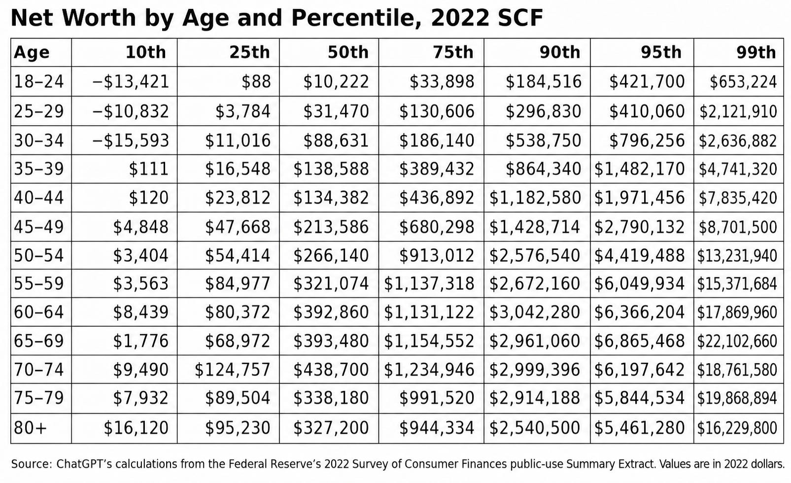
    "I’ve been an economics professor for almost 30 years, but I don’t think I’ve ever before seen anything like the table below. I knew that claims that “58% of Americans can’t afford a $1,000 car repair” were laughable clickbait. I knew that — measured by income — the middle class is disappearing… by becoming upper-middle class. But only recently did I start to fully appreciate the chasm between populist pessimism and actual data on Americans’ net worth. From the 2022 Survey of Consumer Finances: 


    "Main reflections:

    1. Economists have long known that inequality is relatively low for consumption, medium for income, and high for wealth. What they rarely emphasize, however, is how much wealth depends on age. The richest Americans aged 65-69 are worth about 30x as much as the richest Americans aged 18-24.

    2. Net worth is very high in absolute terms. The median is over six figures by the mid-30s. Americans at the 75th percentile are millionaires by their mid-50s. Americans at the 90th percentile are millionaires by around 40. Claims about middle-class, middle-aged Americans who “can’t afford” eggs or gas or beef are nonsense.

    3. The most sensible argument for worrying about trade deficits is that we’re “living beyond our means.” Trade deficits represent borrowing, and we can’t keep borrowing forever. But given Americans’ extraordinary net worth, the most sensible argument for worrying is still senseless. After 50 years of unbroken trade deficits, we’re wealthier than ever."


    Tuesday, September 1, 2026

    Despite government spending and regulations on green energy transitions, fossil fuels still accounted for 76.3% of Canada’s domestic energy consumption in 2024 compared to 76.8% in 1995

    By Kenneth P. Green, Julio Mejía and Elmira Aliakbari. They are all with the Fraser Institute.

    Energy Facts - Canada Edition

    • Despite continued discussion about energy system transitions, fossil fuels remain central to Canada’s energy system. In 2024, they accounted for nearly 88% of domestic energy production and more than 76% of energy consumption.
    • Pipelines remain essential for the country’s energy system. Over the past decade, pipeline safety has improved, with safety incidents falling by nearly 60% and the share of incidents involving product releases declining from 83.2% in 2014 to 20.6% in 2024.
    • Canada’s largest energy-consuming sectors remain heavily reliant on fossil fuels: in 2024, fossil fuels supplied nearly three-quarters of industrial energy use, and more than half of residential energy use, with natural gas remaining the dominant source, particularly for space heating. Meanwhile, fossil fuels accounted for almost 99% of the transportation sector’s energy consumption in 2024.
    • The energy sector is also a major economic contributor, representing 6.9% of Canada’s total economic activity. Its importance is even greater in some provinces: energy accounts for 30.1% of Alberta’s economy, 22.7% of Newfoundland & Labrador’s, and 21.5% of Saskatchewan’s.
    • Energy is one of the top 10 categories of average household spending. Over the past two decades, energy prices have risen faster than overall inflation and have been more volatile than many other household expenses, increasing pressure on family budgets.
    • Overall, fossil fuels remain essential to Canada’s standard of living, and ensuring reliable, affordable, and safe energy systems will remain a key priority in the years to come.

    Monday, August 31, 2026

    Most European Countries that Had Wealth Taxes Have Repealed Them

    By David R Henderson. Excerpts:

    "According to the OECD, 12 OECD countries had individual net wealth taxes in 1990, and all 12 were European countries. By 2017, only four OECD countries still had them" 

    "the likely reason is that they were losing some of their wealthiest residents to other countries that didn’t impose taxes on wealth." 

    AI and Employment: So Far, So Good

    By Alex Tabarrok.

    "In September 2023, the Census Bureau added questions about AI to its Business Trends and Outlook Survey. Census asked hundreds of thousands of businesses whether they had used AI in the previous two weeks to produce goods and services. At that time, 3.7% said yes; by late 2025 the figure had reached about 10%. (In November 2025 Census broadened the question to ask about AI use in any business function, producing a jump in measured adoption to about 18%.)

    Twice the Bureau has asked a key question:

    In the last six months, how did the use of Artificial Intelligence affect this business’s total employment?

    In Dec. 2023 to Feb 24, when ~5% of firms were using AI the answers were 2.8% increased, 2.6% decreased and 94.6% reported no change. Two years later, in the Nov 2025–Feb 2026 supplement, the answers were: 2.3% increased, 2.0% decreased, and 95.7% reported no change. The answers were similar by firm size.

    Some sectors reported more action. Information is the one sector where fewer than 92% report no change. But overall, almost all firms report no change and of those reporting change it’s about evenly divided between increasing and decreasing employment.


    The supplement also asked about tasks. Among firms using AI, 44% say it supplemented or enhanced work an employee already does. Ten percent say it performed a task an employee used to do. Eleven percent say it introduced a task no one had been doing.

    Among those using generative AI, 85% of firms cited writing or editing documents and email as the biggest uses, half cite searching for information, 45% summarizing documents, and 13% coding. Sixty-four percent of adopters say they changed nothing about the business in order to use AI, 15% trained existing staff, another 15% built new workflows, and just over one percent hired anyone with AI skills.

    Among firms where AI has taken over some employee tasks, the degree of substitution is growing. The share reporting that AI took over “a large number” of tasks rose from 2.4% to 7.1%, while the share reporting “a moderate number” rose from 13% to 22%. But this group is still small: only about a tenth of AI adopters, who themselves make up about a fifth of firms.

    I have reported firm-weighted estimates but employment-weighting gives essentially the same result. Thus, we have unusually direct evidence from a very large sample, and it says that the overwhelming majority of firms using AI do not yet report any effect on total employment. Very consistent with what Tyler and I said in our talk to OpenAI."


    Sunday, August 30, 2026

    Occupational Licensing Across Countries

    By Jeffrey Miron

    "The standard argument for occupational licensing is that it keeps out low-quality providers. Existing evidence, however, does not support this claim; moreover,

    licensing erects barriers that can restrict labor supply and worker mobility, with potentially far-reaching implications for wages, employment opportunities, and economic efficiency.

    Indeed, new research suggests that

    [c]ountries with higher licensing rates tend to have lower output per person, larger informal sectors, and lower scores on multiple dimensions of governance quality, including regulatory quality, rule of law, political stability, and control of corruption.

    Licensing is not only a problem in advanced economies. Instead,

    it appears to be a widespread labor market institution spanning countries with diverse legal systems, income levels, and regulatory traditions. […] Countries with lower income levels, weaker governance institutions, or larger informal sectors may adopt additional licensing requirements in an effort to improve quality, increase compliance, or formalize economic activity.

    The research concludes that

    [c]ountries with higher rates of occupational licensing tend to have lower output per person, larger informal sectors, and lower scores on multiple dimensions of governance quality."

    No, Marijuana Legalization Didn't Fill Emergency Rooms With Stoned Drivers

    By Aaron Brown. He teaches statistics at New York University and at the University of California at San Diego. Excerpts:

    "Last October, The Wall Street Journal published an editorial titled "More Marijuana Users Are Crash Dummies."

    "How much social and public-health damage will Americans suffer before doing a U-turn on marijuana promotion?" the editorial begins. "A new study finds that more than 40% of drivers who died in car accidents in one U.S. county over the last six years had elevated levels of the drug in their blood.

    The "new study" they cited is available only as an abstract and a short press release describing a conference presentation of an unpublished report, with no supporting details. After the Journal editorial appeared, we made several attempts to speak with the lead author, Wright State University professor of surgery Akpofure P. Ekeh, to obtain a copy of the draft study and answer some basic questions. We were unable to reach him. A public information officer at the American College of Surgeons, where Ekeh is a member, told us via email that the study "is a research-in-progress, meaning there is not yet a complete study that I am able to provide.""

    "The claim that 40 percent of deceased drivers had elevated levels of marijuana in their blood isn't trustworthy because THC testing is only ordered in some cases, presumably the ones when driver impairment is suspected." 

    "Drivers were likely tested because they were suspected of intoxication."

    "Also, testing the blood of autopsied drivers doesn't mean they were high while driving. THC in the blood generally indicates that someone has used marijuana in the previous few days. Postmortem THC tests are particularly unreliable."

    Another study from the Insurance Institute for Highway Safety did claim to show a difference between pre- and post-legalization of marijuana use by drivers by examining changes in accident rates in five Western states. It found that legalization was associated with a 2.3 percent increase in fatal crash rates.

    Here's how the authors presented the data.
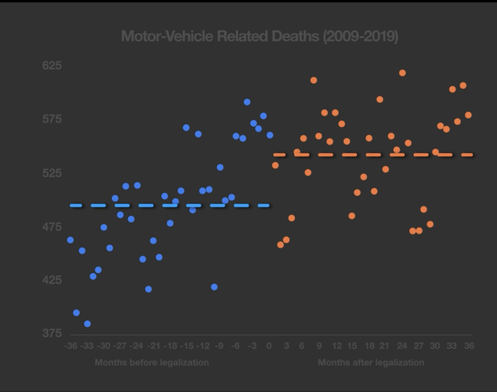
     

    The blue dots represent seasonally adjusted monthly motor-vehicle fatalities before legalization, the orange dots represent those after legalization, and the dashed lines show the averages before and after legalization.

    The three-year average traffic death rate in legalization states was 9.5 percent higher after legalization than before. The pattern was the same in the control states that did not legalize, but they had only a 6.5 percent increase. After some complex adjustments, the authors attributed a 2.3 percent increase to legalization. It looks like a big jump. But that's because the chart presented the data in a misleading way.

    I recharted the data and, unlike the authors, I made it into a time series, accounting for changes in the rate of traffic deaths during the study period. This way, you can see the trends, which undercut the authors' thesis.
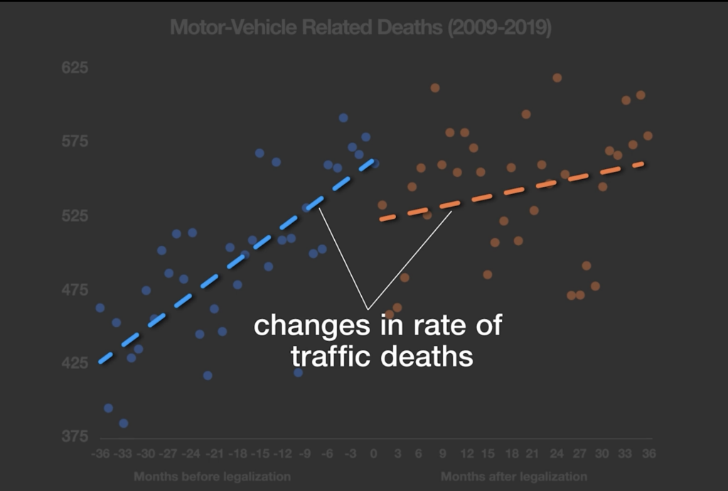
    The blue dots represent seasonally adjusted monthly motor-vehicle fatalities before legalization, the orange dots represent those after legalization, and the dashed lines show the averages before and after legalization.

    The three-year average traffic death rate in legalization states was 9.5 percent higher after legalization than before. The pattern was the same in the control states that did not legalize, but they had only a 6.5 percent increase. After some complex adjustments, the authors attributed a 2.3 percent increase to legalization. It looks like a big jump. But that's because the chart presented the data in a misleading way.

    I recharted the data and, unlike the authors, I made it into a time series, accounting for changes in the rate of traffic deaths during the study period. This way, you can see the trends, which undercut the authors' thesis.


    The press release also had no mention of a control, so we have no idea if the drivers' THC-positive rate is higher or lower than for the general population. Scientific studies require a control. It also looked at one county in Ohio, covering data before and after marijuana was legalized there in 2023, and there was no significant change in the ratio of drivers with THC in their blood.

    So the study, if it ever does appear, will have nothing to say on the impact of marijuana legalization on driving while high, and it won't present evidence that this practice is on the rise. That didn't stop The Wall Street Journal in its coverage of this yet-to-materialize study from claiming in its subhead that "high-on-pot drivers are contributing to more highway accident deaths."

    The most explosive finding about the dangers of legal weed comes from a study by a team of Canadian researchers, who looked at emergency room records in Ontario before and after legalization took effect in October 2018. As CNN summarized it, the study found that "documented marijuana-related traffic accidents that required treatment in an emergency room rose 475% between 2010 and 2021."

    Why is the 475 percent claim misleading? For starters, the news coverage didn't mention that we're talking about a very small number of people. During the period when marijuana was legalized and commercialized, 120,569 people showed up in Ontario emergency rooms due to traffic accidents. Just 125 people, or 0.1 percent of the total, "had documented cannabis involvement," according to the clinical judgment of the onsite medical team. Moreover, for every cannabis involvement patient, there were 18 with alcohol impairment. Of the people with cannabis involvement, 42 percent also had alcohol involvement. Cannabis alone does not seem to be the major intoxicant choice to impair driving. 

    The tally of 125 people over 20 months works out to about six people per month. Before legalization, there were two people per month showing up at emergency rooms with "cannabis involvement." That's a 200 percent increase, not a 475 percent increase. Why did the authors claim a 475 percent increase? 

    Marijuana legalization overlapped with the COVID-19 lockdowns. During the pandemic, people were driving much less, leading to a decline in total car accidents.

    The authors wanted to adjust for this unusual situation, so they assumed that if people had been driving normally, there would have been many more marijuana-related accidents. That assumption, along with a few other adjustments, led them to raise the 200 percent increase to 475 percent.

    This adjustment isn't valid. You can't compare COVID lockdown data with pre-COVID data because life was so abnormal. School closures in Ontario meant people were driving their kids to school less often, and many were working from home or were unemployed. Since most people who drive while high are less likely to do so while heading to work or taking their kids to school, you would expect an increase in the proportion of drivers on the road with marijuana in their system during the lockdowns, even if the absolute number stayed the same.

    Another problem is that the 125 people counted by the researchers weren't necessarily high while driving. Just because they were classified as cannabis users in the E.R. doesn't mean they were under the influence at the time of the accident, or that marijuana caused them to crash their cars.

    Some of those 125 people were passengers rather than drivers, which makes the inference that marijuana contributed to the crashes even more dubious. If someone who didn't use marijuana was giving a ride to a friend because he was too stoned to drive, and they still got into an accident, the passenger would have been counted as a patient with "documented cannabis involvement." That tells us nothing about whether marijuana legalization led to more traffic accidents.

    Another problem with the dataset is that many of the people were counted because they admitted to the doctor at the E.R. that they were marijuana users. Patients would have been more willing to admit to their drug habit after legalization than before, which further biased the data.

    by claims that legalization increases traffic accidents by 2.3 percent. Even if there were solid evidence for that claim, it's laughably inadequate to support a drug war."