"I have a series of columns (2021, 2024, 2025, and 2026). documenting that Americans are getting richer.
And here’s a chart that adds additional evidence. More and more households over time are high income (over $100k) and fewer and fewer are low income (under $35k).
And, yes, these numbers are adjusted for inflation.
The chart was included as part of an article by Max Borders for the Advocates of Self-Government.
He asked why people feel economically anxious even though incomes have increased.
The answer is that some important purchases have become relatively more expensive. And the reason, unsurprisingly, often involves bad government policy.
Here are some excerpts.
In 1967, only 16.5 percent of households earned the equivalent of $100,000 or more in today’s dollars. Today? Nearly 45 percent. The middle-income group really has shrunk—from 54 percent of households to 36 percent. …The disappearing middle class didn’t simply tumble into poverty. Millions of households graduated into higher real incomes, despite persistent inflation. And the percentage at the bottom fell, too. …We’re richer. Many of the things we buy have become dramatically better and cheaper.
But some of the things we cannot easily do without have become painfully expensive. …Start with housing. Why don’t developers just build more homes where people want them? Often because it’s illegal. Zoning restrictions and building codes are costly. Minimum lot sizes consume land. Parking requirements increase costs. Permitting adds delays. NIMBY opposition prevents construction. Then we all express shock that restricting the supply of something makes it more expensive. Or consider health care. Whatever else American health care is, it is not some laissez-faire free-for-all. It’s a labyrinth of government subsidies, third-party payments, occupational licensing, insurance regulation, patent protections, insurance mandates, in-state monopolies, and restrictions on competition. …And then there’s college. For decades, our solution to expensive higher education has been to give people more money with which to buy increasingly expensive higher education. This has created a tuition spiral: Loans. Grants. Subsidies.
The article includes another chart from Mark Perry.
It shows how prices for some items have increased much faster than inflation while others have declined. In some cases by large amounts.
And notice that prices seem to go up the most in the areas where government has a big footprint.
I’ll close with a few more passages from the article.
…not every red line on this chart is caused by government. But officials can make an intrinsically expensive problem considerably worse. …If your diagnosis is that “capitalism” has made ordinary life unaffordable, your solution will probably be more subsidies, more controls, and more regulation. But what if the diagnosis is backward? What if competitive markets are actually doing remarkably well in much of the economy—and our worst affordability crises are concentrated in sectors where competition, supply, and productivity are tightly regulated and unusually constrained? …we’ve constructed bottlenecks to accessing some of the most important things in life. Housing. Health care. Education. Childcare.
Amen. To make life more affordable, we need free enterprise, not subsidies, intervention, protectionism, and third-party payer.
Government is the problem, not the solution."
Saturday, October 10, 2026
America’s Affordability Problem Is Government


Friday, September 25, 2026
Family Income Continues to Grow in 2025 Data
"Yesterday the Census Bureau released their annual treasure trove of data from the Current Population Survey, Annual Social and Economic Supplement. Loads of new data are now available for 2025 on income, poverty, and health insurance coverage. This new data allows me to update one of my favorite charts, showing the distribution of family income in the U.S. since 1967. Census releases this data by grouping families into nine different income groups, which I have collapsed into three groups, each being as close to one-third of the total as I can get using the publicly available data.
Figure 1

See also a similar chart from Mark Perry which uses household income (rather than family income) over the same time period.
Figure 1 shows that, adjusted for inflation, the proportion of families with income over $150,000 has grown almost seven-fold since 1967. There has been a roughly constant one-third of the population between $75,000 and $150,000, and the ranks of those under $75,000 has been cut in half since 1967. Again, these dollar figures all adjusted for inflation, using the preferred deflator of the Census Bureau.
What’s even more astonishing is when we look at the number of families at various thresholds, rather than just the share, as seen in Figure 2.
Figure 2

In 1967 there were fewer than 3 million families with incomes over $150,000 (in 2025 inflation-adjusted dollars). By 2025, that had grown to over 31 million families. If we look at the highest income threshold in this Census data — over $200,000 — the number of families has grown from just 1 million in 1967 to over 20 million in 2025. And there are fewer lower-income families too: the number of families under $75,000 shrunk, not just as a proportion of the total as seen in Figure 1, but even in absolute terms by almost 3 million families from 1967 to 2025.
Of course, some of these families do have more earners than in 1967, though we shouldn’t overstate that too much. Using other data from Census, we can see that the share of families with multiple earners hasn’t increased much since 1967, and especially hasn’t since the mid-1990s.
Table 1

As seen in Table 1, as far back as 1967 the majority of families in the U.S. had multiple earners. Now it’s true these were not all married couples with both spouses working full-time, and hours of work in the household have risen over time — but not much since the 1990s. This data is somewhat skewed by the aging of the population, as evidenced by the rising number of families with no earners. But even if we drop those families with no earners, multiple-income families haven’t grown much: from 58% of the total in 1967 to 63% in 2025."
Wednesday, September 9, 2026
Capital Is Not Taking Half of America’s Income, and Other Myths About the “Labor Share"
By Richard DiSalvo, Erica York.
"Economists and journalists have been pointing to a labor share of income series from the Bureau of Labor Statistics (BLS) as evidence that capital is taking an ever-increasing slice of the economic pie. By that series, labor’s share fell from nearly two-thirds in the 1950s to about half today, fueling headlines like “US workers’ share of national income falls to a new low.”
But a closer look at the national income accounts shows a different story. Labor’s share is both higher and more stable than the BLS series suggests.
Capital Takes Between 17 and 24 Percent, Not Half, of Gross Income
Most recently (Q2, preliminary), the BLS series reports 53 percent of income accrues to labor, leaving 47 percent to nonlabor, which commentators call “capital” or “owner” income. But in that commentary, the definitions of income and the underlying assumptions BLS uses to split it often go unclarified. We untangle those assumptions below; but first, we build directly from the national accounts to show how total US income divides to capital and labor, then contrast that with the BLS series.
Gross domestic income totaled roughly $32.2 trillion at an annual rate in the second quarter of 2026. Of every dollar, 50.4 cents were paid to workers as compensation: 41.5 cents of wages and salaries plus 8.9 cents of benefits. This is unambiguously labor income. But it does not necessarily follow that all 49.6 cents of the “nonlabor” income accrue to capital.
The income unambiguously paid to capital includes corporate profits after corporate tax, interest, and rents, and this amounted to nearly 17 cents. About 3.6 cents of that is “imputed rent,” an estimate of what homeowners would pay to rent their own homes. Imputed rent is not actually cash that people collect and is not what people typically think of as “capital income.” (The national accounts also include the “current surplus of government enterprises,” which operate at a loss, and thus account for a small, negative value, which we exclude.)
Another 6.7 cents were the income of proprietorships and partnerships, a mix of pay for the owners’ work and return on their investment. If this is entirely attributed to return on investment, capital would still only earn 24 cents per dollar of gross income—far less than half.
Gross Income Overstates What Households Actually Receive
The remaining categories of “income” deserve a closer look, because they aren’t income that accrues to anyone.
Depreciation takes nearly 17 cents of every dollar. This is the cost of replacing worn-out buildings, equipment, and software; each year, this spending returns the capital stock to where it started, and it never makes its way to a paycheck or a brokerage account.
Taxes are collected before income ever reaches a household: 7.0 cents in taxes on production and imports (TOPI, including sales and property taxes, federal excise taxes, and customs duties net of subsidies) plus 2.8 cents in corporate income taxes.
Using a gross measure to attribute non-labor income to capital counts these categories as accruing to capital even though they never show up as capital income. That creates a particularly odd position for many commentators when it comes to tariffs. Every dollar of tariff revenue mechanically raises the “nonlabor” share of income and is thus categorized as “capital income.” Analysts’ interpretations of tariff incidence vary, but no common interpretation considers tariff revenue to be capital income.

Labor’s Share of Net Income Is Within Historical Levels
Removing depreciation and taxes leaves net income. In the second quarter of 2026, that leaves roughly $23.7 trillion of private sector income that was actually paid out to people.
A leading literature survey on the labor share distinguishes between income that unambiguously belongs to labor (employee compensation), income that unambiguously belongs to capital (profits, interest, and rent), and the ambiguous remainder (proprietors’ income, after excluding taxes). Tracking these three categories as shares of net income since 1947 tells a clean story and changes the picture substantially from the headlines.

Unambiguous labor income has made a round trip: it was about 69 percent of net income in the late 1940s, rose to about 75 percent in the 1970s, and is 68.3 percent today. Labor share, in other words, is not at a “never before seen” level.
Unambiguous capital income has risen from about 13 percent of net income in the late 1940s to 22.6 percent today. More than half of that rise has come since 2000, when it stood at 17 percent, with the largest jump coming during the pandemic years of 2020 and 2021 (before the release of AI tools).
The ambiguous proprietors’ slice fell from about 18 percent of net income in the 1940s to about 10 percent by 1970, driven largely by the decline in farming. It fell to a low of around 6.7 percent in 1982, then recovered to roughly 9 percent to 10 percent, most recently measuring 9.1 percent.
The nature of proprietors’ income is ambiguous. Assign it entirely to labor, and capital’s share stays at 22.6 percent of net income, the “unambiguous capital share” in the nearby chart. Or assign it all to capital, and capital’s share rises to 31.7 percent of net income—this is the approach we take to reach the highest capital share we can infer. The truth is somewhere in between, but recent research suggests proprietor income is mostly labor, so even our 31.7 percent estimate—still far below half—is likely too high.
Because proprietor income has been a relatively stable share since the late 1980s, no fixed (time-invariant) allocation of it between labor and capital can drive recent trends, although an allocation that itself changes over time can. A time-varying allocation is one of several drivers of the BLS trend, which we discuss next.
Estimating Labor Share and Assumptions Behind the BLS Approach
A labor share estimate requires dividing income into two categories: labor and capital.
In the corporate sector, the split is easy: wages on one line, profits on another. Indeed, some economists restrict their analysis to the corporate sector for this reason. For noncorporate businesses, it must be estimated, since their income is a mix of labor and capital. Government, nonprofits, farms, and the imputed rent on owner-occupied housing are often excluded.
Every published labor share estimate must make assumptions about noncorporate actors, and these assumptions can move the level and trend.
The BLS measure uses an imputation strategy to split the noncorporate business sector into labor and capital income, producing a time-varying allocation. It only covers the nonfarm business sector, or about three-quarters of the economy. This contrasts with using the national accounts, which keeps all income under one fixed convention.
Let’s start with the BLS split of proprietor income. BLS assumes proprietors “pay themselves” the average hourly compensation of employees in the sector times their hours, and treats whatever is left as capital income. Because hours per worker move slowly, this is essentially a comparison of two averages:
The result has shifted enormously; we estimate BLS’s inferred capital share of proprietors’ income rose from less than a fifth in 1990 to about half today, in line with trends documented by Elsby, Hobijn, and Şahin through 2012.
Then let’s look at the omissions. Government and nonprofits, roughly 15 percent of the economy, are excluded; including them, as BLS economists note, would increase BLS’s estimated labor share. Farms are also excluded; this matters little today but makes historical comparisons anachronistic, as farm proprietors’ income was 6 percent of the total in the late 1940s.
Finally, the BLS ratio divides income-side compensation by product-side output, so the bookkeeping gap between GDP and GDI (the “statistical discrepancy”) can affect the trend. Our approach uses the income accounts throughout, so all components sum to total income by construction.
Correcting the Headlines
The description of the labor share as “unprecedented” or “record low,” the “close to 50-50 split,” and the commonly shared figure depicting a trend downward since the 1940s are all misleading. Labor earns about half of every dollar of gross income, but the remainder should not all be attributed to capital—much of what is counted in gross income does not accrue to anyone. A better measure uses net income, and the share of net income accruing to capital is between 22.6 percent and 31.7 percent, depending on how proprietors’ income is treated. The labor share is back to a historically precedented, not “never-before seen,” level. And the “downward trend throughout” needs to be replaced with “the labor share rose, then fell, over the postwar era.” It has made a round trip, rather than declining consistently from its starting level."

Monday, September 7, 2026
Labor's share of income
From Labor’s Share of GDP: Wrong Answers to a Wrong Question By Alan Reynolds.
"Jason Furman and Peter Orszag found “the decline in the labor share of income is not due to an increase in the share of income going to productive capital—which has largely been stable—but instead is due to the increased share of income going to housing capital.” Depreciation and government, they noted, also gained an increased share (i.e., grew faster than labor income.)"
Workers do not receive shares of GDP – they receive shares of personal or household income.
Contrary to popular confusion, dividing employee compensation (wages and benefits) by GDP does not measure how a capitalist private economy (e.g., “superstar firms”) divides income between labor and capital. Most obviously, the government makes up a huge share of GDP, including nonmarket goods like defense and public schools. Nonprofits also account for a lot of GDP, with no obvious payout to labor or capital. Less obviously, depreciation makes up another huge share of GDP, including wear and tear on public highways and bridges as well as private equipment, homes, and buildings. The “imputed rent on owner-occupied homes” is another large piece of GDP. Asking if labor is getting a fair share of defense, depreciation and imputed rent is a truly foolish question. Net private factor income would be a better gauge than GDP, for the purpose at hand, but still flawed. The ratio of compensation to GDP uses the wrong numerator as well as an untenable denominator. Labor income must add the labor of self-employed proprietors.When people say “labor’s share is falling,” they surely mean income people receive from work has not kept up with income people (often the same people) receive from property: dividends, interest, and rent. But, that crude Piketty-Marx labor/capital dichotomy ignores another increasingly important source of personal income: namely, government transfer payments from taxpayers to those entitled to cash and in-kind benefits."
"labor’s share of household income is highest in deep recessions (77.5% in 1982, 76.2% in 2009) and lowest at cyclical peaks (70.6% in 2000, 68.3% in 2007). The higher labor share in recessions does not mean recessions are good for workers, of course, but that they are even worse for business and investors. Those who equate a higher labor share of income (e.g., during recessions) with higher real income for workers are making a basic and very large mistake."
"labor’s somewhat smaller share of income is not because of any sustained rise of capital income or capital gains. It is because of a sustained rise in the share of income from transfer payments and a sustained fall in the labor force participation rate."
"Labor’s share of personal income fell mainly because the share devoted to government transfer payments rose. Labor’s share of GDP fell for other reasons (rising shares going to housing, government, and depreciation), but it is a fundamentally misconstrued statistic used to rationalize irresponsible remedies to an illusory problem of “monopolies.”""
From The Labor Share Fell. So What? by Alex Tabarrok.
"I have also plotted total compensation to labor (in real terms) in the graph above and far from shrinking it is higher than ever and growing. Moreover the right axis is logged so you can also see that outside of recessions the growth rate of labor compensation looks quite steady (similar slope over time). (Labor compensation per member of the labor force is noisier but looks similar)."
"In short, the data are consistent—not proof of, but consistent with—a story in which capital has become more productive, raising output. More productive capital also raises the demand for labor, so while more of the new output goes to capital in the first instance, the pie is growing and labor’s absolute compensation has grown with it."
Comment from Scott Sumner
"People often assume that if labor's share is falling then capital's share is rising. That is not always true, as GDI also includes depreciation and indirect business taxes, both of which have been rising as a share of GDI. So capital's share has risen by considerably less than labor's share has fallen.
Matt Rognlie showed that much of the rise in capital income has been the implicit rent on owner-occupied housing, which is not what most people think of when they hear "capital income". Another part of the rise is labor income being reclassified as capital income for tax purposes."
BLS Overstates Drop in Labor Share by David Henderson.
"The underlying assumptions about "proprietor income" are biasing the labor share calculations. The calculation of labor share involve adding compensation received by employees to "proprietor income," which is the labor income received by those who run their own business. However, proprietor income is conceptually tough to measure, because someone who owns their own business can receive both "labor income," as if the person was an employee of their own business, and "capital income," as the owner of the business. In the real world, these two types of payments are jumbled together. To address this issue, the Bureau of Labor Statistics has assumed that the hourly labor compensation of proprietors is the same as that of employees. However, if the labor income of proprietors is actually rising over time, then this assumption means that the labor share is understated. One study finds that about one-third of the observed decline in labor share is due to this assumption that the hourly labor compensation of proprietors is the same as that of employees, rather than using an alternative method that tries to estimate the capital income of proprietors directly. (bold and italics in original)"
Labor’s share of income in the very long run is pretty stable by Scott Sumner.
"It seems silly to focus on gross domestic income, which includes depreciation and indirect taxes. If we subtract them out we get the more conventional measure of national income, the way most people envision the concept. And using that measure the labor’s share has been amazingly stable, rising from 68.0% in 1965 to 68.1% in 2015. Capital’s share fell from 32.0% to 31.9%. No change in 50 years! Is that too good to be true? Yes, for instance in 1990 labor’s share was 72.4%, so it’s just a coincidence. But it does suggest that labor’s share in the very long run is pretty stable."

Friday, September 4, 2026
Median Family Income for Married Couples With Children Is Probably Higher Than You Think
"In 2024, median income for married couples with children at home was $143,400 in the US. That’s an almost 80 percent real (inflation-adjusted) increase since 1974, the first year Census reports comparable data. Is there some selection bias in who chooses to get married and have kids? Yes. Has there been an increase in dual-income families? Yes, but probably much less than you think (the median family of this type already had two earners by the late 1970s).
With those caveats, this is still pretty impressive:"

Thursday, April 23, 2026
Is each American generation doing better?
"We construct a posttax, posttransfer income measure from 1963 to 2023 based on the Current Population Survey Annual Social and Economic Supplement that allows us to consistently compare the economic well-being of five generations of Americans at ages 36–40. We find that Millennials had a real median household income that was 20% higher than that of the previous generation, a slowdown from the growth rate of the Silent Generation (36%) and Baby Boomers (26%), but similar to that of Generation X (16%). The slowdown for younger generations largely resulted from stalled growth in work hours among women. Progress for Millennials younger than 30 has also remained robust, though largely due to greater reliance on their parents. Additionally, lifetime income gains for younger generations far outweigh their higher educational costs.
That is from Kevin Corrinth and Jeff Larrimore in Demography. Via the excellent Kevin Lewis."
Thursday, November 13, 2025
The Growth of Family Income Isn’t Primarily Explained by the Rise of Dual-Income Families
By Jeremy Horpedahl. Excerpts:
"most of the growth of high-income families can not be explained by the rise of dual-income families. The basic reason is that the growth in dual-income families had mostly already occurred by the 1980s or 1990s (depending on the measure). So the tremendous growth since about 1990, when just about 15 percent of families were above $150,000 (in 2024 dollars), is better explained by rising prosperity, not a trick of more earners."
"You can see this in a number of ways. First, here is the share of married couples where both spouses are working. I have presented the data including all married couples (blue line), as well as only married couples with some earners (gold line), since the aging of the population is biasing the blue-line downwards over time."

Two trends are clear in this first chart: dual-income families do rise from the 1960s (and likely before that if we had data), but the rise is complete by the late 1980s or so: the figures for 2019 are almost identical to about 1987. There is some business cycle effect, especially with the blue line, but there is no upward trend. In fact, overall by 2019 (pre-pandemic, I include 2020 but it’s probably unreliable), these figures were noticeably lower than the late 1990s. Among couples with earners (that is, primarily excluding retirees), the majority of married couples were dual-income families as early as 1973.
The data in the first chart comes from a BLS report on women in the labor force, but they haven’t updated it with comparable data since 2020 (so far as I can tell). But we can use a related series from BLS in their “Employment Characteristics of Families” report. Although it only goes back to the early 1990s, we can see the same pattern of not much increase since then. This report allows us to look specifically at married couples with children at home. Admittedly, this is a subset of all families, but it is probably exactly the kind of family people envision when they think of rising dual-income families.

Dual-income parents peaked in the late 1990s (as a share of married couples with children), declined during each of the three recessions since then, and post-COVID have recovered and exceeded the late 1990s peaks. But only about 2 percentage points. And notice also that this was already clearly the majority situation as far back as BLS calculated it, as it was over 60 percent in 1992"
"We can see this a few other ways too. For example, in a great paper by Kevin Corinth and Jeff Larrimore (I wrote about it here), they show that total hours worked in the household by married couples did indeed rise from the Greatest Generation and the Silent Generation through the Boomers, but after the Boomers there is no increase. In fact, by their late 30s, Boomers were working slightly more hours (the combined couple hours) than the next two generations! The median Boomer is in their late 30s right around — you guessed it — 1990."

"while women are working more hours, total hours haven’t changed much since about 1990. That means that male working hours must have decreased slightly. This factor alone would push family income in the other direction: women earn, on average, less than men! We won’t get into the very detailed literature on why this is so today, but as more of the family market labor is from women, this alone would cause family income to fall (recall though that when we include non-market work, women have always worked more than men). So given that change in full-time wife employment, combined with flat family working hours, the increase in total family income is even more impressive."
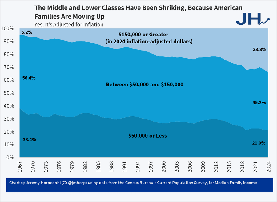
"the share of US families with over $150,000 of income (in 2024 inflation-adjusted dollars) was 5.2% in 1967, 15.4% in 1990, and 33.8% in 2024. The change from 1967 to 1990 is impressive, with share tripling, though some of this is likely explained by the rise of dual-income families. But the increase from 1990 to 2024 is even more impressive: while it’s just a little more than a doubling, it is a growth over 18 percentage points!"
One-Third of US Families Earn Over $150,000
"It’s astonishing that the richest country in world history could convince itself that it was plundered by immigrants and trade. Truly astonishing.
From Jeremy Horpedahl who notes:
This is from the latest Census release of CPS ASEC data, updated through 2024 (see Table F-23 at this link).
In 1967, only 5 percent of US families earned over $150,000 (inflation adjusted).

And even though it says so in the chart and in the text let me say it again, this is inflation adjusted and so yes it’s real and no the fact that housing has gone up in price doesn’t negate this, it’s built in. We would have done even better had NIMBYs not reduced the supply of housing.
See also Asness and Strain.
Addendum: Note it isn’t the rise of dual-earner households which haven’t increased for over 30 years."
Wednesday, October 29, 2025
Economic Stagnation May Be Over (If We Can Avoid a Recession Soon)
"The Census Bureau recently released a massive amount of new data on Americans and the US economy, as they do each year with their “Income, Poverty, and Health Insurance Coverage in the United States” release. The latest data cover the year 2024 and contain a lot of good news about how Americans are faring. In this post, I will focus on the income data that was released in this report.
The most recent data show a convincing, optimistic story: contrary to the pessimistic, populist narrative that dominates our current political moment, the data show that last year, Americans of all stripes enjoyed record incomes and that gains appear to have accelerated since the mid-1990s. We should probably expect more gains in the years ahead—unless another recession ruins them.
It will probably not surprise you that the past five years have been a rocky time in the US for household and family incomes. The brief but sharp recession in 2020 knocked down incomes, and then the inflation that ramped up in 2021 and peaked in 2022 made it hard for incomes to keep up. And we can see this in the data. Thankfully, real (inflation-adjusted) income growth resumed in 2023, and by 2024, most measures of income in this report had returned to or even exceeded their 2019 levels.
This first chart shows inflation-adjusted median incomes for US households and families (which are a subset of households that contain related people living together), but we can get into more detail than just the median with this data release, too. Here are the long-run outcomes: since 1967, real median family income has increased by 74 percent, household income has increased by 53 percent, and personal income has increased by 71 percent. That’s all adjusted for inflation.

For the wonks interested in different inflation adjustments, I am using the Census’s preferred measure of inflation, the chained CPI back to 2000 and the retroactive CPI before that. If we had used a chained inflation measure throughout the series, such as the Personal Consumption Expenditures price index, the gains would have been even larger (e.g., 88 percent for family income, rather than 74 percent).
Five years of no or slight growth in incomes might not seem like much to celebrate, unless you realize this was probably the most turbulent economic period in the living memory of most adults today. It’s also useful to put those 2019 and 2024 peaks in historical perspective. And the return to growth and recovery of pre-pandemic income levels happened rather swiftly, at least as compared to recent history.
For example, if we were looking at this data a decade later in 2014, we would notice that there had been essentially no improvement in median incomes since the year 2000, thanks to the slow recovery from two recessions in the 2000s. We observe this pattern throughout the history of the income data: when recessions happen frequently, median income stagnates, never getting a chance to surpass its prior peak. That’s the cautionary tale of this history: if another recession hits the US soon, we could be returning to a long stagnation of staying near the 2019 peak in income.
The chart above shows median income, the middle of the distribution. But it is also useful to look across the distribution of income to see if all are benefiting from economic growth. As the chart below shows, real household income declined across the distribution, bottoming out in 2022, and then recovered to at least the level of 2019. It’s true that growth has been best at the top of the income distribution, but the recovery happened across the distribution. In other words, Americans at all income levels are now at record high incomes (as always, adjusted for inflation).

Another way we can examine income changes across the distribution is to take a longer historical perspective and look at the percent of families (here I am switching from households) that fall within certain income ranges.

Where the breaks between groups should be isn’t an exact science, but I use about $50,000 above and below the median family income as reasonable cutoffs for the middle-income group. As we can see, the middle-income group was over half of the total in 1967, but this group’s size gradually shrank by about 10 percentage points over the next almost six decades. But notice that the lower-income groups shrank too. That’s because this chart shows one astonishing fact: the number of rich American families has skyrocketed, with over one-third now having at least $150,000 in income.
These trends are not sensitive to choosing different income cutoffs: if we use $200,000 as our definition of rich, the number has grown from 2 percent of families in 1967 to 21 percent in 2024. It also is not a trick of using families instead of households, as Mark Perry’s similar chart using households (and different income cutoffs than my chart) shows the same general trends.
What can we learn from these income trends?
The long-run positive trends show us that the American Dream is not dead, incomes are rising, more and more Americans are becoming quite wealthy, and the gains are spread across the distribution. While free markets in the US are infringed on by governments and special interests using government to tilt outcomes in their favor, the market continues to deliver the goods.
The decline of incomes through 2022 and the continued uncertainty equally show the folly of those government interventions. Government restrictions on business activity caused or, at the very least, contributed to the economic downturn in 2020. And the federal response through both monetary and fiscal policy in response to the downturn in many ways made things worse, especially the disastrous inflation of 2021–2023. The dramatic expansion of the money supply in 2020 was combined with multiple rounds of fiscal stimulus. Especially noteworthy is the 2021 American Rescue Plan, which was passed well after the initial crisis when the labor market had already been in recovery mode for almost a full year."