Evaluating the free market by comparing it to the alternatives (We don't need more regulations, We don't need more price controls, No Socialism in the courtroom, Hey, White House, leave us all alone)
"A recent article in The Guardian profiles economist Isabella Weber. She doesn’t seem to like other economists very much, supposedly because we “obsess over ideological purity and are inflexible when searching for solutions.” Weber wants economists to come up with solutions that work even if… I guess, even if they don’t work well in theory? Maybe they will work well in practice?
Anyway, so far as I can tell, the article only gets into details on two concrete solutions to affordability. I’m sure she has more in her book, but let’s see what these are. The first for governments to create “publicly owned entities that can buy and sell grain into its market,” presumably to smooth out fluctuations in grain prices. The second is “the Mexican government’s canasta básica policy, through which retailers voluntarily cap the total price of a basket of two-dozen essential goods.”
Let’s look at the second one, since I think for developed countries like the US, fluctuating grain prices aren’t the primary source of affordability concerns. But perhaps American consumers would like a basket of grocery essentials to be cheaper.
Has this policy in Mexico worked? It was first implemented in 2022, and food inflation has certainly fallen in Mexico since then. But it has also fallen everywhere else in the world — 2022 was peak inflation not just in the US, but in most countries — so we can’t judge the success of the program based on that alone.
Instead, we can look at internationally comparable data on food spending, which comes from the USDA’s Economic Research Service. Our World in Data has a nice chart based on this data, and even though it is now two years out of date (I will provide 2025 data below), the 2023 data makes a case against the success of the “price controls” in Mexico (I put “price controls” in quotes because it is not a true price control, but an attempt to control prices via incentives):
Figure 1
It will probably not surprise you that the US spends much less on food as a percent of total spending than Mexico, given that we are a high-income country. But it is still worth pointing out just how low food spending is in the US. However, this chart still paints Mexico in a very poor light: for countries with about the same income level in the Americas (as measured by consumer expenditures), Mexicans spend much more on food than Argentina, Chile, or Panama.
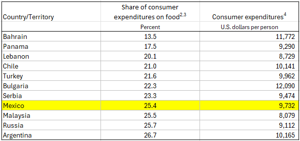
If we use the 2025 USDA data, and focus on the 10 countries with consumption expenditure closest to Mexico (between about $8,000 and $12,000 of consumption), we see that Mexico is very much on the high end: only Argentina was clearly higher:
Table 1
Finally, we can compare Mexico against itself in this data, looking at food spending going back to 2017:
Figure 2
Food spending actually peaked in 2020, though be cautious of any data from 2020 as the pandemic made data collection difficult. After declining in 2021 and then into 2022 (the policy seems to have been put in place in mid-2022), there haven’t been any further declines. And food spending is still well above pre-pandemic levels (unlike the US, where the 2025 figure of 6.4% is the same as 2017-18).
Ultimately, we would want a more sophisticated analysis than my simple tables and charts here. But it doesn’t appear that Mexico’s 2022 policy really made food much more affordable, either relative to peer countries with similar income levels, or relative to Mexico’s own recent history. And that’s even before we get into any unintended consequences of the “price controls.” Of course, the policy may have made that basic basket of two-dozen items more affordable than it otherwise might be — for that we would need to compare individual item prices to peer countries — but it hasn’t obviously made food overall more affordable in Mexico."
"Asian women have out-earned White men in each of the last 12 quarters over the last three years. In the most recent quarter (2026:Q3), White men earned only 92.6 cents for every $1 earned by Asian women, a GENDER/RACE EARNINGS GAP of 7.4% favoring Asian women."
Abstract:
The Gini index remains the most important measure of economic inequality worldwide, and accurate estimates of this index are essential for effective public policies. Yet, Gini estimates for the same country and year vary considerably across data sources, a problem that remains largely unresolved. The paper reviews the largest global and regional databases providing Gini estimates, surveys the related literature, and constructs a unified dataset of 122,351 Gini observations spanning 222 countries and territories and 158 years, from 1867 to 2024. The analysis of this new dataset shows that income-based Ginis exceed consumption-based ones by 4.7 points on average globally, and by as much as 10 points in some regions, with these gaps widening over time. The gross--net income distinction and the use of alternative equivalence scales together with several other measurement choices add further systematic differences. Based on these findings, the paper provides correction factors that can be used to harmonise Ginis built on different welfare concepts. We further show that overall divergence across databases has grown only modestly since 1960, and mainly through the proliferation of databases rather than through genuine divergence among long-standing sources. Thus, improving on the existing discrepancies across Ginis globally is possible, but ultimately depends on database administrators disclosing full details of Gini construction and on users selecting Ginis built on comparable measures.
"Dana Goldman is a top-notch health economist and the founding director of the University of Southern California’s Schaeffer Institute for Public Policy and Government Service. On October 22, he published a courageous and eye-opening mea culpa that everyone should read:
In November 2009, I joined 10 other economists in a letter urging Congress to pass a bill that became the Affordable Care Act. I could hardly imagine what would come next.
The ACA promised to expand coverage, and it did. But I signed the letter primarily because the ACA promised to “bend the cost curve” of American health care, which was getting out of control.…
The curve did not bend, and I now wish I hadn’t signed my name to that letter.
Why did Obamacare fail to contain costs?
I, and many of my economist colleagues, didn’t foresee how many of the ACA’s cost-control and financing provisions would be stripped out by Congress, on a bipartisan basis, or watered down over the following decade.
That was true of many health economists. But many saw this coming. We warned the world as loudly as we knew how. In July 2009, I wrote:
… the administration agreed that the new subsidies would start flowing immediately, while the pay cuts would take effect over time. That means the pay cuts may never take effect at all: physicians have been blocking their own scheduled pay cuts for nearly a decade…
All [the industry deals] are contingent on the favored groups getting something they want, and all “savings” could be undone by future lobbying. To paraphrase George Bailey, the industry isn’t selling — the industry is buying.
In December 2009, when the ACA’s authors were drafting the financing provisions that Congress would later strip out, I wrote:
Senate Democrats promise to fund half of their new entitlement with $491 billion of Medicare cuts.…Congress frequently reneges on such promises. Want proof? At the very same time Congress is promising to cut future Medicare spending by $491 billion, it is reneging on a past promise to cut Medicare’s physician payments by $210 billion. Even Medicare’s chief actuary calls the (new) promised cuts “doubtful” and “unrealistic.”
… this legislation would set in motion political forces that would make additional spending inevitable. It would create new constituencies for government spending, hook existing constituencies on even more government spending, and promise implausible cuts in existing subsidies to constituencies that are highly organized and vocal.
In 2011, when I was trying to prevent the spigot from opening, I explained that the dynamic behind these predictions is something economists have known about for some time:
The measure repealing the 1099 mandate may itself increase the deficit slightly. It will reduce federal tax collections by $17 billion, and the offsetting spending cuts are highly questionable. This vote’s real significance, however, is that it shows why ObamaCare’s entitlement spending would survive the political process while its revenue-raising provisions would not.…
When the political process “goes to work” on the rest of ObamaCare’s various provisions, the revenue-raisers will fall because they get the formula wrong, while the entitlement spending will survive because it gets the formula right.…
The 1099 mandate is actually the second ObamaCare revenue-raiser to fall. Worried about the political fallout from private insurers exiting the Medicare program, the Obama administration rather transparently forestalled cuts to Medicare Advantage by granting $1.3 billion of “quality-based” bonuses to mediocre and low-performing MA plans.
This public-choice dynamic is why the Congressional Budget Office, the chief Medicare actuary, and even the International Monetary Fund have discredited the idea that ObamaCare will reduce the deficit. It is one of the principal reasons why, as Thomas Jefferson wrote, “The natural progress of things is for liberty to yield, and government to gain ground.” In other words, the game is rigged in favor of bigger government.
It also explains why the Obama administration is sprinting to implement ObamaCare in spite of a federal court having struck down the law as unconstitutional. As that and similar cases work their way toward the Supreme Court, the White House needs to get some concentrated interest groups hooked on ObamaCare’s subsidies–fast.
If Goldman receives praise for admitting error, it will encourage others to do the same. If he receives scorn, it will have the opposite effect."
"Social Security’s trust fund is nearing insolvency. The latest trustees report projects that the Old-Age and Survivors Insurance Trust Fund will run out in late 2032. If this occurs, benefits paid will be limited to payroll tax revenue, resulting in a roughly 22 percent benefit cut. Some lawmakers have suggested eliminating the payroll tax cap to help close the gap. This would raise revenue, but it would push top marginal tax rates on wages to over 60 percent in some states.
Social Security is financed with a 12.4 percent payroll tax on employee wages and a matching tax on self-employment income. The tax is split evenly between the employee and employer. The payroll tax is “capped,” meaning that it applies only to the first $184,500 in wages and salaries (in 2026).
Several proposals would eliminate or alter the cap. Two proposals would introduce a “donut hole” by applying the payroll tax to earnings above either $250,000 (Social Security Expansion Act) or $400,000 (Social Security 2100 Act). A proposal by Sens. Elizabeth Warren (D-MA) and Bernie Moreno (R-OH) would apply the payroll tax to all earnings.
Eliminating the payroll tax cap would raise the top marginal tax rate on labor earnings. The top marginal tax rate is the combined federal, state, and local tax that a top earner pays on each additional dollar of wage and salary income.
For example, a top earner in Massachusetts faces a top marginal tax rate of 49.5 percent. This includes the top individual income tax rate of 37 percent, the 2.9 percent Medicare payroll tax, the 0.9 percent Additional Medicare Tax, and Massachusetts’s top income tax rate of 9 percent.1 Eliminating the cap would raise the top marginal tax rate in the state by 8.7 percentage points to 58.2 percent.
The top marginal tax rate would depend on where a taxpayer resides. The top marginal tax rate would rise to 63.1 percent in New York City, 63 percent in California, and 59.7 percent in Washington, DC. In states without an income tax, the top rate would rise to 49.4 percent. This would be the highest top marginal tax rate on wages since the Tax Reform Act of 1986.
Lawmakers should proceed with caution.
First, higher top marginal tax rates reduce the incentive to work. This is because eliminating the cap would reduce the after-tax wage that an individual earns. For example, top earners in Washington, DC, would experience a 17.4 percent reduction in their after-tax wage rate if the cap were eliminated. Using the Congressional Budget Office’s estimate that the labor supply elasticity (or responsiveness) of high-income workers is 0.17 (net of the income effect), this would imply a reduction in hours worked of 3 percent for those facing the top marginal tax rate.
Second, eliminating the cap would exacerbate the incentive for business owners to reclassify their income. Owners of partnerships and S corporations can split their income between profits and wages. The tax code creates an incentive to pay more income out as profits because profits are taxed at a top federal income tax rate of 29.6 percent (37 percent reduced by the 20 percent deduction for pass-through business income) compared to the top federal tax rate on wages of 40.2 percent. Eliminating the cap would widen that gap from 11 percentage points to 19.8 percentage points.
Third, eliminating the cap would reduce revenue from other taxes. Because the employer-side payroll tax is borne by workers in the form of lower W-2 wages, raising it shrinks the base of the income and employee-side payroll tax. The Joint Committee on Taxation estimates that for each dollar raised by the payroll tax, the federal government collects only 86 cents. Furthermore, the reduction in hours worked would mean that total taxable income would fall, offsetting an even larger share of the initial tax increase.
Finally, eliminating the cap would delink taxes from benefits. One of the virtues of the current Social Security system is that benefits and taxes are at least loosely linked. The more an individual works, the more they pay in payroll taxes, but also the more they accrue in future benefits, up to the cap. This limits the work disincentive effect because future benefits partly offset taxes at the margin. Eliminating the cap without expanding benefits would make the tax on earnings above the cap a pure tax, with no offsetting benefit.
Lawmakers are right to be concerned about the future of Social Security. Reform will require changes to both spending and revenue. It matters, however, how those changes are structured. Eliminating the cap on the payroll tax would come with important economic trade-offs.
[1] The top marginal tax rate is calculated on total labor compensation, including the employer-side payroll tax. Assumes Massachusetts’s paid family leave payroll tax remains capped."
By David Galland. He is with The Rational Optimist Society. Excerpts:
"For three years, Courtney Hofmann’s young son Alex suffered pains no one could explain.
He chewed on things to cope with headaches. His gait changed, and he stopped growing. By the time he turned seven, he had been seen by 17 doctors and specialists, including pediatricians, neurologists, orthopedists, ENTs, and even dentists.
Every doctor followed the established protocols, ordering exams to test their latest theories, but ultimately none came up with a helpful diagnosis.
Finally, in desperation, Courtney pasted her son’s medical records into ChatGPT and asked for an opinion.
After engaging in a collaborative exchange about her son’s symptoms, ChatGPT came back with tethered cord syndrome, a rare condition in which the spinal cord is abnormally anchored to the surrounding tissue instead of floating freely. As Alex grew and his spine lengthened normally, the tethered cord was increasingly stretched.
ChatGPT results in hand, Courtney found a neurosurgeon who specialized in the condition. He confirmed the diagnosis, and Alex had the necessary surgery. Today, he’s fine.
And so we find ourselves on the cusp of a new era of medicine and healthcare where, for the price of a modest monthly subscription, a chatbot working from the same records as 17 medical professionals correctly diagnosed a complicated medical problem the experts had all missed.
In this Deep Dive, we’ll look at the astonishing progress AI is enabling across the very foundations of medicine, including disease diagnosis, drug development, and treatment.
As you’ll read, AI is almost certainly the most important development in human health since antibiotics.
And it’s happening right now, as you read this, which means we’ll be the beneficiaries of this healthcare revolution."
The current AI-driven progress in radically improved diagnosis and healthcare is the result of three fairly obvious developments unfolding at the same time:
Data digitization – Though privacy rules and fragmented systems still create roadblocks, today nearly all medical records and associated images have been digitized, creating a pool of trillions of data points available for analysis and, importantly, training AI.
Foundation Models – A single large model can now process text, images, genomes, and waveforms—such as those produced by an ECG—all at once. The latest AI models can read your medical history, review your charts, study your scans, and weigh your genetics, processing every input together in an analysis that happens in the blink of a proverbial eye.
Compute – The AIs powering today’s medical breakthroughs run on a level of computation that would have been prohibitively expensive—and perhaps impossible—just 15 years ago.
Put those three developments together, and you get . . . a near-superhuman diagnostician that can weigh your personal health data against a vast library of peer-reviewed research, massive clinical databases, and archives of medical images tied to known outcomes—and apply all of it in seconds."
"The first randomized controlled trial of AI in cancer screening involved nearly 106,000 women in Sweden. During the trial, radiologists, supported by an AI system called Transpara, detected 29% more breast cancers than using standard practices, with no increase in false positives.
Importantly, those results were produced while cutting screen-reading workload by 44%!"
"An observational study in Germany involving the routine screening of nearly half a million women found that radiologists using AI caught 17.6% more breast cancers than those not using it."
Policymakers across the country are confronting the unfortunate—and predictable—economic results of prohibiting restaurants from paying servers a lower base wage supplemented by tips
"In recent years, one of the predominant policy initiatives of the progressive left has been raising the minimum wage in locales around the country. At the same time, left-leaning politicians have sought the elimination of what's known as the tip credit, which allows employers to pay restaurant servers and other tipped employees a lower hourly base wage that they then bolster with gratuities.
Just a few years into this experiment, however, policymakers are showing signs of an about-face on the tip credit's abolition as they grapple with the unfortunate, and predictable, economic results.
In 2022, Washington, D.C., made news headlines when voters passed Initiative 82. As originally designed, it would have repealed the tip credit and required servers to be paid the District's full statutory minimum wage by 2027. (D.C.'s minimum wage was $16.10 per hour in 2022, but has since risen to $18.40 due to inflation indexation.) Prior to Initiative 82, D.C. servers could be paid a $5.35 tipped wage, so long as they earned enough tips to make up the difference between the lower tipped wage and the higher traditional minimum wage.
D.C.'s Initiative 82 was just the beginning. One Fair Wage, a progressive group that lobbies against subminimum wages, quarterbacked an all-out push to eliminate the tip credit in jurisdictions across America. Chicago became the second prominent city to follow suit. States like New York, Connecticut, and Illinois also quickly saw legislation introduced to eliminate the tip credit at a statewide level. (Apart from this recent wave, a small handful of American states—including California, Oregon, and Alaska—have long operated without a tip credit).
But just when it seemed like momentum against the tip credit had reached its apex, progressive politicians started to see the writing on the wall. In the aftermath of the tip credit's repeal, D.C. saw a close to 5 percent decline in full-service restaurant jobs. Tipped worker earnings also dropped by just under $12 million—likely a result, at least in part, of restaurants reducing hours for staff in the face of higher labor costs. At the same time, many D.C. restaurants began implementing service fees or so-called auto-gratuity policies that added mandatory 10-20 percent charges onto customers' bills.
Mugged by this economic reality, D.C. Mayor Muriel Bowser called for the full repeal of Initiative 82. Ultimately, the D.C. Council settled for a partial repeal in 2025, maintaining at least some semblance of a tipped wage that sits below the traditional minimum wage into the years ahead (although the tipped wage eventually rises to 75 percent of the traditional wage by 2034). This was a familiar story: The council had previously repealed Initiative 77, a near-identical attempt to abolish the tipped wage that voters passed in 2018.
After Chicago moved to eliminate the tip credit, the Illinois Restaurant Association found that 89 percent of Windy City restaurants raised menu prices; another 79 percent responded by reducing worker hours. Again bowing to economic reality, the progressive Chicago City Council voted to freeze the tip credit's planned elimination, only to see the effort vetoed by Mayor Brandon Johnson. Eventually, a compromise was brokered to at least pause the tip credit at its current level for two years—which punts the issue until after Johnson stands for election again, allowing a potential successor to endorse a more lasting reversal.
In Michigan, a 2024 state supreme court ruling set the tip credit on the path toward elimination by 2030. But state lawmakers intervened last year, deciding to maintain a 50 percent tip credit in perpetuity after 2031. Notably, Michigan is currently governed by a Democratic trifecta in the governorship and both houses of the Legislature. The tip credit's revival garnered key support from Republican lawmakers to pass in a bipartisan fashion, before being signed into law by Democratic Gov. Gretchen Whitmer.
While progressive efforts to eliminate the tip credit may be motivated by an earnest desire to ensure waiters are paid more, the math isn't that simple. Requiring a server to be paid a $16 traditional minimum wage—up from a $5 tipped wage—might appear to raise their pay on paper. But this fails to consider several important factors.
Under our "No Taxes on Tips" new normal, raising the minimum wage for servers could lead to a partial reduction in tips, which under certain scenarios can result in less take-home pay for waiters once the taxman takes his cut. If more server earnings come in the form of "auto-gratuity" policies—which are treated as taxed wages under the law—then the tax repercussions may grow even grimmer.
But more broadly, these laws attempt to subvert basic economics. As of 2025, Bureau of Labor Statistics data show that D.C. restaurants shed over 1,600 jobs in aftermath of Initiative 82; meanwhile, between 2022 and 2025, restaurant job growth in the District declined by more than 8 percent. This is just one example. The fallout is the inevitable result of restaurants responding to labor costs that suddenly skyrocket, forcing establishments to cut worker hours and sometimes transition to quick-service models that require less hourly staff. And that's to say nothing of the diners who bear the cost with higher prices and new service fees.
"We're watching a beloved bar back, a beloved busser, a dishwasher have their jobs taken away," D.C. restaurant worker Valerie Graham toldReason in 2024. "Not because our owner-operator is an evil billionaire but because they're an independent business owner who had to make some business decisions and there's a callousness with which our industry is talked about."
To be sure, the tip credit has only survived in modified and reduced form in D.C., Chicago, and Michigan—and in the case of Chicago, the about-face is only temporary. But the partial reversals show the tip credit's elimination is not a foregone conclusion. Economic reality continues to rear its head."