"It’s as though two completely separate conversations have been going on. From day one, the health policy community has correctly seen the Affordable Care Act as an attempt to completely change the health care system. This isn’t even controversial. It’s accepted by all as an undisputed fact.
However, no one has ever said this to the American people. In fact, the message of the Obama presidency — going all the way back to the 2008 campaign — was just the opposite. In that election, Barack Obama rejected Hillary Clinton’s call for an individual mandate (a proposal that would obviously affect everyone) in favor of his own proposal which appeared to mainly help those who couldn’t afford insurance. And how many people would that be? You could be forgiven if you thought it was about 10% of the population.
Then, on the eve of the passage of the ACA, virtually every Democrat who appeared on TV to defend it had one and only one message to offer: people were being discriminated because of pre-existing conditions. And how many of those people are there? Well for the first three years under the law, anyone denied insurance because of a pre-existing condition was able to enter the new (ObamaCare) risk pools and pay the same premium a healthy person would pay. How many did that? About 107,000. That’s out of a U.S. population of approximately 314 million!"
It’s as though two completely separate conversations have been going on. From day one, the health policy community has correctly seen the Affordable Care Act as an attempt to completely change the health care system. This isn’t even controversial. It’s accepted by all as an undisputed fact.
However, no one has ever said this to the American people. In fact, the message of the Obama presidency — going all the way back to the 2008 campaign — was just the opposite. In that election, Barack Obama rejected Hillary Clinton’s call for an individual mandate (a proposal that would obviously affect everyone) in favor of his own proposal which appeared to mainly help those who couldn’t afford insurance. And how many people would that be? You could be forgiven if you thought it was about 10% of the population.
Then, on the eve of the passage of the ACA, virtually every Democrat who appeared on TV to defend it had one and only one message to offer: people were being discriminated because of pre-existing conditions. And how many of those people are there? Well for the first three years under the law, anyone denied insurance because of a pre-existing condition was able to enter the new (ObamaCare) risk pools and pay the same premium a healthy person would pay. How many did that? About 107,000. That’s out of a U.S. population of approximately 314 million!
- See more at: http://healthblog.ncpa.org/the-selling-of-obamacare/#sthash.cibenW27.dpufIt’s as though two completely separate conversations have been going on. From day one, the health policy community has correctly seen the Affordable Care Act as an attempt to completely change the health care system. This isn’t even controversial. It’s accepted by all as an undisputed fact.
However, no one has ever said this to the American people. In fact, the message of the Obama presidency — going all the way back to the 2008 campaign — was just the opposite. In that election, Barack Obama rejected Hillary Clinton’s call for an individual mandate (a proposal that would obviously affect everyone) in favor of his own proposal which appeared to mainly help those who couldn’t afford insurance. And how many people would that be? You could be forgiven if you thought it was about 10% of the population.
Then, on the eve of the passage of the ACA, virtually every Democrat who appeared on TV to defend it had one and only one message to offer: people were being discriminated because of pre-existing conditions. And how many of those people are there? Well for the first three years under the law, anyone denied insurance because of a pre-existing condition was able to enter the new (ObamaCare) risk pools and pay the same premium a healthy person would pay. How many did that? About 107,000. That’s out of a U.S. population of approximately 314 million!
- See more at: http://healthblog.ncpa.org/the-selling-of-obamacare/#sthash.cibenW27.dpuf
It’s as though two completely separate conversations have been going on. From day one, the health policy community has correctly seen the Affordable Care Act as an attempt to completely change the health care system. This isn’t even controversial. It’s accepted by all as an undisputed fact.
However, no one has ever said this to the American people. In fact, the message of the Obama presidency — going all the way back to the 2008 campaign — was just the opposite. In that election, Barack Obama rejected Hillary Clinton’s call for an individual mandate (a proposal that would obviously affect everyone) in favor of his own proposal which appeared to mainly help those who couldn’t afford insurance. And how many people would that be? You could be forgiven if you thought it was about 10% of the population.
Then, on the eve of the passage of the ACA, virtually every Democrat who appeared on TV to defend it had one and only one message to offer: people were being discriminated because of pre-existing conditions. And how many of those people are there? Well for the first three years under the law, anyone denied insurance because of a pre-existing condition was able to enter the new (ObamaCare) risk pools and pay the same premium a healthy person would pay. How many did that? About 107,000. That’s out of a U.S. population of approximately 314 million!
- See more at: http://healthblog.ncpa.org/the-selling-of-obamacare/#sthash.cibenW27.dpuf
Thursday, November 7, 2013
The Selling of ObamaCare
Interesting post from John Goodman's Health Care Blog. Excerpt:

Look Closer: Tax Increases, Not Spending Cuts, Are the Harmful Austerity
Great post from Salim Furth of the Heritage Foundation.

Proponents of government spending want to use the recent history of Europe as evidence that spending cuts are harmful, but their arguments lose traction when one looks closely at the data.
One example comes from Paul Krugman, who used the International Monetary Fund’s Fiscal Monitor data to argue that “austerity has large negative impacts.” But he could have made a more valuable observation: Tax increases have large negative impacts, spending cuts not as much.
That lesson is visible in the charts: A dollar increase in tax revenue lowers gross domestic product (GDP) by $2.10 over the same time period, while a dollar of spending cuts only lowers it 80 cents. (Those are short-run effects, and in the long run, economists expect that the private sector picks up any slack left by the government.) Greece has a lot of influence on these estimates, and without Greece the revenue effect falls to $1.30 and the spending effect to 40 cents.
Spending cuts are baked into GDP, so those estimates imply that the private sector is basically unharmed by spending cuts. Taxing more in order to cut deficits, on the other hand, is an exercise in futility: Historically, the tax increases hurt the economy so much that the increases utterly fail to lower the deficit.
A more recent generalization about austerity comes from Ezra Klein, who tweeted that “austerity destroyed Europe’s economy.” The problem? His graph shows an estimate of only aggregate demand growth, not austerity or fiscal policy.
Looking at the data on austerity we can see that generalizing about Europe obscures more than it reveals. Klein obviously believes that the U.S. and Japan were substantially less austere than the eurozone. But looking at two different measures of austerity, we can see that is not the case.
In structural deficit reduction from 2009 to 2012, the U.S. is in the middle of the eurozone countries—slightly more “austere” than Germany, the largest eurozone economy. In the Fiscal Monitor estimate of discretionary deficit reduction policy, the U.S. is more austere than all but four eurozone countries. Japan, by contrast, has moved toward larger deficits, bigger government, and higher taxes.
How have those policies worked out? Germany’s GDP grew 8 percent from 2009 to 2012, the U.S.’s grew just over 6 percent, and Japan’s grew just under 6 percent. Maybe tax-and-spend is not such a great strategy for Japan after all.
Finally, which country in the eurozone had the strongest growth record from 2009 to 2012? Slovakia, which surged 9.5 percent. According to the Fiscal Monitor, Slovakia cut taxes by 1.59 percent of GDP and cut spending by 4.07 percent of GDP.
(Wonkish notes: Krugman used GDP growth from 2008 to 2012, so his growth “effect” starts a year before the cause. Krugman also excluded eurozone countries Slovakia and Slovenia from his graph and regression without explanation. The Fiscal Monitor table that Krugman cites does not include a “total austerity” series—Krugman and I had to add up the spending cuts and revenue increases to get “total austerity.” I dropped changes in interest payments from the spending side, since they are not driven by fiscal policy. None of these analytical choices makes a substantial difference in the regression results. Finally, these spending cuts include the expiration or termination of temporary stimulus spending.)
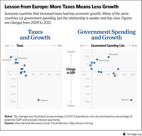
Proponents of government spending want to use the recent history of Europe as evidence that spending cuts are harmful, but their arguments lose traction when one looks closely at the data.
One example comes from Paul Krugman, who used the International Monetary Fund’s Fiscal Monitor data to argue that “austerity has large negative impacts.” But he could have made a more valuable observation: Tax increases have large negative impacts, spending cuts not as much.
That lesson is visible in the charts: A dollar increase in tax revenue lowers gross domestic product (GDP) by $2.10 over the same time period, while a dollar of spending cuts only lowers it 80 cents. (Those are short-run effects, and in the long run, economists expect that the private sector picks up any slack left by the government.) Greece has a lot of influence on these estimates, and without Greece the revenue effect falls to $1.30 and the spending effect to 40 cents.
Spending cuts are baked into GDP, so those estimates imply that the private sector is basically unharmed by spending cuts. Taxing more in order to cut deficits, on the other hand, is an exercise in futility: Historically, the tax increases hurt the economy so much that the increases utterly fail to lower the deficit.
A more recent generalization about austerity comes from Ezra Klein, who tweeted that “austerity destroyed Europe’s economy.” The problem? His graph shows an estimate of only aggregate demand growth, not austerity or fiscal policy.
Looking at the data on austerity we can see that generalizing about Europe obscures more than it reveals. Klein obviously believes that the U.S. and Japan were substantially less austere than the eurozone. But looking at two different measures of austerity, we can see that is not the case.
In structural deficit reduction from 2009 to 2012, the U.S. is in the middle of the eurozone countries—slightly more “austere” than Germany, the largest eurozone economy. In the Fiscal Monitor estimate of discretionary deficit reduction policy, the U.S. is more austere than all but four eurozone countries. Japan, by contrast, has moved toward larger deficits, bigger government, and higher taxes.
How have those policies worked out? Germany’s GDP grew 8 percent from 2009 to 2012, the U.S.’s grew just over 6 percent, and Japan’s grew just under 6 percent. Maybe tax-and-spend is not such a great strategy for Japan after all.
Finally, which country in the eurozone had the strongest growth record from 2009 to 2012? Slovakia, which surged 9.5 percent. According to the Fiscal Monitor, Slovakia cut taxes by 1.59 percent of GDP and cut spending by 4.07 percent of GDP.
(Wonkish notes: Krugman used GDP growth from 2008 to 2012, so his growth “effect” starts a year before the cause. Krugman also excluded eurozone countries Slovakia and Slovenia from his graph and regression without explanation. The Fiscal Monitor table that Krugman cites does not include a “total austerity” series—Krugman and I had to add up the spending cuts and revenue increases to get “total austerity.” I dropped changes in interest payments from the spending side, since they are not driven by fiscal policy. None of these analytical choices makes a substantial difference in the regression results. Finally, these spending cuts include the expiration or termination of temporary stimulus spending.)
Wednesday, November 6, 2013
Joe Stiglitz's Cognitive Dissonance
From Division of Labor.
A complimentary copy of Joe Stiglitz's "The Price of Inequality"
recently appeared in my mailbox. I'm no big fan of Stiglitz's work, but
in skimming the table of contents I noticed a chapter on rent-seeking
and decided to read it.
On p. 45, Stiglitz writes:
Like a blind squirrel finding a few acorns, Stiglitz's rent seeking chapter does hit a few worthy targets (import restrictions, ethanol, Wall St). However, in addition to the cognitive dissonance over the Chicago school and spectrum auctions, the chapter suffers from a macro case of cognitive dissonance in that Stiglitz advocates more government involvement while failing to realize that it is a large and active government that provides the rents he bemoans.
On p. 45, Stiglitz writes:
Three factors contributed to the increased monopolization of markets. First, there was a battle over ideas about the role that government should take in ensuring competition. Chicago school economists (like Milton Friedman and George Stigler) who believe in free and unfettered markets argued that markets are naturally competitive ...Just a few pages later (p.62) he writes:
In the Clinton administration, we tried to make the mining companies pay more for the resources they take out of public lands .... [The companies] argued that the policy would impeded growth. But the fact of the matter is that, with an auction, companies will bid to get the mining rights .... Modern auction theory has shown how changing the design of the auction can generate much more revenue for the government. These theories were tested out in the auction of spectrum used for telecommunications beginning in the 1990s ....Wonder where Uncle Sam got the idea of auctioning off spectrum rights ... oh yeah, from one of those free market fundamentalist Chicago schoolers named Ronald Coase.
Like a blind squirrel finding a few acorns, Stiglitz's rent seeking chapter does hit a few worthy targets (import restrictions, ethanol, Wall St). However, in addition to the cognitive dissonance over the Chicago school and spectrum auctions, the chapter suffers from a macro case of cognitive dissonance in that Stiglitz advocates more government involvement while failing to realize that it is a large and active government that provides the rents he bemoans.
Competition Saves Lives--Who Knew?
From Division of Labor.
"Part of the abstract of a paper by Martin Gaynor, Rodrigo Moreno-Serra, and Carol Propper in the new issue of the AEJ: Economic Policy:
"Part of the abstract of a paper by Martin Gaynor, Rodrigo Moreno-Serra, and Carol Propper in the new issue of the AEJ: Economic Policy:
The English government introduced a policy in 2006 to promote competition between hospitals. Using this policy to implement a difference-in-differences research design, we estimate the impact of the introduction of competition on not only clinical outcomes but also productivity and expenditure. We find that the effect of competition is to save lives without raising costs."
Tuesday, November 5, 2013
Storms are becoming ever more survivable
Great post from Matt Ridley. Here it is
You cannot read much into a single year’s events, of course. None the less, the apocalyptic predictions of ever worsening storms made in 2005, after Hurricane Katrina all but destroyed New Orleans, seem to have been wide of the mark. There has been no trend up or down in storm frequency or power since the 1960s, when satellites began measuring these things.
The way bad storms are beamed into our living rooms today probably gives the opposite impression. Yet the run-up to an impending storm tends to get more coverage than the clean-up afterwards, leaving a false impression of unrepaired devastation. The more salient trend to draw from weather in the modern era is that whatever it throws at us, we are getting better at coping: civilisation has become steadily more resilient in the face of natural disasters.
The financial cost of storms goes up and up, of course, as the insurance industry never tires of reminding us. But then so does the value of the economy — there are more coastal properties worth more money and more fully insured. The trend in insurance claims tells you nothing about the weather itself. Indeed, as Professor Roger Pielke, of the University of Colorado at Boulder, told Congress last year, global insured catastrophe losses have not increased as a proportion of GDP since 1960.
For all the havoc that today’s St Jude’s storm may bring to transport and property in Britain, and even if it does result in tragic loss of life, the effect is bound to be less than it would have been in times past. In any other century a storm such as today’s would have killed more people, wrecked more ships, destroyed more crops and left more people homeless than it will do today.
In November 1703, for instance, a great storm destroyed the Eddystone lighthouse, drowned 1,500 Royal Navy sailors in 13 sunken men-of-war, killed 400 people in the Somerset Levels, piled up 700 ships in the Pool of London, tore lead off Westminster Abbey’s roof, killed the Bishop of Bath and Wells in his bed with a falling chimney, and left towns on the South Coast looking “as if the enemy had sackt them and were most miserably torn to pieces”, in Daniel Defoe’s words. There must have followed a pretty bleak winter for many poor people.
Thanks to forecasts, warnings, better building materials and rescue services, we are more likely to survive today. Consider, for example, that the Met Office was telling us last week roughly where today’s storm would strike before it had even been born in the western Atlantic. That was not possible in 1703; indeed it was far from easy in 1987, as Michael Fish can attest.
Putting society and infrastructure back together after a weather disaster is also much quicker today than it would have been 300 years ago. There is virtually nothing that a storm does that cannot be undone by bulldozers and builders. The same is not always true of volcanoes and earthquakes.
The fierce cyclone that hit eastern India this month killed only 17 people, after it was well forecast and 800,000 people were evacuated from its path, a sharp contrast to the 10,000 killed in the same region by a cyclone 14 years ago. That India was in a good position to issue warnings and implement evacuation plans this time is largely a function of the intervening years of economic growth, plus the evolution of technology: nearly a billion Indians use mobile phones today, compared with hardly any in 1999.
The global death rate as a result of tropical storms (cyclones, typhoons and hurricanes) was 55 per cent lower in the 2000s than it had been in the 1960s. Much of that change is down to technology, but freedom helps too. In 2007 Hurricane Dean, a Category 5 storm, struck the Yucatan in capitalist, middle-income Mexico, but the country was well prepared and not a single person died. A year later a storm of similar ferocity hit impoverished, authoritarian Burma and killed about 200,000 people.
One of the things that makes the world more resilient to weather disasters is trade. In 1694, some 15 per cent of the entire population of France starved after heavy rains destroyed the third harvest in a row, while plenty of food existed elsewhere in Europe. Trade was so small a part of the economy that the means to get sufficient grain into France from other countries in Europe simply did not exist. At one point a convoy of 120 ships left Norway to bring grain to France, but was captured by the Dutch before being heroically recaptured by the privateer Jean Bart and escorted in triumph to Dunkirk. Yet even this was not enough to save many French lives.
Today a disastrous harvest in one region merely leads to an upward nudge in global food prices as food is diverted to the affected region. It would be almost impossible for famine to occur in a world where voluminous and truly free trade existed — because simultaneous harvest failures all around the world are virtually impossible, while rising prices would draw food to hungry regions. World trade reduces the risk of disaster.
I am often told that globalisation makes us more vulnerable, because a country such as Britain depends on other countries for many of the goods we need, so a natural disaster or a trade embargo would leave us desperate. But I am not convinced. Britain is no more precarious for getting its laptops and combine harvesters from abroad than a town is precarious for getting its bread from the countryside, or an office worker is precarious for getting his electricity from a plug.
Indeed local trade is vulnerable to weather disasters in a way that international trade is not. Interdependence actually spreads risk. As individuals we gave up self sufficiency tens of thousands of years ago partly because it reduced risk. And there is nothing more precarious than a self-sufficient community, which could be destroyed by a single storm, drought or flood.
So, when this storm has passed, say a little thank you to technology and globalisation for the fact that, on the whole, even the very worst weather need not disrupt your life very severely or for very long.
A big wind hitting Britain today does less harm than in past centuries
My Times article on the storm that was to hit
Britain on 28 October. In the event, four or five people died.
Disruption to transport lasted only a few days.
If you are reading this with the hatches battened
down, it may not be much comfort to know that 2013 has been an
unusually quiet year for big storms. For the first time in 45 years
no hurricane above Category 1 has made landfall from the Atlantic
by this date, and only two in that category, confounding an
official US government forecast of six to nine hurricanes in the
Atlantic, three to five of which would be big. Even if the last
month of the hurricane season is bad, it will have been a quiet
year.
It’s not just the Atlantic that is quiet. Globally, the
“accumulated cyclone energy” of all big tropical storms — known as
hurricanes, cyclones and typhoons, depending on the ocean — looks
to be heading for one of the lowest numbers on
record (though there are two months to go).You cannot read much into a single year’s events, of course. None the less, the apocalyptic predictions of ever worsening storms made in 2005, after Hurricane Katrina all but destroyed New Orleans, seem to have been wide of the mark. There has been no trend up or down in storm frequency or power since the 1960s, when satellites began measuring these things.
The way bad storms are beamed into our living rooms today probably gives the opposite impression. Yet the run-up to an impending storm tends to get more coverage than the clean-up afterwards, leaving a false impression of unrepaired devastation. The more salient trend to draw from weather in the modern era is that whatever it throws at us, we are getting better at coping: civilisation has become steadily more resilient in the face of natural disasters.
The financial cost of storms goes up and up, of course, as the insurance industry never tires of reminding us. But then so does the value of the economy — there are more coastal properties worth more money and more fully insured. The trend in insurance claims tells you nothing about the weather itself. Indeed, as Professor Roger Pielke, of the University of Colorado at Boulder, told Congress last year, global insured catastrophe losses have not increased as a proportion of GDP since 1960.
For all the havoc that today’s St Jude’s storm may bring to transport and property in Britain, and even if it does result in tragic loss of life, the effect is bound to be less than it would have been in times past. In any other century a storm such as today’s would have killed more people, wrecked more ships, destroyed more crops and left more people homeless than it will do today.
In November 1703, for instance, a great storm destroyed the Eddystone lighthouse, drowned 1,500 Royal Navy sailors in 13 sunken men-of-war, killed 400 people in the Somerset Levels, piled up 700 ships in the Pool of London, tore lead off Westminster Abbey’s roof, killed the Bishop of Bath and Wells in his bed with a falling chimney, and left towns on the South Coast looking “as if the enemy had sackt them and were most miserably torn to pieces”, in Daniel Defoe’s words. There must have followed a pretty bleak winter for many poor people.
Thanks to forecasts, warnings, better building materials and rescue services, we are more likely to survive today. Consider, for example, that the Met Office was telling us last week roughly where today’s storm would strike before it had even been born in the western Atlantic. That was not possible in 1703; indeed it was far from easy in 1987, as Michael Fish can attest.
Putting society and infrastructure back together after a weather disaster is also much quicker today than it would have been 300 years ago. There is virtually nothing that a storm does that cannot be undone by bulldozers and builders. The same is not always true of volcanoes and earthquakes.
The fierce cyclone that hit eastern India this month killed only 17 people, after it was well forecast and 800,000 people were evacuated from its path, a sharp contrast to the 10,000 killed in the same region by a cyclone 14 years ago. That India was in a good position to issue warnings and implement evacuation plans this time is largely a function of the intervening years of economic growth, plus the evolution of technology: nearly a billion Indians use mobile phones today, compared with hardly any in 1999.
The global death rate as a result of tropical storms (cyclones, typhoons and hurricanes) was 55 per cent lower in the 2000s than it had been in the 1960s. Much of that change is down to technology, but freedom helps too. In 2007 Hurricane Dean, a Category 5 storm, struck the Yucatan in capitalist, middle-income Mexico, but the country was well prepared and not a single person died. A year later a storm of similar ferocity hit impoverished, authoritarian Burma and killed about 200,000 people.
One of the things that makes the world more resilient to weather disasters is trade. In 1694, some 15 per cent of the entire population of France starved after heavy rains destroyed the third harvest in a row, while plenty of food existed elsewhere in Europe. Trade was so small a part of the economy that the means to get sufficient grain into France from other countries in Europe simply did not exist. At one point a convoy of 120 ships left Norway to bring grain to France, but was captured by the Dutch before being heroically recaptured by the privateer Jean Bart and escorted in triumph to Dunkirk. Yet even this was not enough to save many French lives.
Today a disastrous harvest in one region merely leads to an upward nudge in global food prices as food is diverted to the affected region. It would be almost impossible for famine to occur in a world where voluminous and truly free trade existed — because simultaneous harvest failures all around the world are virtually impossible, while rising prices would draw food to hungry regions. World trade reduces the risk of disaster.
I am often told that globalisation makes us more vulnerable, because a country such as Britain depends on other countries for many of the goods we need, so a natural disaster or a trade embargo would leave us desperate. But I am not convinced. Britain is no more precarious for getting its laptops and combine harvesters from abroad than a town is precarious for getting its bread from the countryside, or an office worker is precarious for getting his electricity from a plug.
Indeed local trade is vulnerable to weather disasters in a way that international trade is not. Interdependence actually spreads risk. As individuals we gave up self sufficiency tens of thousands of years ago partly because it reduced risk. And there is nothing more precarious than a self-sufficient community, which could be destroyed by a single storm, drought or flood.
So, when this storm has passed, say a little thank you to technology and globalisation for the fact that, on the whole, even the very worst weather need not disrupt your life very severely or for very long.
Mark Perry Explains Why There Is No Male/Female Wage Gap
See Another 4 Pinocchio whopper? Obama says women are paid 77 cents on the dollar for doing the exact same work as men. Here is that great post:

According to a TV election ad last year, “President
Obama knows that women being paid 77 cents on the dollar for doing the
same work as men isn’t just unfair, it hurts families.” Do the data support the president’s claim? Not at all.
For example, the Bureau of Labor Statistics (BLS) releases an annual report on the “Highlights of Women’s Earnings” (since the report looks equally at data for men’s and women’s earnings, one might ask why the report isn’t simply titled “Highlights of Earnings in America?”… but perhaps the answer is obvious). Here’s the opening paragraph from the most recent BLS report “Highlights of Women’s Earnings in 2012″ that was released a few weeks ago:
1. Among full-time workers (those working 35 hours or more per week), men were more likely than women to work a greater number of hours (Table 5). For example, 26% of men worked 41 or more hours per week in 2012, compared with only 14% of women who worked those hours, meaning that men were almost twice as likely as women to work 41 hours per work or more. Further, men were also about three times more likely than women to work 60-hour weeks: 5.3% of men worked 60 hours per week in 2012 compared to only 1.8% of women who worked those hours.
Also, women were more likely than men to work shorter full-time workweeks of 35 to 39 hours per week: 12% of women worked those hours in 2012, compared to 5% of men who did so.
Comment: Because men work more hours on average than women, some of the raw wage gap naturally disappears just by simply controlling for the number of hours worked per week, an important factor not even mentioned by groups like the National Committee on Pay Equity. For example, women earned 81.2% of median male earnings for all workers working 35 hours per week or more, for a raw, unadjusted pay gap of 18.8% for full-time workers (Table 5). But for those workers with a 40-hour workweek, women earned 87.7% of median male earnings, for a pay gap of only 12.3%. Therefore, once we control only for one variable – hours worked – and compare men and women both working 40-hours per week in 2012, about one-third of the raw 18.8% pay gap disappears.
2. The BLS reports that for single workers who have never married, women earned 95.8% of men’s earnings in 2012, which is a wage gap of only 4.2% (see Table 1 and chart above), compared to an overall unadjusted pay gap of 19.2% for workers in that group. When controlling for marital status and comparing unmarried men and unmarried women, more than 78% of the unadjusted 19.2% wage gap is explained by just one variable (among many): marital status.
3. Also from Table 1 in the BLS report, we find that for married workers with a spouse present, women earned only 76.6% of what married men with a spouse present earned in 2012 (see chart). Therefore, BLS data show that marriage has a significant and negative effect on women’s earnings relative to men’s, but we can accurately assume that marriage is a voluntary lifestyle decision, and it’s that personal choice, not necessarily labor market discrimination, that contributes to much of the gender wage gap for married workers.
4. Also in Table 1, the BLS reports that for young workers ages 20-24 years and 25-34 years, women earn 89% and 90.2% of their male counterparts (see chart), respectively. Once again, controlling for just a single important variable – age – we find that about half of the overall unadjusted raw wage gap for all workers disappears for young workers.
5. In Table 7, the BLS reports that for full-time single workers with no children under 18 years old at home (single workers includes never married, divorced, separated and widowed), women’s median weekly earnings were 95.2% of their male counterparts (see chart). For this group, once you control for marital status only, you automatically explain 76% of the unadjusted gender earnings gap.
6. Also in Table 7, the BLS reports that married women working full-time with children under 18 years at home earned 76.3% of what married men earned working full-time with children under 18 years (see chart). Once again, we find that marriage and motherhood have a significantly negative effect on women’s earnings; but those lower earnings don’t necessarily result from labor market discrimination, they more likely result from personal family choices about careers, workplace flexibility, child care, and hours worked, etc.
7. If we look at median hourly earnings, instead of median weekly earnings, the BLS reports in Table 8 that women earned 86.4% of what men earned in 2012, which accounts for almost one-third of the raw 19.8% gender earnings gap that exists for weekly earnings. And when we look at young workers, women ages 16 to 19 years earned 97.9% of the hourly wage of their male counterparts in 2012, and for the 20-24 year old group, women earned 92.0% of what men earned per hour. Also in Table 9, we see that for never married hourly workers of all ages, women earned 92.3% of the hourly earnings of their male counterparts in 2012, which explains about half of the unadjusted 13.6% gender difference in hourly earnings.
Bottom Line: When the BLS reports that women working full-time in 2012 earned 81% of what men earned working full-time, that is very much different than saying that women earned 81% of what men earned for doing exactly the same work while working the exact same number of hours, with exactly the same educational background and exactly the same years of continuous, uninterrupted work experience. As shown above, once we start controlling individually for the many relevant factors that affect earnings, e.g. hours worked, age, marital status and having children, most of the raw earnings differential disappears. In a more comprehensive study that controlled for all of the relevant variables simultaneously, we would likely find that those variables would account for almost 100% of the unadjusted, raw earnings differential of 19.8% lower earnings for women reported by the BLS. Discrimination, to the extent that it does exist, would likely account for a very small portion of the raw gender pay gap.
For example, in a 2005 NBER working paper “What Do Wage Differentials Tell Us about Labor Market Discrimination?” by June O’Neill (Professor of economics at Baruch College CUNY, and former Director of the Congressional Budget Office), she conducts an empirical investigation using Census data and concludes that:
I think President Obama deserves another 4 Pinocchio rating for his statement in bold above, and for ignoring the empirical evidence from his own Department of Labor that explains much, or all, of the gender differences in wages. In 2012, PolitiFact gave Obama’s claim a rating of “Mostly False.”
For example, the Bureau of Labor Statistics (BLS) releases an annual report on the “Highlights of Women’s Earnings” (since the report looks equally at data for men’s and women’s earnings, one might ask why the report isn’t simply titled “Highlights of Earnings in America?”… but perhaps the answer is obvious). Here’s the opening paragraph from the most recent BLS report “Highlights of Women’s Earnings in 2012″ that was released a few weeks ago:
In 2012, women who were full-time wage and salary workers had median usual weekly earnings of $691. On average in 2012, women made about 81 percent of the median earnings of male full-time wage and salary workers ($854). In 1979, the first year for which comparable earnings data are available, women earned 62% of what men earned.How do we explain the 23% gender pay gap claimed by Obama, or the fact that women working full-time earned only 81 cents for every dollar men earned in 2012? Here’s how the National Committee on Pay Equity explains it:
The wage gap exists, in part, because many women and people of color are still segregated into a few low-paying occupations. Part of the wage gap results from differences in education, experience or time in the workforce. But a significant portion cannot be explained by any of those factors; it is attributable to discrimination. In other words, certain jobs pay less because they are held by women and people of color.Let’s investigate the claim that the gender pay gap is a result of discrimination by looking at some of the labor market data by gender in the BLS report for 2012:
1. Among full-time workers (those working 35 hours or more per week), men were more likely than women to work a greater number of hours (Table 5). For example, 26% of men worked 41 or more hours per week in 2012, compared with only 14% of women who worked those hours, meaning that men were almost twice as likely as women to work 41 hours per work or more. Further, men were also about three times more likely than women to work 60-hour weeks: 5.3% of men worked 60 hours per week in 2012 compared to only 1.8% of women who worked those hours.
Also, women were more likely than men to work shorter full-time workweeks of 35 to 39 hours per week: 12% of women worked those hours in 2012, compared to 5% of men who did so.
Comment: Because men work more hours on average than women, some of the raw wage gap naturally disappears just by simply controlling for the number of hours worked per week, an important factor not even mentioned by groups like the National Committee on Pay Equity. For example, women earned 81.2% of median male earnings for all workers working 35 hours per week or more, for a raw, unadjusted pay gap of 18.8% for full-time workers (Table 5). But for those workers with a 40-hour workweek, women earned 87.7% of median male earnings, for a pay gap of only 12.3%. Therefore, once we control only for one variable – hours worked – and compare men and women both working 40-hours per week in 2012, about one-third of the raw 18.8% pay gap disappears.
2. The BLS reports that for single workers who have never married, women earned 95.8% of men’s earnings in 2012, which is a wage gap of only 4.2% (see Table 1 and chart above), compared to an overall unadjusted pay gap of 19.2% for workers in that group. When controlling for marital status and comparing unmarried men and unmarried women, more than 78% of the unadjusted 19.2% wage gap is explained by just one variable (among many): marital status.
3. Also from Table 1 in the BLS report, we find that for married workers with a spouse present, women earned only 76.6% of what married men with a spouse present earned in 2012 (see chart). Therefore, BLS data show that marriage has a significant and negative effect on women’s earnings relative to men’s, but we can accurately assume that marriage is a voluntary lifestyle decision, and it’s that personal choice, not necessarily labor market discrimination, that contributes to much of the gender wage gap for married workers.
4. Also in Table 1, the BLS reports that for young workers ages 20-24 years and 25-34 years, women earn 89% and 90.2% of their male counterparts (see chart), respectively. Once again, controlling for just a single important variable – age – we find that about half of the overall unadjusted raw wage gap for all workers disappears for young workers.
5. In Table 7, the BLS reports that for full-time single workers with no children under 18 years old at home (single workers includes never married, divorced, separated and widowed), women’s median weekly earnings were 95.2% of their male counterparts (see chart). For this group, once you control for marital status only, you automatically explain 76% of the unadjusted gender earnings gap.
6. Also in Table 7, the BLS reports that married women working full-time with children under 18 years at home earned 76.3% of what married men earned working full-time with children under 18 years (see chart). Once again, we find that marriage and motherhood have a significantly negative effect on women’s earnings; but those lower earnings don’t necessarily result from labor market discrimination, they more likely result from personal family choices about careers, workplace flexibility, child care, and hours worked, etc.
7. If we look at median hourly earnings, instead of median weekly earnings, the BLS reports in Table 8 that women earned 86.4% of what men earned in 2012, which accounts for almost one-third of the raw 19.8% gender earnings gap that exists for weekly earnings. And when we look at young workers, women ages 16 to 19 years earned 97.9% of the hourly wage of their male counterparts in 2012, and for the 20-24 year old group, women earned 92.0% of what men earned per hour. Also in Table 9, we see that for never married hourly workers of all ages, women earned 92.3% of the hourly earnings of their male counterparts in 2012, which explains about half of the unadjusted 13.6% gender difference in hourly earnings.
Bottom Line: When the BLS reports that women working full-time in 2012 earned 81% of what men earned working full-time, that is very much different than saying that women earned 81% of what men earned for doing exactly the same work while working the exact same number of hours, with exactly the same educational background and exactly the same years of continuous, uninterrupted work experience. As shown above, once we start controlling individually for the many relevant factors that affect earnings, e.g. hours worked, age, marital status and having children, most of the raw earnings differential disappears. In a more comprehensive study that controlled for all of the relevant variables simultaneously, we would likely find that those variables would account for almost 100% of the unadjusted, raw earnings differential of 19.8% lower earnings for women reported by the BLS. Discrimination, to the extent that it does exist, would likely account for a very small portion of the raw gender pay gap.
For example, in a 2005 NBER working paper “What Do Wage Differentials Tell Us about Labor Market Discrimination?” by June O’Neill (Professor of economics at Baruch College CUNY, and former Director of the Congressional Budget Office), she conducts an empirical investigation using Census data and concludes that:
There is no gender gap in wages among men and women with similar family roles. Comparing the wage gap between women and men ages 35-43 who have never married and never had a child, we find a small observed gap in favor of women, which becomes insignificant after accounting for differences in skills and job and workplace characteristics.To claim that a significant portion of the raw wage gap can only be explained by discrimination is intellectually dishonest and completely unsupported by the empirical evidence. And yet we hear all the time from groups like the National Committee on Pay Equity, the American Association of University Women, the Institute for Women’s Policy Research, and President Obama, President Jimmy Carter and Terry McAuliffe that “women are paid 77 cents on the dollar for doing the same work as men.” And in most cases when that claim is made, there is almost no attention paid to the reality that almost all of the raw, unadjusted pay differentials can be explained by everything except discrimination – hours worked, age, marital status, children, years of continuous experience, workplace conditions, etc. In other words, once you impose the important ceteris paribus condition of “all other things being equal or held constant,” the gender pay gap that we hear so much about doesn’t really exist at all.
This observation is an important one because it suggests that the factors underlying the gender gap in pay primarily reflect choices made by men and women given their different societal roles, rather than labor market discrimination against women due to their sex.
I think President Obama deserves another 4 Pinocchio rating for his statement in bold above, and for ignoring the empirical evidence from his own Department of Labor that explains much, or all, of the gender differences in wages. In 2012, PolitiFact gave Obama’s claim a rating of “Mostly False.”
Sunday, November 3, 2013
How Does Lack Of Insurance Affect Death Rates?
See This Is Why We Need Obamacare by NICHOLAS D. KRISTOF of the NY Times. Excerpt:
"Death rate: 799.5 deaths per 100,000 population"
So the overall death rate is about 15 times higher for the average American than it is for people without insurance. Maybe this has to do with age. Younger people are less likely to die and therefore less likely to buy insurance.
Also, the CDC shows that the two leading causes of death, by far, are cancer and hearth disease.
"But how about showing empathy also for a far larger and more desperate group: The nearly 50 million Americans without insurance who play health care Russian roulette as a result. FamiliesUSA, a health care advocacy group that supports Obamacare, estimated last year that an American dies every 20 minutes for lack of insurance."At 1 every 20 minutes, that is 26,280 a year. If we divide that by 50,000,000 we get 0.0005256. Per 100,000 that is 52.56. That is the death rate for people who lack insurance. What is it per 100,000 for the whole country? Here is a stat from the CDC for 2010
"Death rate: 799.5 deaths per 100,000 population"
So the overall death rate is about 15 times higher for the average American than it is for people without insurance. Maybe this has to do with age. Younger people are less likely to die and therefore less likely to buy insurance.
Also, the CDC shows that the two leading causes of death, by far, are cancer and hearth disease.
Number of deaths for leading causes of death:
- Heart disease: 597,689
- Cancer: 574,743
- Chronic lower respiratory diseases: 138,080
- Stroke (cerebrovascular diseases): 129,476
- Accidents (unintentional injuries): 120,859
- Alzheimer's disease: 83,494
- Diabetes: 69,071
- Nephritis, nephrotic syndrome, and nephrosis: 50,476
- Influenza and Pneumonia: 50,097
- Intentional self-harm (suicide): 38,364
Subscribe to:
Posts (Atom)