Evaluating the free market by comparing it to the alternatives (We don't need more regulations, We don't need more price controls, No Socialism in the courtroom, Hey, White House, leave us all alone)
macroeconomics
is an incredibly hard thing to get right. It’s very hard to empirically
test any of the theories — at best you can make policy, and wait for
history to happen, and then observe whether you kinda-sorta got it
right. So how are Milton Friedman’s macroeconomic ideas holding up now?
The post below explores this question.
I recently wrote a Bloomberg View post
about consumption Euler equations, and how these are increasingly being
targeted as a broken piece of macroeconomics. I traced the idea back to
Milton Friedman and the Permanent Income Hypothesis, and Bloomberg
decided (wisely) to go with Friedman for the headline. "Economists Give
Up on Milton Friedman's Biggest Idea" is probably going to get orders of
magnitude more clicks than "Economists Search for Replacement for
Infinitely Lived Perfectly Far-Sighted Model of Consumption Smoothing".
The
headline may have been better for clicks, but it is quite misleading.
It is particularly misleading to call it Friedman’s “biggest idea.”
I
think that the way Smith goes about doing his evaluation of Friedman is
quite wrong. But rather than get into why I disagree, let me proceed
to do the evaluation my way.
There is a joke among
macroeconomists that students cannot look at last year’s exam to prepare
for this year’s. The professors always ask the same questions, but
they change the answers. So “incredibly hard thing to get right” is an
understatement. I do not want to compare Friedman’s views to what Noah
Smith or someone else would say now. I want to compare them to what
economists believed then, meaning 1967, prior to Friedman’s address to the American Economic Association.
Back
then, monetarism had about the same status as astrology. Robert Solow
could quip, “Everything reminds Milton of the money supply. Everything
reminds me of sex, but at least I keep it out of my papers.”
As of
1967, Friedman was one of a small set of economists who paid attention
to the growth rate of the money supply. By 1980, more economists were
paying attention to it. But that has not lasted. All macroeconomists
pay attention to the Fed, but only a small set pay attention to the
growth rate of the money supply. Most of them pay attention to interest
rates. Those of you familiar with Scott Sumner know that he scorns the
focus on interest rates and instead urges paying attention to forecasts
of nominal GDP or nominal income.
Back then, the Phillips Curve
was thought to present policy makers with a “menu” of choices for
inflation and unemployment. If they chose to aim for a low value for
unemployment, the result would be a high value for inflation, and
vice-versa.
Back then, “fine tuning” was thought possible.
Economists believed that their advice, if followed by policy makers,
could eliminate recessions. The advice would focus on fiscal policy,
meaning changes in government spending and taxes deliberately undertaken
to manage “aggregate demand.”
Milton Friedman’s project was to undermine the theories that supported policy discretion. He had several objections.
First,
regarding the idea of using temporary tax cuts to spur the economy, he
proposed the Permanent Income Hypothesis. He never said that all
consumers optimize their spending patterns using stochastic calculus—the
Euler Equation was an element of the technically elegant but utterly
stupid consensus that emerged in the decades after Friedman roiled the
profession. It was part of Olivier Blanchard’s survey that infamously
concluded that “the state of macroeconomics is good” .
Friedman
merely claimed that the propensity to consume out of a temporary tax cut
would be lower than the propensity to consume out of a permanent tax
cut. If so, then temporary tax cuts might not be very stimulative when
enacted. Instead, much of the tax cut would be saved, and it might be
spent in later years, even after the economy had recovered. If you want
evidence that Friedman was roughly correct, all you have to do is
notice that economists believe that consumers have savings left over
from the COVID relief checks, and that this is now fueling inflation. I
cannot think of any economist who disagrees with the view that spending
out of temporary tax cuts is likely to be less than spending out of
permanent tax cuts.
Second, regarding the use of discretionary
policy, Friedman worried about “long and variable lags” between the
attempt to steer the economy and the impact of policy. You might
initiate a policy to fight a recession this year, but the impact could
show up two years later, when the expansionary policy was no longer
appropriate. James Tobin, who disagreed with Friedman, nevertheless
eloquently described Friedman’s view that a discretionary regime would
be “like an amateur shower tuner, alternately being scalded and
chilled.” In response to this, economists proceeded to devote
considerable attention to the challenge of ensuring that policy was
countercyclical instead of reinforcing the cycle. Recall that in the
Obama years, Larry Summers tried, not very successfully, to guide policy
with the mantra that stimulus should be “timely, targeted, and
temporary.”
Many economists came to support Friedman’s view, which
is that rules would work better than discretion. Ben Bernanke threw
out the rules playbook when the Financial Crisis hit in 2008. Many
economists have subsequently praised him. They also praised the
response by Congress and the Fed to COVID. By the time we are finished
dealing with our current inflation, economists may rediscover the case
for rules.
Third, regarding using the Phillips Curve as a “menu,”
Friedman was particularly devastating. He asserted that there was a
“natural rate of unemployment” to which the economy gravitates. He
claimed that trying to maintain unemployment below that rate would lead
not to a one-time increase in inflation, but to an accelerating rate of
inflation. According to the state of thinking in 1967, stagflation was
impossible. Friedman warned that it was possible, and in the 1970s
stagflation is what we got.
My views
I
think that macroeconomics, as conventionally practiced, is very nearly
hopeless. I do not think that it helps much to think in terms of a
“representative household” or “representative firm.” You fool yourself
if you think of the economy as one giant GDP factory. You fool yourself
by thinking that “spending creates jobs, and jobs create spending.” In
fact, jobs are created when entrepreneurs discover sustainable patterns
of specialization and trade. Hence my book, Specialization and Trade.
Once
you get rid of the “representative agent” mindset, it is easier to
understand how government deficits create a false sense of wealth. The
person lending to the government (by investing in government bonds) is
not the same as the person receiving payments from the government. The
lender thinks: I have less cash on hand today, but I will get it back next year, so I am approximately where I was before. The recipient thinks: I have more money now! Perceived wealth goes up, because there is no offsetting person who thinks: I am poorer now, because the government has borrowed money and will soon tax me to get it back.
In
the “representative agent” model, you are the only person in the
economy. The government borrows from you to write you a check. It is
obvious to you that this does not make you wealthier. If only we lived
in that simple world, government deficits would not appear to be a free
lunch, and politicians would have less incentive to run deficits.
I
also do not subscribe to any linear models of inflation. Inflation is
not proportional to money growth. It is not inversely related to the
unemployment rate.
I think of inflation as having two possible
regimes. In one regime, it is low and stable. In the other regime, it
is high and variable. It takes a lot of effort to destabilize the
dollar. Once it is destabilized, it takes a lot of effort to stabilize
it again.
The excessive spending on the Vietnam War and President
Johnson’s domestic programs made our gold peg unsustainable. Then
President Nixon ended the gold peg and administered the adverse supply
shock of wage and price controls. Those policies helped set the stage
for the inflationary breakout of the 1970s.
The process of
unwinding inflation was long and difficult. In the early 1980s,
interest rates were very high, disrupting major sectors of the economy.
More
recently, Presidents Bush and Obama ran large deficits. To be honest, I
thought that was enough to destabilize the dollar. I was wrong then.
Under
President Trump, the response to COVID was to run record deficits,
creating more paper wealth even as production and distribution were
being curtailed by people avoiding workplaces, mostly by choice but
sometimes by government edict. President Biden wanted to run even more
deficits. Only Senator Manchin stood in the way of the wildest spending
proposals. After more than a decade of fiscal profligacy, the vast
creation of phony paper wealth finally reached the point where inflation
could no longer be contained. We have to pray that getting things back
under control will not be as arduous a process as it was in the early
1980s.
What I believe today certainly does not resemble what
economists believed in 1967. But I am no disciple of Milton Friedman,
either. I do not think that the Fed can follow a money growth rule,
because it is too deeply committed to propping up the market for
government debt. And even if it were to follow a money growth rule, I
think that would do little to mitigate the inflationary impulse of
government deficits of the past dozen years."
"In the United States, it is conventional wisdom that wages have stagnated for decades.
A few examples to illustrate the point: In a recent story in “The New
York Times’s” Business section, an article began with this statement:
“One of the most urgent questions in economics is why pay for
middle-income workers has increased only slightly since the 1970s, even
as pay for those near the top has escalated” (Scheiber, 2021).
Conservative commentator David Brooks declared in 2017 that
“middle-class wage stagnation is the biggest economic fact driving
American politics.” A 2018 analysis by the Pew Research Center had this
headline: “For most U.S. workers, real wages have barely budged in
decades.” Populist politicians on the political right and progressives
on the political left share this view, as well.
Many economists agree. Economists assume wage stagnation as a fact in
commentary written for the public (e.g., Krugman, 2021; Stiglitz, 2020)
and in academic and policy papers (e.g., Azar et. al, 2020; Hoynes and
Rothstein, 2019; Sachs et. al, 2015; Benmelech et. al, 2022; Benmelech
et. al, 2019).
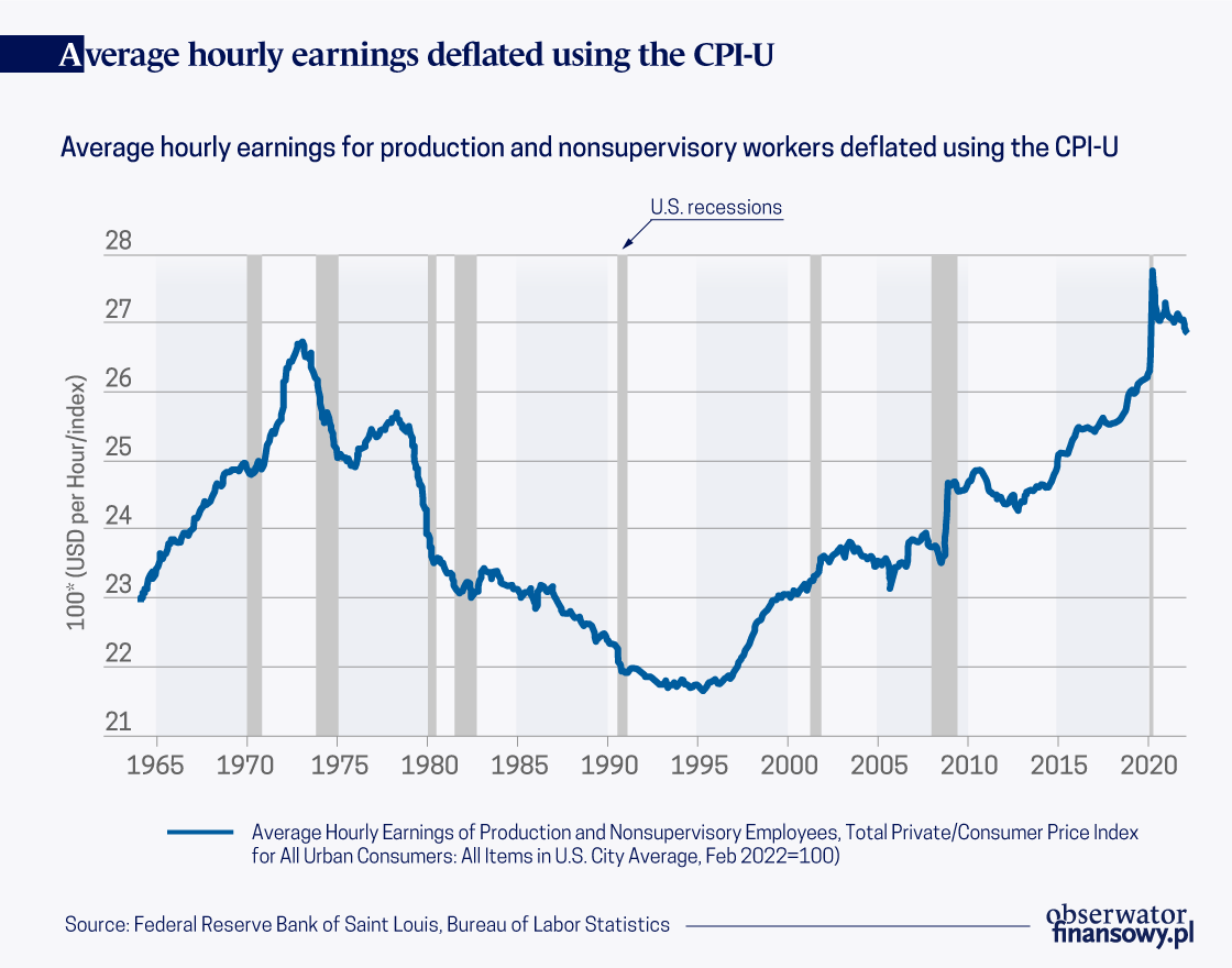
This view has empirical support. See the growth of inflation-adjusted
average wages for production and nonsupervisory workers, shown in
Figure 1. A startling fact is that average real wages have grown by only
0.7 percent over the half century beginning in February 1973. In
February 2022 dollars, wages have grown over this period by $0.18. There
is no question that an $0.18 increase over a half century is correctly
interpreted as stagnant.
Selecting the base year
Many descriptions of U.S. wage stagnation begin in 1973 (or 1979)
because that was the previous peak in the series, the rapid growth in
inequality that began around that time, and due to perceived shifts in
the economy during the 1980s away from organized labor and towards
a greater emphasis on economic efficiency (e.g., Mishel et. al, 2015).
The starting year for wage growth calculations is crucially
important, but has received relatively little attention in the academic
and policy debates around wage stagnation. See my recent bookOpens in new window, for more detailed discussion of this issue.
Calculating wage growth using 1973 (or 1979) as a base year
mechanically produces smaller growth magnitudes because 1973 was
a previous peak of the series and because 1978/1979 was a local maximum
of the series.
A quick glance at Figure 1 — which contains the full available time
series for average hourly earnings for production and nonsupervisory
workers — does not lead one to conclude that 1973 is the obvious base
year for economists or analysts to choose. The year the series begins,
1964, might be more natural. With that as the base year, wages have
grown by 17 percent. That may still be interpreted as stagnant, but
still much faster than growth calculated from 1973.
In Strain (2020), I make several arguments that — at least for the
purpose of the policy debate — July 1990 is a sensible base period.
First, I argue that when political leaders and political leaders argue
that “wages have been stagnant for decades,” many people hear that as
referring to their own wages. But 1973 was a half century ago. Choosing
a more recent base year is more sensible, and even one three decades ago
may be too far in the past because it would apply to too few current
workers. Second, July 1990 was a business cycle peak, which helps to
avoid overstating wage growth by estimating it from a trough.
The third reason I argue in Strain (2020) for 1990 as the base year
rests on the fact that the U.S. experienced two decades of stagnating –
actually, declining – average real wage growth, beginning in the early
1970s and ending in the early 1990s. Averaging wage growth from that
period with the decades that followed – i.e., averaging economic
outcomes from two different economic regimes – arguably distorts our
understanding of wage growth over time. Finally, the earlier the base
year, the harder it is to adequately adjust for inflation. Measuring
changes in a typical consumption bundle from 1990 to 2022 is challenging
enough given quality improvements in continuing products and the vast
number of new goods and services that have entered the typical bundle
during that period. Going back a half century is even harder, still.
Selecting the price index
In addition to selecting the base year, the issue of inflation
adjustment is of first-order importance. So far, I have been using the
consumer price index, which is arguably the most prominent measure of
inflation. There is widespread recognition that the headline CPI may
overstate the rate of inflation, particularly over longer periods of
time (Boskin et. al, 1998; Broda et. al, 2009). Given that, many
economists use a CPI research series (known as the CPI-U-RS) that
attempts to account for some of these issues, though the CPI-U-RS does
not deal adequately with substitution bias over the periods of time in
question (Moulton, 2018).
An alternative to the CPI is the personal consumption expenditure
price index (PCE). There are numerous technical differences between the
two indices, and each has strengths and weaknesses. The CPI is
specifically designed to capture price changes in a typical consumption
bundle, whereas the PCE includes all expenditures made for consumption,
including those made by third parties (e.g., employer-provided health
insurance premiums). The CPI focuses on urban consumers, while the PCE
tries to capture all consumers, and does a better job capturing price
changes faced by rural populations.
The most important advantage of the PCE is its more realistic
treatment of consumer substitution across goods in response to price
changes. For example, if the prices of strawberries goes up, consumers
will buy fewer strawberries and more raspberries. Because of the PCE’s
ability to better capture this type of substitution, it is the measure
used by the nonpartisan Congressional Budget Office when analyzing
trends in wages over time. The PCE is also the Federal Reserve’s
preferred measure of consumer price inflation (though of course the Fed
studies many measures of price changes across several distinct markets,
including consumer goods and services).
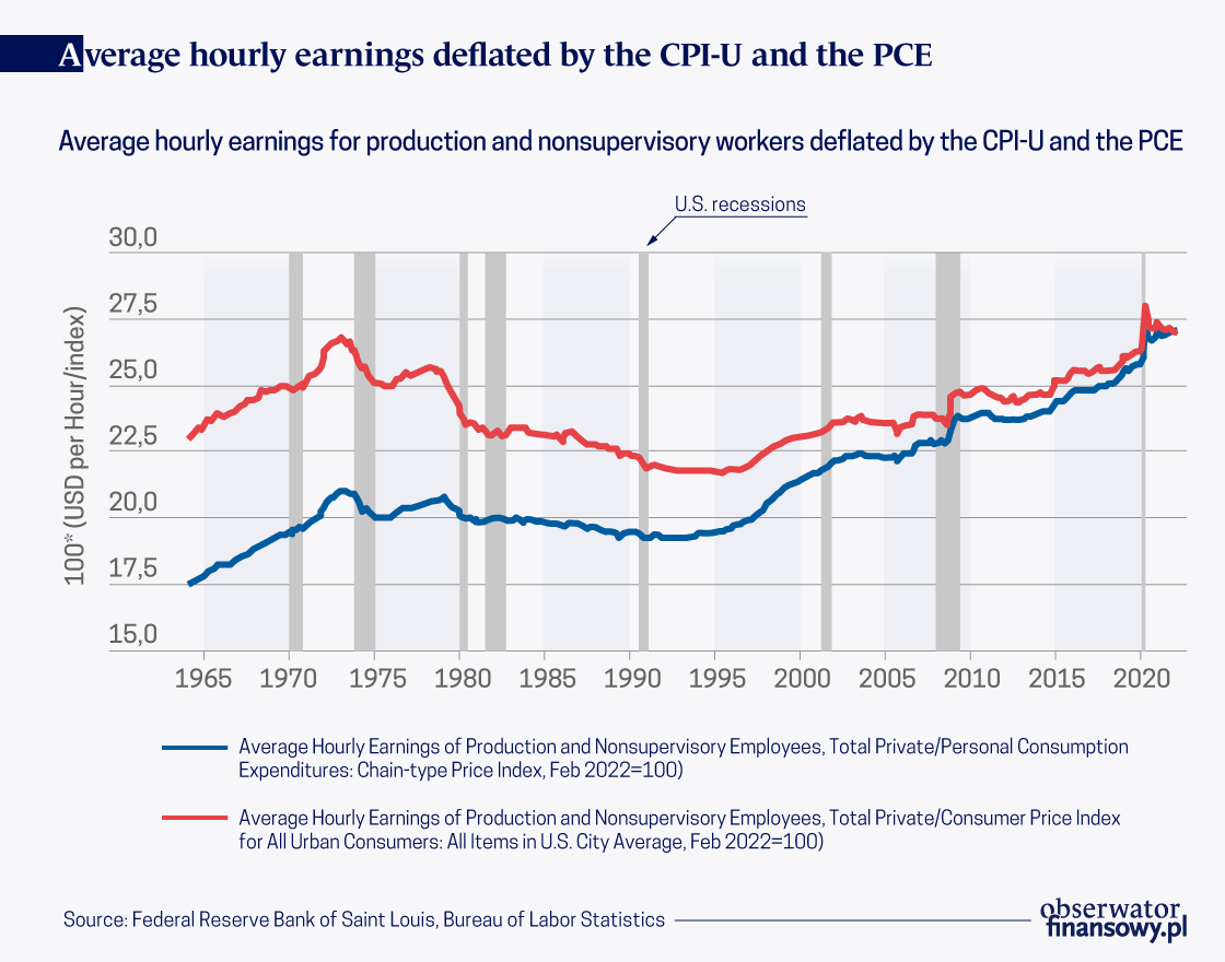
Because the CPI overstates inflation, calculations using the CPI for
inflation adjustment understate real wage growth. Figure 2 shows two
series for the average real wage for production and nonsupervisory
workers. One is deflated by the CPI and one by the PCE. Both are
expressed in February 2022 dollars, so the closer the series is to
February 2022 the closer real wages are to nominal wages.
The presentation in Figure 2 highlights how conclusions —
quantitative, but perhaps also qualitative — are driven in part by the
choice of price index, and how the further in the past the base year,
the larger the role the choice of price index plays.
Have wages stagnated for decades?
Using July 1990 as the base period, average real wages using the CPI
grew by 21 percent over the three-decade period ending in February 2022.
Real wages grew by 39 percent using the PCE.
So far, I have been discussing average wages. Because the analysis
has focused on production and nonsupervisory workers — workers who are
not managers, roughly speaking — there is less reason than usual to be
concerned that average wages produce a distorted picture of what is
happening to “typical” workers because of growing inequality. Still,
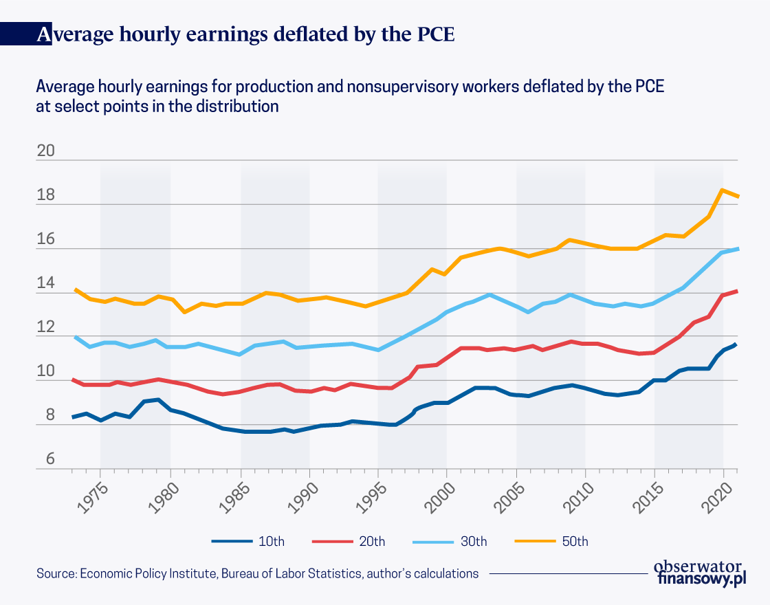
some concern may remain. Figure 3 shows real wage growth for the median
worker and at other points in the distribution.
Since 1990, real median wages grew by 34 percent. Real wages at the
tenth, twentieth, and thirtieth percentiles grew over this period by 50,
48, and 38 percent, respectively.
The ubiquity of 1973 might argue for economists and analysts to adopt
a new standard base year. But it would be better still for scholars and
commentators to take a more nuanced approached when describing wage
growth over time. Wage trends over the past half century are too nuanced
to be succinctly summarized without considering the 1970s and 1980s
separately from the three decades that followed.
Thirty-nine percent growth in average wages over the past three
decades (and 34 percent median wage growth) is slower than wage growth
at the top of the distribution. But given the choice between “stagnant”
or “not stagnant,” the latter is the more accurate characterization.
A 39 percent increase in purchasing power is a significant increase.
My characterization of wage growth over this period would be “solid, but
not spectacular.” Of course, policy should not be content with this
pace of growth. It is not “fast enough.” Policymakers should focus on
policies to boost productivity, which will quicken the pace of wage
growth, along with measures to increase competition in the labor market."
"His [Steven Koonin’s] book is full of
important, factual information and insights. One of his main messages is
that there is much more uncertainty about where the climate is headed
than many climate scientists and even a higher percentage of people in
the media are willing to admit. And the good news is that the long-term
economic effect of even substantial global warming will be small.
Among the scientific sources Koonin uses to
make his case are the very reports by the United Nations’
Intergovernmental Panel on Climate Change (IPCC) that reporters draw on.
The difference is that Koonin spells out what the reports actually say,
whereas reporters tend to draw selectively from the reports in ways
that – according to Koonin – mislead the reader. It would probably come
as a surprise to most people, for example, that the oceans are still
rising slowly, that forest fires have not become more common, and that
hurricanes are not more frequent than they were 100 years ago. Koonin,
who agrees that the earth has warmed and will likely warm further,
considers the various options for slowing global warming. He shows how
hard it would be, especially in developing countries, to reach net zero
emissions by 2050 or even by 2075. So he considers various alternative
ways of slowing global warming and also the idea of adapting to global
warming.
This is from David R. Henderson, “Good Reasoning on Global Warming,” Financial and Economic Review, Vol. 21, Issue 2, June 2022.
Another excerpt:
One of people’s biggest worries is that
global warming will cause glaciers to melt and, therefore, increase the
global average sea level. The CSSR mentioned earlier added to this worry
by pointing out that the average had increased much more quickly after
1993 than before, rising by 7 centimetres in the later period. Koonin
wondered if one could find other recent 25-year periods in which sea
levels also rose quickly. He found one, the period from 1935 to 1960,
when the average rose by 6 centimetres. Koonin argues that one should
look at the whole period and not “cherry pick” the periods in which sea
levels rose particularly quickly. Koonin notes that he sent his
criticism to the lead author of the CSSR report, Don Wuebbles of the
University of Illinois, and to Robert Kopp of Rutgers University, the
main author of the CSSR’s chapter on sea level rise. Both, he writes,
agreed with his criticism, though claimed that they would have pointed
this out in their report, but that it was too late.
By James E. Hanley. James E. Hanley is a Senior Policy Analyst at the non-partisan Empire Center for Public Policy.
"Global warming is real, and it is a problem. But how big of a problem?
According to some, humanity’s very existence seems to be at stake. When
our responses to global warming snap like a rubber band, warns
economist Paul Krugman, “then the megadeaths will begin,” a claim he
says, is not hyperbole, just realism. A popular book warns of an uninhabitable earth.
And United Nations Secretary-General António Guterres has used his
bully pulpit to inform us that we are “firmly on track towards an unlivable world.
Like Krugman, he says this is not “fiction or exaggeration,” but simply
“what science tells us will result from our current energy policies.”
But does the science really say that the earth will become unlivable? More specifically, does the authoritative Sixth Assessment Report
of the Intergovernmental Panel on Climate Change report give us even
the slightest indication that the world is at serious risk of becoming
uninhabitable due to our current energy policies?
The unequivocal answer is “no.” Put another way, Krugman, Guterres,
and others are engaging in hyperbole, exaggeration, and fiction. Because
what the IPCC really says is that 1) our current energy policies are
better than they were when the Fifth Assessment Report was written, so
our predicted warming paths are lower than they were then, and 2) the
world will be twice as wealthy by the year 2050, global warming or not.
Its most dire economic predictions are for a reduction in economic
growth over that time, whereas an uninhabitable world would, of
necessity, be one of devastating economic collapse.
This doesn’t mean there won’t be challenges from climate change, with
some regions facing greater challenges than others. And it doesn’t mean
we won’t be better off if we mitigate it or at least invest in
adaptation strategies. But it does mean that there is a concerted effort
by some elite actors to engage in the politics of fear. I will not
attempt to discern to what extent these otherwise intelligent people are
mistaken, and to what extent they are consciously dishonest. What I
will do here is draw directly from the IPCC Report to argue for
humanity’s bright future.
Myth #1: RCP 8.5 and Very High Levels of Warming
The most dire predictions come from simulations run under a scenario
called representative concentration pathway (RCP) 8.5, sometimes called
the “business as usual,” pathway, which would lead to almost five
degrees of warming by century’s end (WGIII, 3-118, or Working Group III,
ch. 3, p. 118 – pages are cited so others can verify claims made here).
In the Fifth Assessment Report, this was seen as the most likely
future, but it is now considered to be of low likelihood,
with the most likely future paths being much lower – although still
harmful – levels of warming. This is primarily because countries have
changed their policies and the intended trajectories of their future
carbon emissions, even if not rapidly enough to satisfy climate
activists.
RCP8.5 is, according to the ICPP, no longer business as usual. The
report concludes that while such high-emissions scenarios cannot be
completely ruled out, scenarios showing warming of greater than 4°C
“would imply a reversal of current technology and/or mitigation policy
trends” (WGIII: SPM-22). Current “business as (now) usual cenarios, ones
“consistent with the continuation of policies implemented by the end of
2020,” only lead to a rise in temperature of 2.2 – 3.5°C. The report
itself assumes that current policy trends are not going to reverse and
that, however gradually, they will continue to trend toward
“increasingly stringent . . . climate policies” (WGIII 3-26). A good
rough estimate, then might be toward the lower end of that latter
warming estimate.
Unfortunately, while the RCP.5 scenario is no longer seen as scientifically valid, it continues to be used
extensively. And even as the Sixth Assessment downplays its correlation
with reality, the collected reports contain over 1,000 references to
it, providing plenty of opportunities for fear-mongers to cherry-pick
unlikely disaster scenarios.
Myth #2: We’ll All Be Much Worse Off in the Future
Doomsday scenarios suggest we’ll be much worse off in the future.
Scenes of food riots and violent collapse of social order come to mind.
And yet the Sixth Assessment Report very explicitly states that “in
assessed modeled pathways, regardless of the level of mitigation action,
global GDP is projected to at least double (increase by at least 100%)
over 2020-2050” (WGIII, SPM-49). So even in the worst case scenarios,
the IPCC expects the world to double in wealth over the next several
decades (which will, of course, positively impact our capacity to adapt
to any level of warming).
However, global warming is predicted to have a negative effect on GDP
growth, on the order of .04-.09 percentage points per year, for a total
net reduction in 2050 of 1.3 – 2.7 percent (ibid). This is on the order
of a serious recession in the year 2050 after years of sustained normal
growth, problematic, but hardly catastrophic.
Looking further out, the modeled assumptions for economic growth from
2050 – 2100 are lower on an annual basis, only 1.3 to 2.1 percent per
year. But even that reflects a still growing economy. Whether this
assumption is correct is relevant – the point is that the models are
anti-doomsday models. In their basics they assume a much richer, albeit
much warmer, world, in 2100, even if we do not act to mitigate
increasing levels of carbon dioxide in the atmosphere. So they provide
no basis for predicting utter catastrophe. The science does not support
claims of an existential threat to humanity.
Case Study: Africa
Of course, climate change will affect different regions differently,
and some will be hit much harder than others, both because of location
and because of limited capacity for adaptation. One of the most at-risk
regions is sub-Saharan Africa, because of its low-latitude location and
its continuing underdevelopment. IPCC Working Group II’s chapter on
Africa makes for grim reading. A selection:
“In Africa, climate change is [already] reducing crop yields and productivity (medium confidence).
Agricultural productivity growth has been reduced by 34% since 1961 due
to climate change, more than any other region” (WGII, 9-7);
“Climate
change has [already] reduced economic growth across Africa . . . One
estimate suggests GDP per capita for 1991-2010 in Africa was 13.6% lower
compared to if climate change had not occurred” (WGII, 9-6);
Morbidity and mortality will escalate with further global warming, placing additional strain on health and economic systems (high confidence).:
At 1.5°C . . . distribution and seasonal transmission of vector-borne
diseases is expected to increase, exposing tens of millions more people,
mostly in East and Southern Africa (high confidence)” (WGII, 9-7).
And yet, the close reader will see that there is good news there as
well. Although the report does not give a continent-wide GDP estimate
for Africa, nor even one for the sub-Saharan region, it also does not
suggest an absolute decline in GDP, but rather hints at continued
growth. For example, the report argues that “across nearly all African
countries, GDP per capita is projected to be at least 5% higher by 2050
and 10-20% higher if global warming is held to 1.5°C versus 2°C”
(WGII9-7). These are significant numbers, but they indicate again that
the question is how much wealthier Africa becomes in a warmer future, not whether Africa becomes wealthier.
There are other hints of a positive, albeit difficult, future for
Africa. The statement on increases in mortality and morbidity is
accompanied by the addendum that warming “risk[s] undermining
improvements in health from future socio-economic development” (WGII,
9-7). Fleshed out, that means a wealthier Africa can better deal with
morbidity and mortality risks, and rather than guaranteed absolute
increases in mortality and morbidity, climate change will be a limiting
factor on how much gain is made.
Again, far from an unlivable world, we see even in Africa a world
that will be more livable because it will be more wealthy. It just won’t
be as much more livable as it would in the absence of significant
global warming, and it will continue to lag behind more developed
regions of the world.
Finally, the report notes that even in Africa, adaptation can be
effective in responding to global warming, in that it will be
“cost-effective” (WGII, 9-4). This means that in the absence of
mitigation of CO2 emissions, and in spite of the effective certainty
that we will not limit the world to 1.5°C of warming
– at least in the medium-term – investment in adaptation strategies can
help even sub-Saharan Africa sustain growth through a significantly
warmer world.
Conclusion
None of the above is a call for inaction. The IPCC report argues
forcefully that the net effect of mitigating atmospheric CO2
concentration is a wealthier world in the future, albeit only marginally
so. The mitigation strategies, if the report is correct, will pay for
themselves, given time. Of course that is an empirical claim that is
subject to debate, and the correct answer is an important, but not the
only, element in determining our best public policy responses.
Beyond the empirical question, there is an ethical question of
whether a contemporary generation should be asked to pay for the
benefits of future generations that are going to be much wealthier than
that earlier one. Imagine if we could go back in time and ask folks in
1922 or 1962 to make themselves marginally poorer so we could be five
percent wealthier today. They would, at the least, look askance at us,
especially if we could transport them forward in time so they could see
the phenomenal advantages our greater wealth has provided for us. Most
importantly, we should be cautious about throwing ourselves into energy
poverty via unreliable energy sources just because they are
characterized by the ideological mantra “renewable.”
But if we do not pay for mitigation, we should certainly begin
planning for adaptation. Many adaptation measures, such as raising
shorelines, preserving open space for flood management, and enhanced
disease management will have immediate payoffs, benefiting our own
generation as well as future ones. As the Working Group III report
notes, “Some of the most substantial health, wellbeing, and equity
benefits associated with climate action derive from investing in basic
infrastructure: sanitation, clean drinking water, clean energy,
affordable healthy diets, clean public transport, and improved air
quality” (WGIII, 3-106).
But that’s a far cry from giving in to the politics of fear, which
are too often a prelude to a politics of tyranny. After all, if one
truly believes the very existence of humanity is at stake, no regulation
goes too far, and no social control is too strict, in order to save our
species. And that is a price none of us should have to pay."
"in a paper published in the Fall 2012 issue of the Brookings Papers on Economic Activity, Bruce D. Meyer and James X. Sullivan present some alternative interpretations and more cheerful conclusions in "Winning the War: Poverty from the Great Society to the Great Recession."
They conclude: "Despite repeated claims of a failed war on poverty, our
results show that the combination of targeted economic policies and
policies that support growth has had a significant impact on poverty.
... Noticeable improvements have been made in the last decade; although
not as big as the improvements in some earlier decades, they are
comparable to or better than the progress made in the 1980s. We may not
yet have won the war on poverty, but we are certainly winning.""
"their most striking result uses data on consumption, rather than data on
income, to calculate the change in poverty rates over time. Consumption
data comes from a different national survey than does income data (the
Current Expenditure Survey rather than the Current Population Survey).
Meyer and Sullivan point out that at the bottom of the income
distribution, the answers about income on the Current Population Survey
clearly understate the amount of income received. For example, only
about half of welfare payments seem to be reported in the Current
Population Survey. The proportion of economic activity that goes
unreported to the tax authorities--and to the government survey--is
probably higher at the bottom of the income distribution, too. In
addition, when we talk about poverty what we are really worried about is
more accurately captured by consumption rather than by income.
Meyer and Sullivan used consumption data, and again they set up the
calculation so that the poverty rate for consumption data is the same
as the poverty rate for income data as of 1980. Again, the blue line
shows trhe official poverty rate. The red line shows the poverty rate
with a broader definition of income, adjusted for after-tax income. The
green line shows the change in the poverty rate if consumption is used
to measure poverty. By this measure, the poverty rate almost reaches
zero percent in 2007, before the Great Recession.
Thus, they write: "The results in this paper contradict the claim that
poverty has shown little improvement over time and that antipoverty
efforts have been ineffective. We show that moving from traditional
income-based measures of poverty to a consumption-based measure, which
is arguably superior on both theoretical and practical grounds—and,
crucially, accounting for bias in the cost-of-living adjustment—leads to
the conclusion that the poverty rate declined by 26.4 percentage points
between 1960 and 2010, with 8.5 percentage points of that decline
occurring since 1980."
Just to be clear, the notion that the consumption-based poverty rate
nearly reached zero percent does not mean that the war on poverty is
won. After all, the poverty rate was originally set back in the early
1960s, and although the poverty line has been adjusted upward by the
rate of inflation over time, it has not been adjusted for the amount of
economic growth that has occurred. All poverty lines are set in the
context of the society's overall level of income: thus, a
very low-income country the poverty rate per person might be set at
$1.25/day or $2/day, while in the United States, the poverty rate for a
family of 3 is around $16-$17 per person per day. One can argue
that because the U.S. economy has grown dramatically in the half-century
since the poverty level was set, the poverty line should be higher. But
still, it's worth knowing that the U.S. has made progress in terms of
the existing poverty line--when using more appropriate standards of
well-being like consumption or broader definitions of income."
"Five years ago today, Grenfell Tower in North Kensington in London
caught fire. The fire raced up the building as the gaps between its
recently installed external cladding and the building were turned into
heat chimneys. Most of the tower’s residents were trapped in the block
as the fire raged out of control. Seventy-two people died as a result.
The tragedy has come to symbolise the brutal indifference of the
powers-that-be towards the lives of ordinary people.
Stephanie Barwise, QC for the families at the public inquiry into the
Grenfell disaster, has said that the fire was the ‘predictable yet
unintended consequence’ of a ‘laudable desire to reduce carbon
emissions’, coupled with the cost-cutting greed of the building
industry. The inquiry has heard that construction companies
systematically falsified safety tests. But Barwise’s initial point –
that the cladding around Grenfell was put there to fight climate change –
is less well understood.
Back in March 2010, Ed Miliband, then minister for climate change, published Warm Homes, Greener Homes.
There he wrote that ‘social housing has the potential to make a big
contribution in reducing carbon emissions from homes’. He set out his
aim ‘to kickstart the installation of more ambitious eco-upgrades, with
social housing providing particular leadership to stimulate the industry
and reduce costs’. What he meant was that large-scale programmes to
refurbish social housing would encourage building suppliers to make
cheap insulation, including wall cladding.
One of the companies that enjoyed the subsequent windfall was Rydon Construction Limited. Its cash turnover jumped
from £5.65million in 2015 to £24million in 2017. Harley Facades,
Celotex and Kingspan were some of the other big winners from the drive
to refurbish social housing to meet government climate-change
objectives. In 2016, it was reported
that ‘the UK market for wall cladding has increased by 18 per cent
between 2012 and 2015/16’, driven in part by ‘major refurbishment
activity in key sectors, such as housebuilding’.
Grenfell Tower, 20 storeys high, was managed by the Kensington and
Chelsea Tenant Management Organisation. Around 350 people were living in
the Tower in 2017, most of them council tenants, though a few flats
were leasehold under the right-to-buy scheme.
In 2015-16, overcladding was added to the outside of Grenfell by ‘regeneration specialist Rydon’,
supplied by Harley, using insulation materials from Celotex and
Kingspan. Disaster struck on 14 June 2017. After a small fire in one
flat, the overcladding itself spread the fire around the building,
leading to a blaze that took 24 hours to extinguish and cost dozens of
lives.
The decision to put highly flammable overcladding on Grenfell was
clearly motivated by the desire to meet the aims of the government’s
climate-change agenda. In its 2009 Carbon Management Plan,
Kensington and Chelsea Borough Council set out its commitment to the
Climate Change Act 2008. The borough’s policy also cited the London
mayor’s ‘target across London for a 60 per cent cut in CO2 [emissions]’.
In 2012, engineer Max Fordham wrote a report for Kensington and
Chelsea Borough Council, ‘to identify how, as part of the Grenfell Tower
refurbishment scheme, the current energy and environmental comfort
problems can be addressed, and how the chosen solutions sit within the
[London mayor’s plan] to bring existing housing stock up to the mayor’s
standards on sustainable design and construction’.
‘The poor insulation levels and air tightness of both the walls and
the windows at Grenfell Tower’, Fordham continued, ‘result in excessive
heat loss during the winter months’. He said the council’s chief goal
should be to use less energy, ‘in particular by adopting sustainable
design and construction measures’. Later in 2012, he was made an
engineering consultant on the Grenfell refurbishment.
The borough’s planning application for the Grenfell refurb made clear
that the point of the overcladding was to help tackle climate change.
‘The council recognises the government’s targets to reduce national
carbon-dioxide emissions’, it stated.
After the overcladding was completed, the borough boasted that it had
clad ‘a high-rise block in the north of the borough’ – Grenfell Tower –
as part of the ‘Greener Housing’ strategy to ‘mitigate the effects of
climate change’.
Since the Grenfell disaster, much of the cladding put up to meet
climate-change targets has been taken down. For those who lost loved
ones in that terrible fire, it is too little, too late."
"This new study contradicts, though, what the U.S. Department of
Agriculture has been claiming. This comes at a time when President Joe
Biden’s administration is reevaluating biofuel policies in an effort to
combat climate change.
The research found that “ethanol is likely at least 24% more carbon-intensive than gasoline."
“Corn ethanol is not a climate-friendly fuel,” said
Tyler Lark, an assistant scientist at the University of
Wisconsin-Madison’s Center for Sustainability and the Global Environment
and lead author of the study.
This
report runs contrary to the Renewable Fuel Standard, a 2005 federal
program that mixed corn-based ethanol into gas pumps with the goal of
reducing emissions and energy dependence outside of the United States."
"“Right now,
there's little doubt that ethanol is making global warming worse,” said
Tim Searchinger, a scholar at Princeton University.
Others agree.
“If
you care about greenhouse gases, then this expansion of the corn
biofuel industry is going in the wrong direction,” the late Alex
Farrell, then at the University of California, Berkeley, said at the
time.
The
facts remain the same today, despite the ethanol lobby's influence.
Corn-based ethanol produces higher amounts of carbon emissions compared
to gasoline due to the amount of farmland and the tillage the corn
requires. It doesn’t matter how educated someone is on energy policies —
the more intense production is, the more intense carbon emissions will
be."
"Is the Federal Reserve reviewing the connection between high inflation
and the past two years’ U.S. monetary policy? A reporter asked Fed
Chairman
Jerome Powell
that question at a June 15 news conference. After acknowledging
that the Fed is doing so “very carefully,” the chairman deflected. He
said that for decades inflation was “dominated by disinflationary
forces,” but recent history has been plagued by “extraordinary shocks.”
Pointing to the pandemic, the war in Ukraine and shutdowns in China, he
concluded: “We’re aware that a different set of forces are driving the
economy.”
Yet Mr. Powell neglected to mention the expansionary monetary and
fiscal policies of 2020 and 2021 that surely contributed to upward
pressure on prices. More important, he missed the main culprit: the
Federal Reserve. The Fed lost control of inflation by abandoning its
decadeslong strategy of pre-emptive restraint—that is, tightening before
inflation takes hold. That policy, promoted by Fed Chairman
Paul Volcker
in the 1980s, has delivered price stability for nearly 40 years.
The mistake started in August 2020, when the Fed began to
target “inflation moderately above 2% for some time” to make up for past
shortfalls. This attitude encouraged the central bank to label the
emerging inflation as “transitory.” In June 2021 congressional
testimony, Mr. Powell nailed the coffin on pre-emptive restraint
precisely when it was most needed: “We will not raise interest rates
pre-emptively because we think employment is too high, because we fear
the possible onset of inflation. Instead, we will wait for actual
evidence of actual inflation or other imbalances.”
Volcker blamed the runaway inflation of the 1970s on this type
of thinking. He told his Fed colleagues: “We have lost this game in the
past by staying with an expansionary policy too long during a recovery
period.” He then followed through by raising rates early in the economic
recovery of 1984—with the unemployment rate still at 7.8%—to avoid
inflationary pressure.
Alan Greenspan,
Volcker’s successor, continued pre-emptive restraint, most
famously by surprising financial markets with a sharp rate increase in
mid-1994 while inflation during the first half of the year averaged
2.5%. The last pre-emptive rate increase occurred in December 2016 under
Janet Yellen.
That month, the Fed raised the federal-funds target by 25 basis
points as inflation was running at 1.3% for the year.
We believe that the policy of pre-emptive restraint is what anchored
inflationary expectations after the mid-1980s by preventing inflation
from taking hold. The country is now paying for the Fed’s amnesia.
Mr. Sargent is a senior fellow at the Hoover Institution, a
professor of economics at NYU and a 2011 Nobel Laureate in Economics.
Mr. Silber is a senior adviser at Cornerstone Research and author, most
recently, of “The Power of Nothing to Lose: The Hail Mary Effect in
Politics, War, and Business.”"
"Regarding “How U.S. Officials Got Inflation Wrong”
(U.S. News, June 14): In 2015 the Federal Reserve raised interest
rates, predicting that inflation would return to 2%. Yet from 2015 to
2019, inflation rates surpassed or reached 2% only about 26% of the
time. In 2017 and 2018, however, the Fed raised the federal-funds rate
by 25 basis points at nearly every other meeting. It didn’t look at past
policy errors. By mid-2019, the Fed realized it had overtightened and
cut rates. In 2020 Covid struck.
The Fed conducted town-hall meetings in
2019 and 2020 called “Fed Listens,” after three years of deafness.
Progressives pressured the Fed to not be pre-emptive—essentially
endorsing President Trump’s past complaints. This time the Fed adopted a
policy framework emphasizing employment.
This was a mistake. The Fed became pro-growth as supply chains
broke. Monetary policy became too stimulative, and as fiscal stimulus
ramped up, inflation emerged. The Fed’s recasting of its dual mandate as
a short-term goal for unemployment was a distraction. It allowed
inflation to take hold as progressives tried to bend the Fed to the task
of creating more jobs and fighting climate change. The Fed’s errors
that led to inflation stemmed from policy priority confusions, not from
intractable technical issues.
"There are enough batteries in the world today only to power global
average electricity consumption for 75 seconds. Even though the supply
is being scaled up rapidly, by 2030 the world’s batteries would still
cover less than 11 minutes. Every German winter, when solar output is at
its minimum, there is near-zero wind energy available for at least five
days—or more than 7,000 minutes."
"fossil fuels still provide more than three-fourths of wealthy countries’ energy, while solar and wind deliver less than 3%."
"An estimated 3.5 billion
of the world’s poorest people have no reliable access to electricity.
Rather than give them access to the tools that have helped rich nations
develop, wealthy countries blithely instruct developing nations to skip
coal, gas and oil, and go straight to a green nirvana of solar panels
and wind turbines."
"Consider the experience of Dharnai, an Indian village that Greenpeace in
2014 tried to turn into the country’s first solar-powered community."
"the day the village’s solar electricity was turned on, the batteries were drained within hours."
"Villagers were told not to use refrigerators or televisions because they
would exhaust the system. They couldn’t use cookstoves and had to
continue burning wood and dung, which creates air pollution as dangerous
for a person’s health as smoking two packs of cigarettes a day, according to the World Health Organization. Across the developing world, millions die prematurely every year because of this indoor pollution."
"When Dharnai was finally connected to the main power grid, which is
overwhelmingly coal-powered, villagers quickly dropped their solar
connections."
"the grid’s electricity cost one-third
of what the solar energy did. What’s more, it was plentiful enough to
actually power such appliances as TV sets and stoves. Today, Dharnai’s
disused solar-energy system is covered in thick dust, and the project
site is a cattle shelter."
"A new study in
India’s most populous state, Uttar Pradesh, found that even hefty
subsidies couldn’t make solar lamps worth their cost to most people.
Even in wealthy nations such as Germany and Spain, most new wind and
solar power wouldn’t have been installed if not for subsidies."
"Nigeria’s vice president,
Yemi Osinbajo,
articulated the situation elegantly:
“No country in the world has been able to industrialize using renewable
energy,” yet Africa is expected to do so “when everybody else in the
world knows that we need gas-powered industries for business.”"
"increased regulation and increased taxation of capital—two Biden
administration policy priorities—are supply-side headwinds that make
recession more likely."
"In normal years, workers’ productivity rises by about 1%. That alone
is a strong economic tailwind causing GDP growth, making recession by
the reduced GDP definition less likely than otherwise. Unfortunately,
Mr. Biden’s economic policies will likely cause productivity growth to
fall. A 2020 analysis by
one of us (Mr. Mulligan) and three co-authors concluded that Mr.
Biden’s economic agenda would cause full-time equivalent employment per
capita to be 3.1% lower than otherwise and real GDP per capita to be
8.5% lower than otherwise. If that effect were spread over five years,
the reductions relative to the baseline growth would be 0.6% and 1.7% a
year, respectively. That by itself makes a recession likely in one of
those five years.
Mr. Biden’s regulatory agenda seems to be going ahead as
expected. The good news is that the Senate rejected
David Weil,
the president’s nominee to the Labor Department’s Wage and Hour
Division. But Mr. Biden’s mask mandates offset that good news by
disrupting hiring and employee retention when supply chains are already
strained. His regulatory agenda will likely cause employment growth to
fall by 0.2 percentage point a year and real GDP growth to fall by 0.7
point a year."
"Mr. Biden is almost certain to let temporary capital-taxation provisions
in the 2017 tax cut law expire. The effect will be to reduce growth of
real GDP by about 0.4 percentage point a year.
The combined effect of increased regulation and increased taxation of
capital is a reduction in employment growth by about 0.25 percentage
point a year and of real GDP growth by about 1.1 points a year."
"News reports say the President Biden may propose a temporary
reduction in the gasoline tax, and Secretary Yellen over the weekend
said the idea is "worth considering." I would say the idea is worth
rejecting, for three reasons.
Putting
more money in peoples' pockets with any kind of tax cut would increase
aggregate demand. It would thereby undermine the Fed's program to get
inflation under control.
The incidence of the tax cut would fall
partly on producers rather than consumers, depending on the
elasticities of supply and demand. If it is true that refiners are near
capacity, as reports suggest, then supply is relatively inelastic. That
means the tax reduction would mainly benefit producers.
Given
all the externalities associated with driving (climate change,
congestion, accidents), the existing gasoline tax is below the optimal
Pigovian level. Reducing it would move the tax system in a less
efficient direction, That is, it would encourage people to drive more,
exacerbating the negative externalities."
"Imagine that in January 2021 you bought 100 shares of a
company at $100 per share. Since then, the consumer price index, one of
the standard measures of inflation, has risen by 11.74 percent.
Coincidentally, the stock price has kept pace with the inflation rate,
rising from $100 to $111.74. Your shares are now worth $11,174. Their
value, adjusted for inflation, has stayed the same.
But the IRS doesn’t see it that way. If you sell today, you will get a
capital gain of $1,174. The federal government will tax you on that
whole gain. If you’re in the 15 percent bracket for capital gains
income, you will pay $176 in capital gains taxes.
So you paid $176 on a phantom gain, which means that you lost money.
Whatever you think of capital gains taxes, basic fairness dictates
that people who get capital gains should be taxed on the real gains, not
the phantom gains.
This is from David R. Henderson, “End the Tax on Phantom Gains,” Institute for Policy Innovation, June 22, 2022."
"Globalization's many critics frequently assert that the dramatic
growth of cross-border trade and investment has forced countries to
undercut each other in wages and labor standards—a so-called race to the
bottom for rich and poor nations alike.
A more accurate description would be that it has been a race to the
top. Almost every country is richer today, some substantially so, than
three or four decades ago when the globalization era gained steam.
And neither can globalization be described as a zero-sum game, in
which the gains for some countries come at the expense of others. The
vast economic gains made by poor countries in the past few decades have
not come at the expense of advanced economies.
Visualizing the world economy since 1980
The interactive graphic below illustrates how the world economy has
evolved over the past 40 years (1980 to 2019). Countries are ranked in
terms of real per capita GDP on the vertical axis and their share of the
world's population on the horizontal axis. (The data are based on the Penn World Tables 10.0.)
In 1980, before globalization really took off, there was a cluster of
rich, advanced economies, led by the United States and followed by
Western Europe and Japan. Then came middle-income countries, many of
which were in Asia and Latin America, followed by a long sequence of
very poor countries, some highly populated—notably India and China.
The 1990s marked the era of the Washington Consensus,
a period of liberalized trade and investment rules and a shift toward
more market-oriented economic policy. The collapse of communism and
onset of reforms in the developing world—including in China and India,
which opened their previously closed economies—helped integrate
countries into a truly global economy. The flow of trade, investment,
and technology across countries increased considerably, and the term "globalization" sprang into use.
As economic exchange between countries expanded, what happened to the
distribution of world income? Some expected a race to the bottom in
which the distribution of world income would flatten, as poor nations
got richer at the expense of advanced economies. Some in poor countries
saw expanding global trade as a new form of colonialism in which
high-income countries would become even richer at their expense,
exacerbating global inequality.
Neither scenario came true. Instead, the world distribution of income
shifted up. The United States and Western Europe were richer in 2000
than they had been in 1980, middle-income countries mostly grew but at a
lower rate (the lost decade in Latin America due to the debt crisis),
while China was able to inch upward after Deng Xiaoping, China's leader
from 1978 to 1992, began opening up the Chinese economy.
Fast forward another two decades to 2019 and the effects of
intensified globalization become clear. The entire distribution of world
income shifted up further (see 2019 data in graphic). Now the
middle-income countries enjoyed higher incomes than they did during the
1980s and 1990s. The bottom end of the distribution also did much
better, as both China and India and others in Africa and Asia made great
strides in raising their incomes and reducing poverty.
Why has globalization led to an upward shift in world income?
By increasing investment and facilitating the diffusion of
technology, more open economies are able to increase productivity, which
enables faster growth in per capita GDP. The increasing productivity of
domestic workers raises output per worker, thereby improving living
standards. In this sense, countries are not competing with each other
but simply trying to improve their own lot by themselves.[1]
Globalization deserves some credit for enabling once desperately poor
countries to grow more rapidly and thereby reduce poverty. World
poverty has declined significantly over the past 40 years. According to
the World Bank, the share of the world's population in extreme poverty has fallen from 42 percent in 1981 to just 8.6 percent in 2018.[2]
This tremendous advance has not come at the expense of richer countries
in North America and Western Europe. (It remains to be seen how much
the COVID-19 pandemic may have reversed this progress, however.)
The past 40 years have also seen reduced global inequality.
Unlike previous periods of economic divergence, developing economies
began to converge with richer countries starting in the mid-1990s. Dev
Patel, Justin Sandefur, and Arvind Subramanian show that a "new era of unconditional convergence" became more pronounced in the first two decades of the 21st century.[3]
Of course, the above graphic measures average income (per capita GDP)
and does not show income distribution within each country. Inequality
has increased within many countries
and is a major challenge facing policymakers. Globalization may have
contributed in some degree to that inequality, but having a larger
economy makes it easier to finance redistributive policies and public
investments that might be able to ameliorate some of that inequality.
Furthermore, many forces besides globalization are at work in generating
income inequality. As Caroline Freund
has pointed out, "there is wide variability in both income growth and
inequality despite similar experiences with globalization and
technology, suggesting that other factors are largely responsible for
the changes."[4]
Despite the enormous difficulties that have confronted so many
countries in recent years, the last few decades—the globalization
era—have actually seen tremendous economic progress around the world.
The recent turn away from open markets risks jeopardizing this progress."