Evaluating the free market by comparing it to the alternatives (We don't need more regulations, We don't need more price controls, No Socialism in the courtroom, Hey, White House, leave us all alone)
Thursday, December 3, 2020
Excess mortality during the Coronavirus pandemic (COVID-19)
Excess mortality is a term used in epidemiology and public health that refers to the number of deaths from all causes during a crisis above and beyond what we would have expected to see under ‘normal’ conditions.1
In this case, we’re interested in how deaths during the COVID-19
pandemic compare to the average number of deaths over the same period in
previous years.
Excess mortality is a more comprehensive measure of the total
impact of the pandemic on deaths than the confirmed COVID-19 death
count alone. In addition to confirmed deaths, excess mortality captures
COVID-19 deaths that were not correctly diagnosed and reported2 as well as deaths from other causes that are attributable to the overall crisis conditions.3
How is excess mortality measured? How does this allow us to compare countries?
Excess
mortality can be measured in several ways. The simplest way is to take
the raw number of deaths observed in a given period in 2020 – say Week
10, which ended on 8 March4 – and subtract the average number of deaths in that week over the previous years, for example the last five.
While
the raw number of deaths helps give us a rough sense of scale, this
measure has its limitations, including being less comparable across
countries due to large differences in populations.
A measure that is more comparable across countries is the P-score, which calculates excess mortality as the percentage difference between the number of weekly deaths in 2020 and the average number of deaths in the same week over the previous five years.
For
example, if a country had a P-score of 100% in a given week in 2020,
that would mean the death count for that week was 100% higher than –
that is, double – the average death count in the same week over the
previous five years.
While the P-score is a useful measure, it too
has limitations. For example, the five-year average death count might
be a relatively crude measure of ‘normal’ deaths because it does not
account for trends in population size or mortality. For a more in-depth
discussion of the limitations and strengths of different measures of
excess mortality, see our article with John Muellbauer and Janine Aron.
We exclude the most recent weeks of data because it is incomplete
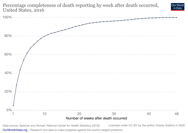
Mortality
data is incomplete in the weeks, and even months, after a death occurs
because of delays in reporting. For example, the chart here shows US
data from 20165
on the completeness of death reporting by week after a death occurs.
After four weeks, only 54% of deaths have been fully recorded; by eight
weeks this figure is 75%, and it doesn’t reach 100% until almost a year
after the date of death.6 Similar delays in reporting exist for all countries to varying extents.
To avoid showing data that is incomplete and therefore inaccurate, we do not show the most recent weeks of countries’ data series.
The decision about how many weeks to exclude is made individually for
each country based on when the reported number of deaths in a given week
changes by less than ~3% relative to the number previously reported for
that week, implying that the reports have reached a high level of
completeness.7
The exclusion of data based on this threshold varies from zero weeks
(for countries that quickly reach a high level of reporting
completeness) to four weeks.8
How do levels of excess mortality compare across countries?
Excess mortality for all ages
The chart here shows excess mortality during the pandemic for all ages using the P-score.9 You can see that some countries – such as England & Wales10
and Spain – suffered high levels of excess mortality, while others –
such as Germany and Norway – experienced much more modest increases in
mortality. To see the P-scores for other countries click
Add country
on the chart.
It is important to note that because the P-scores in this chart
combine all ages, they are impacted by differences in mortality risk by
age and countries’ age distributions. For example, countries with older
populations – which have a higher mortality risk, including from
COVID-19 – will tend to have higher all-age P-scores by default. When
comparing countries it is informative to look at the P-scores for
different age groups.
Excess mortality by age group
The chart here shows P-scores broken down by two broad age groups:
ages 15–64, which contains most of the working age population, and ages
85+, which has the highest mortality risk.11 Two more age groups can also be selected by clicking
Add country
: ages 65–74 and ages 75–84.
You can see that Spain suffered high levels of excess mortality even
for its younger, working population aged 15–64, while Germany
experienced relatively low levels of mortality even for its most
vulnerable population aged 85+.
Excess mortality using raw death counts
Besides visualizing excess mortality as a percentage difference, we
can also look at the raw death counts as shown here in this chart. The
raw death counts help give us a rough sense of scale: for example, the
US suffered some 275,000 more deaths than the five-year average between 1
March and 16 August, compared to 169,000 confirmed COVID-19 deaths during that period.
However, this measure is less comparable across countries due to
large differences in populations. You can still see the death counts for
other countries by clicking “Change country” on the chart.
But these figures – as reported by governments and national health ministries – are the number of confirmed deaths due to COVID-19, which may differ from the total death toll from the pandemic for several reasons:
Some
(but not all) countries only report COVID-19 deaths that occur in
hospitals – people that die from the disease at home may not be
recorded;
Some countries only report deaths for which a COVID-19 test has confirmed that a patient was infected with the virus – untested individuals may not be included;
Death reporting systems may be insufficient to accurately measure mortality – this is particularly true in poorer countries;
The pandemic may result in increased deaths from other causes
for a number of reasons including weakened healthcare systems; fewer
people seeking treatment for other health risks; or less available
funding and treatment for other diseases (e.g. HIV/AIDS, malaria, tuberculosis);
The
pandemic may result in fewer deaths from other causes – for example,
the mobility restrictions during the pandemic might lead to fewer deaths
from road accidents.
This
list makes clear that the two statistics – confirmed deaths due to
COVID-19 and excess mortality – are giving a perspective on different
questions. The confirmed deaths often undercount the total death toll,
but in contrast to excess mortality they contain information about the cause of death.
The excess mortality includes not only those who have died from
COVID-19, but also those from other causes. When during the studied
period fewer people have died from other causes (such as road
accidents), the excess mortality statistics might suggest a death toll
from COVID-19 that is lower than the actual total. This means both
metrics are needed to understand the total death toll of the pandemic."
No comments:
Post a Comment
Note: Only a member of this blog may post a comment.


No comments:
Post a Comment
Note: Only a member of this blog may post a comment.